Ready to bring your home in line with the 2024 color paint trends? Modern paint colors are changing every year, with only a few veterans always here to stay.
We explore some modern interior paint colors to help determine the color scheme of 2024 that best suits your home.
Key Takeaways
- Creamy whites provide a relaxing and comforting impact, perfect for any room.
- Blues and greens are modern house colors, with teal serving as a popular middle ground.
- Violets evoke cheerful memories and create a positive atmosphere in challenging times.
- Terracotta offers warmth and earthiness, making it a popular and soothing interior paint color.
What Colors are Trending for 2024?
There’s a lot to be learned about color psychology and how it affects our desire for certain hues at points in our life.
Interior designers know this better than any other group of artists. That’s because they use color in their designs to communicate with both our preferences and the broader social context.
Every year, a new wave of fashionable colors for interior design emerges that reflects the current cultural climate.
So, what amazing colors can you expect to see in the 2024 paint trends?
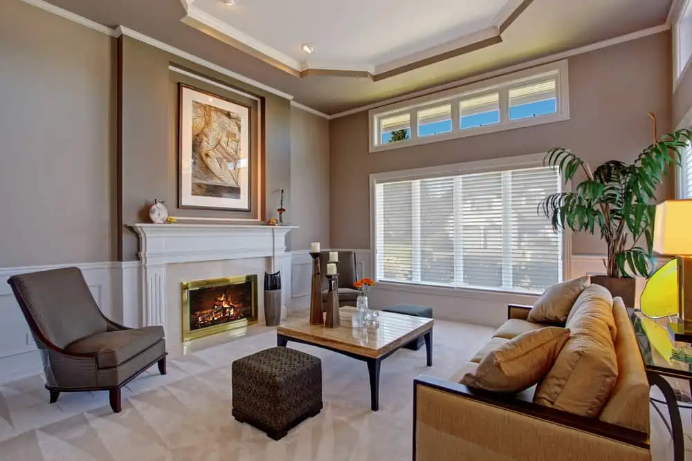
Creamy Whites
Consider them to be “vintage” or “historic” whites. These hues offer a relaxing and comforting impact that dazzling whites do not have. A warm white is versatile and can be paired with any decor style, making it a great choice for any room.
Chalky whites are also making a comeback, as they have a relaxing impact and go well with other current grounding colors.
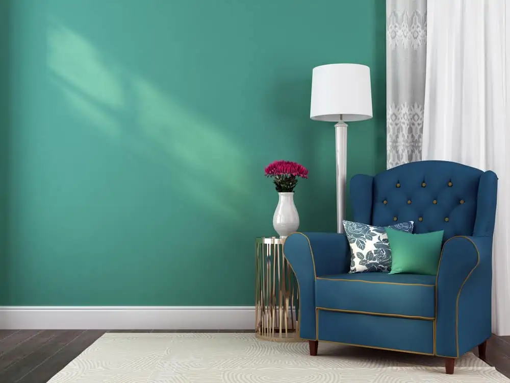
Blues and Greens
There was a lot of teal in the nineties. It’s making a comeback in 2024, albeit in a more refined form. Blue and green are modern house colors, with teal serving as a good middle ground.
It has the stability of royal blue with the optimism and natural beauty of green, making teal a perfect blend of both.
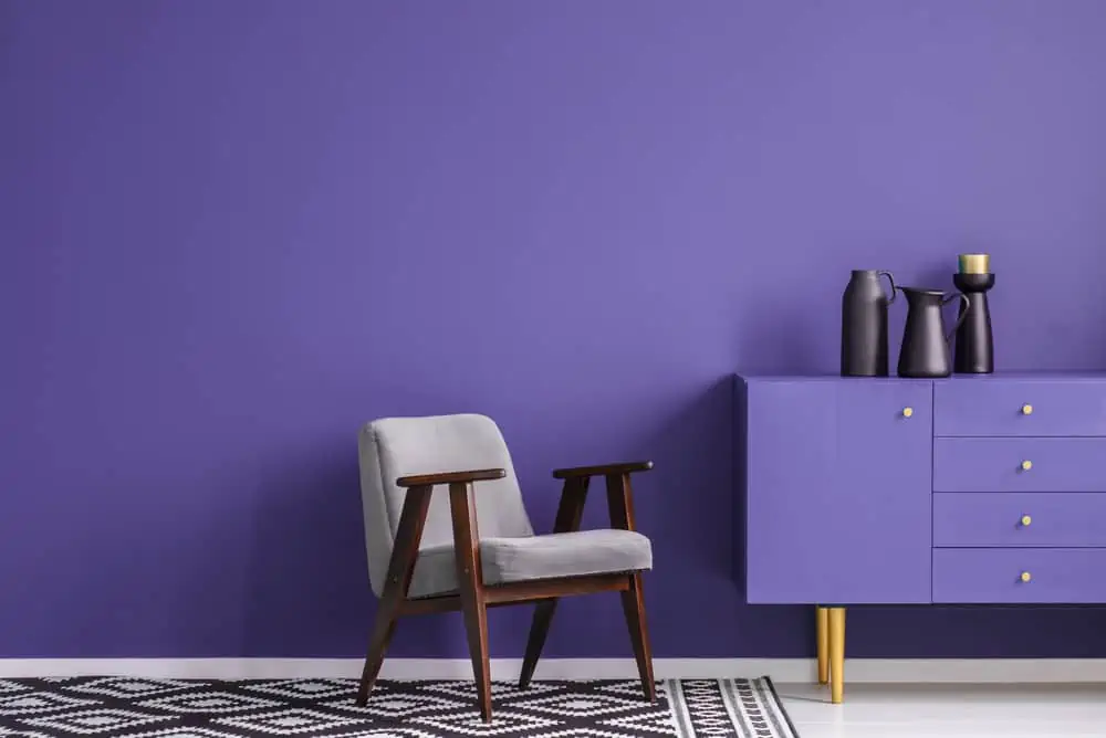
Violets
We all know that life is full of difficulties, but recent times have been especially challenging. Taking this into consideration, the interior colors of 2024 should be vibrant, joyful, and positive.
Tones of violet, in particular, are relaxing and evocative of cheerful memories like sugar confections, florals, and the beginning of spring.
Terracottas
Arizona desert soil, or an Italian vase with a green plant, is an excellent analogy.
It’s easy to see why terracotta is one of the most popular and modern interior paint colors, as it’s both inviting and soothing. I think the color’s warmth and earthiness can help anchor us.
Modern Paint Colors
As far as contemporary paint colors for your home’s exterior are concerned, here are 15 stunning choices, all in line with this year’s trends.
Exterior Paint Colors
While these colors are currently on-trend, they’re timeless, so you won’t tire of them quickly.
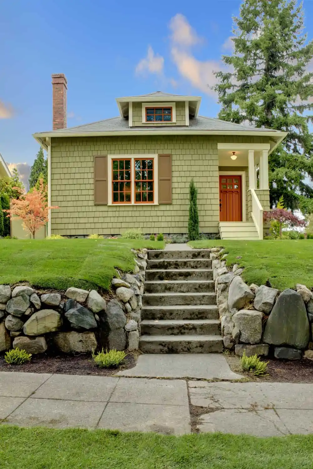
1. Gray
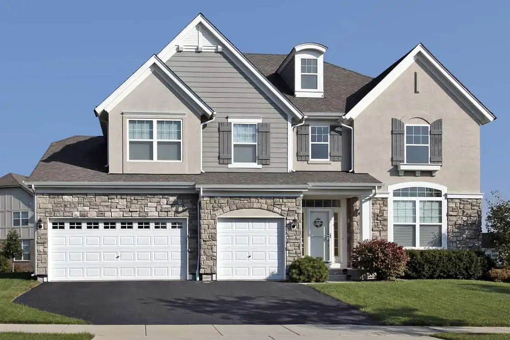
Choose a classic neutral as your new exterior paint color, and you can’t go wrong. Consider painting your house gray if you want to stay one step ahead of the neighborhood’s white dwellings.
There’s a gray trend going on, and it looks just as good on the exterior of a house as it does on the interior of a living room.
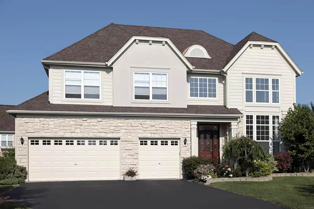
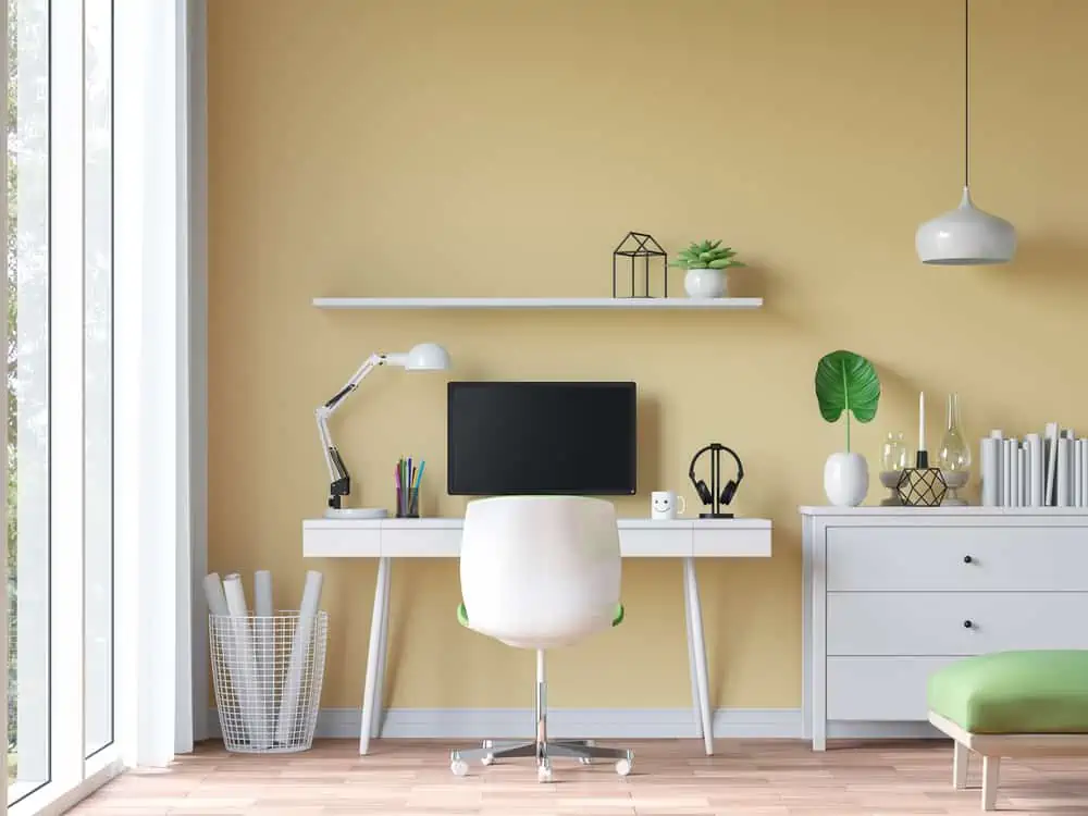
2. Creams and Yellows
Even though creams and yellow might look similar to some, they are two very distinct color categories. Choose creams if you want something neutral that doesn’t stand out too much and is easy to combine with other colors. Go for yellow if you want some on the brighter and sunnier side.
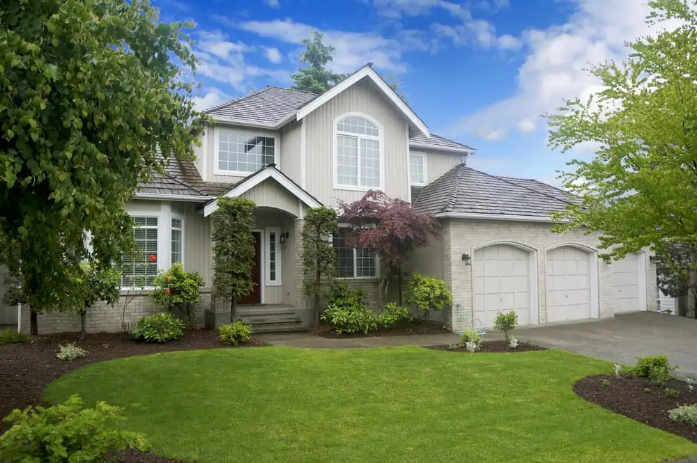
3. Warm Gray
If you want a warm gray paint color for the outside of the house, may I suggest Amherst Gray by Benjamin Moore? If you’re looking for a hue that has a lot of depth and drama, this is a terrific choice for the siding.
Additionally, it makes an excellent accent/trim color for your home’s exterior. It’s classy and looks fantastic as an outside color on a home’s façade.
4. Muted Sage
For fans of the idea of a muted sage house, I’d like to present Acacia Haze by Sherwin-Williams. Acacia Haze is comparable to the color of cacti or succulents, allowing for a wide range of color combinations.
Colors like taupe and even coffee brown complement it well, but the truly winning combination with this color would be a clay-like front entranceway.
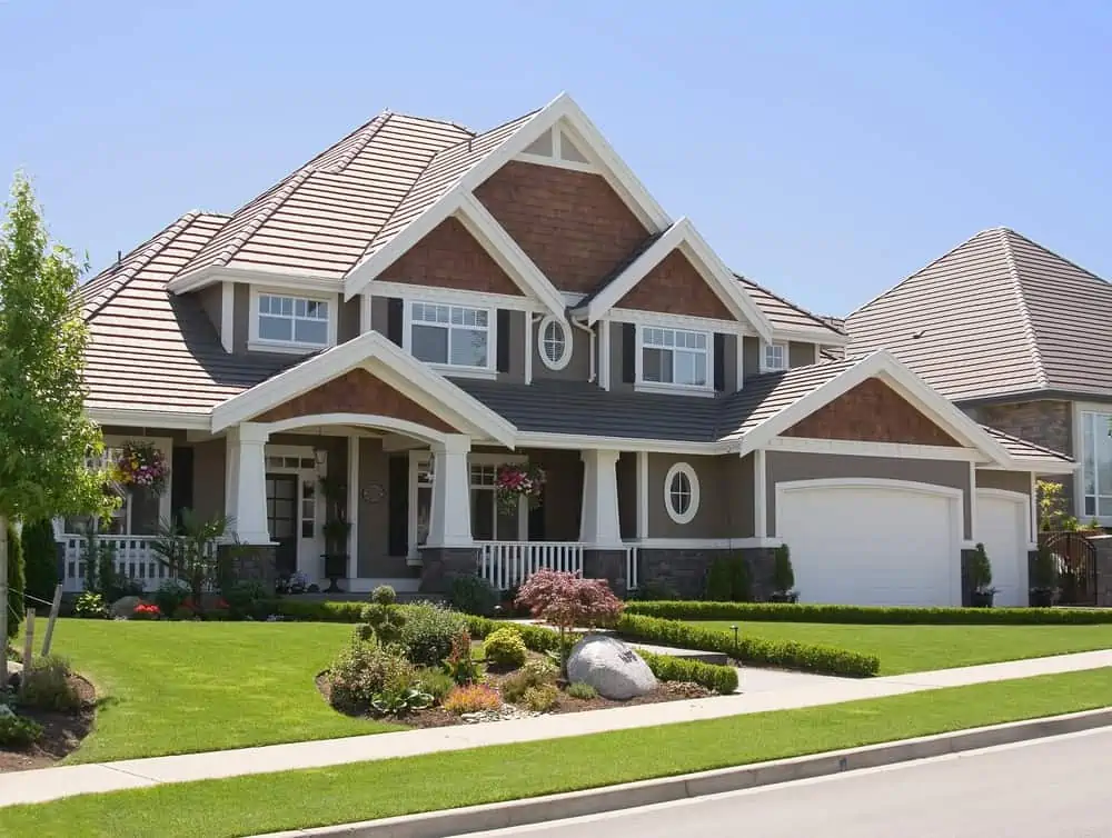
5. Red
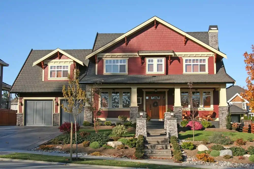
Reds that go well with your composite slate or shake roofing color can be found by following a general rule of thumb. Almost any shade of red will work well with a neutral gray shake or slate roof shingles. Go with a hue that accentuates with the rest of your home’s decor.
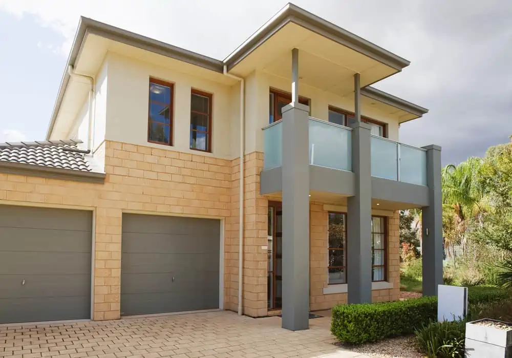
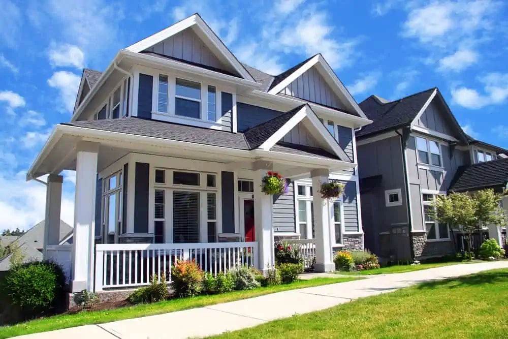
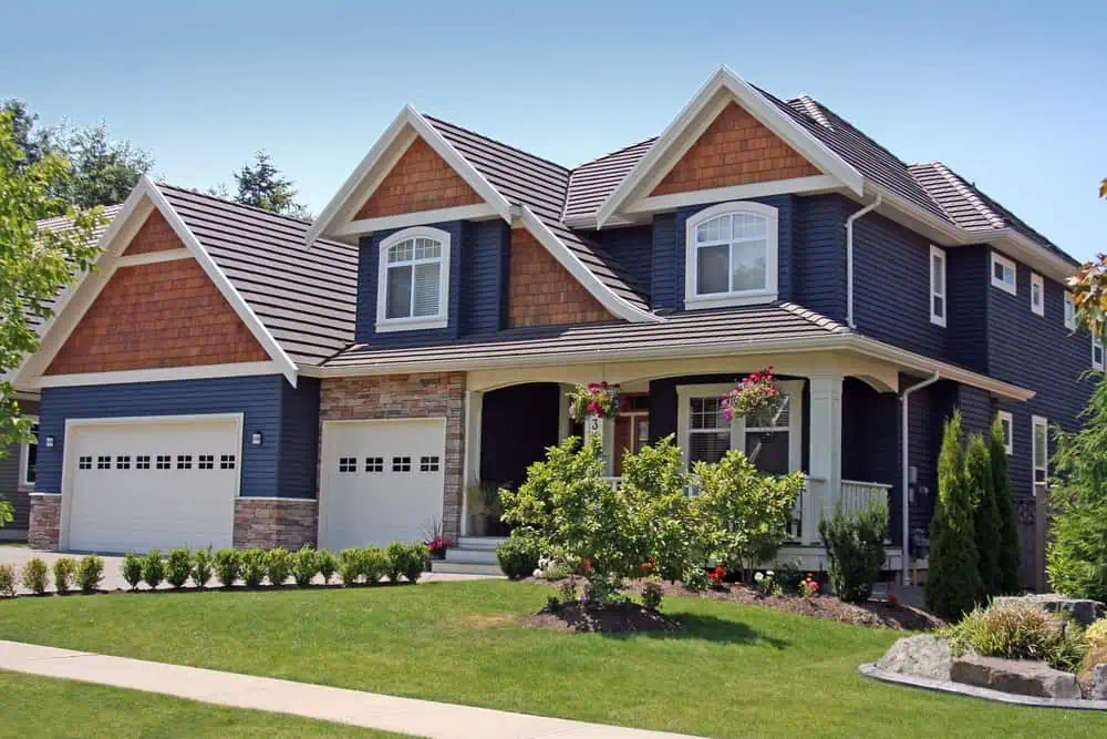
6. Blue-Gray
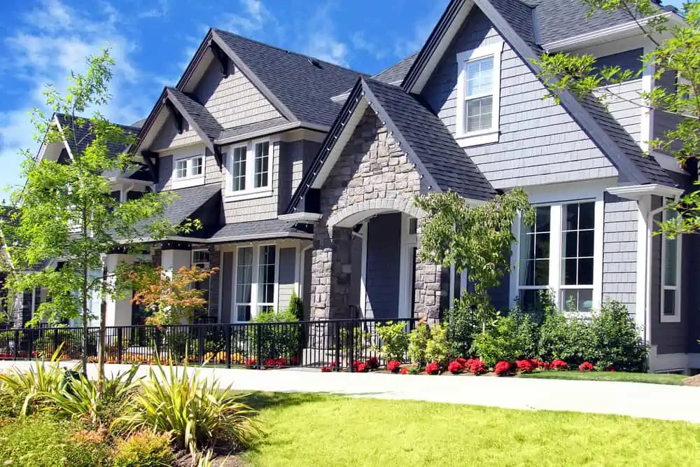
Grays and blues have been the most popular exterior paint colors for the past decade. To create a pleasant color palette for the outside of your home, designers are now blending the two. The color goes well with stone and wood accents.
7. Off-White
You would not believe how many paint shade choices you have when it comes to off-white. A personal favorite would be Seapearl by Benjamin Moore.
In terms of versatility, it’s hard to beat this white’s LRV of nearly 78. Off-white, nearly gray, is a good choice for homes that receive a lot of bright sunlight during the day since it is a softer and more muted shade.
What Is LRV
It’s a paint color’s Light Reflective Value. Meaning, the measurement of how much light reflects and/or absorbs into the color.
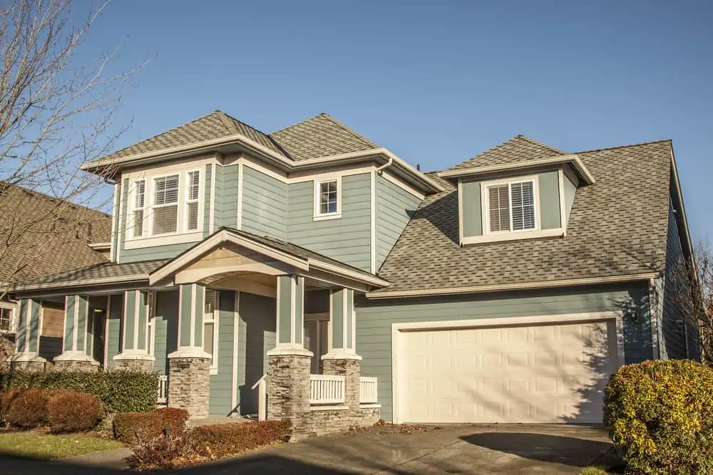
8. Teal
As mentioned earlier, teal is making a comeback, as blues and greens are natural and soothing enough to be found inside and outside the house. You can pair teal with white or black trims, but it also works with shades of brown, brick, or terracotta.
9. Slate Blue
Blue, like the sky, exhibits a variety of moods. When trimmed in clean white, a brilliant blue house might appear fun.
Slate blue is a color that calls for calmness and composure. Despite its rather neutral tone, it manages to be a powerful color. Pair it with white trims and shutters, and you have a simple but sophisticated home exterior.
10. Lilac
In spite of its rather toned-down shade, lilac can be very intimidating for an exterior house color. However, it sparks joy and a sense of renewal and suggests a spring vibe. If an entire lilac house feels like too much, opt for lilac shutters and go with a neutral tone for the siding.
11. Dark Green
Dark green is such a suitable color for a home’s exterior. It’s either used to make the house blend in with the natural surroundings or completely stand out in the urban jungle.
12. Muted Navy
Muted navy is one color that’s growing in popularity. With rustic brown accents and pristine white trims, it’s making a comeback inland, not only on the coasts. Valspar’s Mountain River might be the perfect option here.
13. Violet
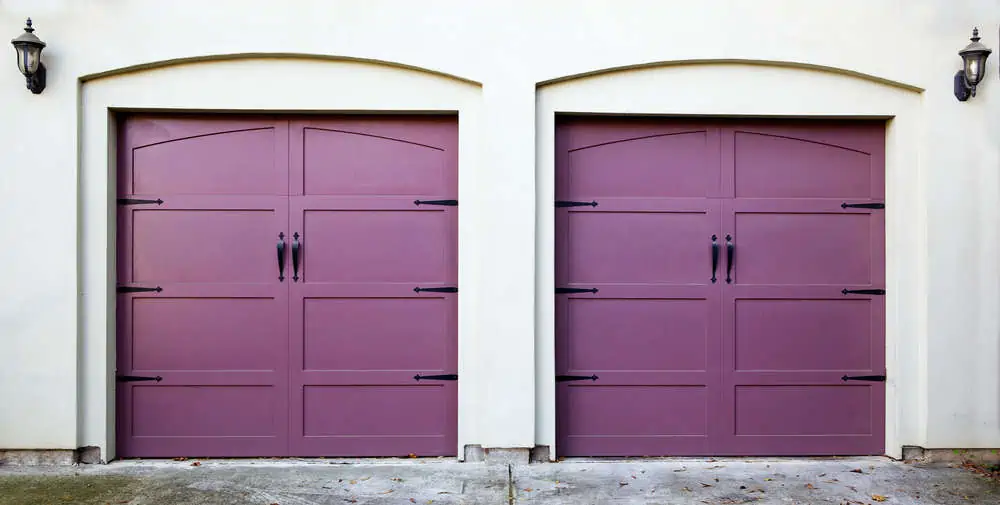
You may be hesitant to paint the exterior violet if you have a historical property since it seems out of place. But, you can stand out from the crowd while maintaining a strong sense of architectural history by choosing a color with gray undertones. Ultraviolet Light by Sico would make a great choice.
14. Sage
Sage green is a shade of green that’s a little on the pale side. It’s said to represent new beginnings because of its association with green.
You’ll be at ease and relaxed because of its serenity and calmness. Sage green is a lovely color combination that is both soothing to the eyes and the mind. Thanks to its adaptability, this tone’s main quality is that it can be utilized both indoors and out.
15. Taupe
Like beige, brown, and white, taupe is a neutral color. It has a distinct natural warmth, making it a perfect complement to earth tones. A variety of earth tones look fantastic with taupe sidings, such as navy blue, brick red, and even forest green.
Interior Paint Colors
Ready to explore some modern interior paint colors that range from bold teal to soft neutrals?
1. Deep Warm Brown
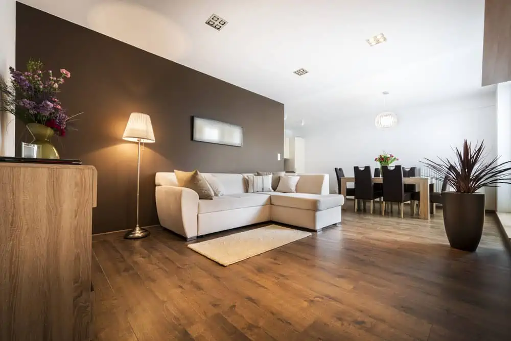
Warm, rich, and with subtle gray undertones, deep warm brown could be perfect for a living room, a bedroom, or a home office. Combine it with neutrals such as white or a softer greige for a simple look that’s appropriate for both large and small bedrooms.
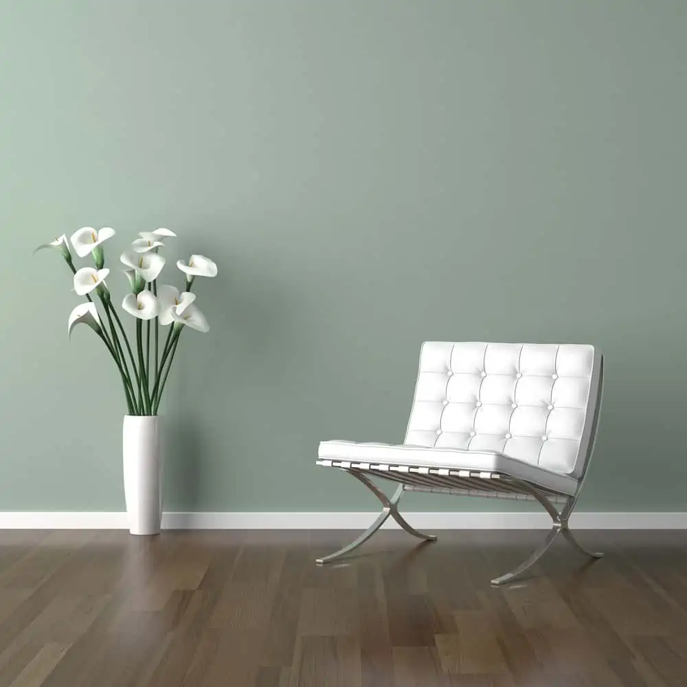
2. Light Sage
There’s nothing like using a soothing hue of sage when it comes to calming a room down. It’s known for its grayish, silvery overtones and versatility. This hue puts an exquisite spin on classic greens, creating a peaceful atmosphere in the home when used as a color for your walls.
Sage is a mild enough color to be considered neutral, but it is dominant enough to set the tone in any environment.
3. Soft Neutrals
The warm neutrals provide a gentle tone without the coldness typically associated with classic grays.
They may be used in any room without overwhelming or clashing with the other colors. Soft neutrals also allow you to play around with shapes and patterns for a more intriguing decor.
4. Teal
Teal is often classified as a cold color because of its associations with the outdoors, such as snow and water. But lighter shades of teal can be used to make smaller spaces appear larger, while darker teal hues can tone down a room with too much natural light. Use it accordingly.
5. Charcoal
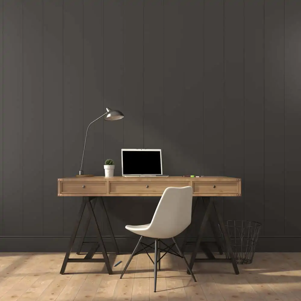
There are some warm and genuine neutral possibilities for charcoal, so you can work with this hue in any scheme.
In minimalist and urban decor, charcoals are a great choice because of their ability to create strong visual contrasts. Iron Ore by Sherwin-Williams takes the cake in this particular color category.
6. Creams
Because it’s warm and inviting, cream is the perfect neutral paint color. Warm creams are the perfect middle ground between stark white and more muted gray/brown neutrals.
Go nutty with creativity, basically acting like a blank canvas for pops of colors inside and outside the house.
7. Gray-Green Tone
Green-gray is a neutral that’s very close to taking center stage. It’s not quite green, not quite gray, but with potential blue undertones.
This is a soft color that’s perfect for a room where you want to attract natural light. For gray-green lovers, I have a gorgeous recommendation: Rainwashed by Sherwin-Williams.
8. Light Periwinkle
Periwinkle is a very versatile color, but if you choose a lighter shade, it’s even easier to mix it with other tones.
Periwinkle goes well with violet-blue, sky blue, turquoise, pinks, yellows, reds, and other complementing colors. All yellow-brown tones are a fantastic match for this tint as well! It would be great when used on an accent wall.
9. Wine
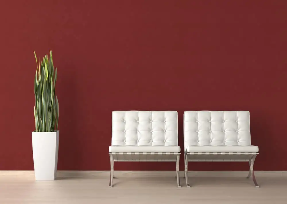
To add depth, drama, and a deliciously comfortable feeling to any area, use hues of red wine. Wine is a shade of red that can solve all these problems. Red Red Wine by PPG is my go-to choice here.
10. Sand
Sand, like other natural tones, has a calming effect while also serving as a neutral backdrop. Sand has a hint of warmth that you don’t receive from other neutral colors. When painting a feature wall in a bolder shade of sand, it can truly make a room stand out.
11. Dark Periwinkle
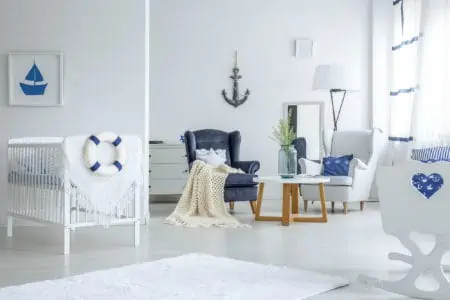
It’s not the first hue that comes to mind when you think of a painting job, but pale periwinkle is a more restrained option than a bright purple or icy blue. Dark periwinkle might just be the perfect color for a bathroom, a nursery, or a home office.
12. Warm Grays
There are many ways to incorporate warm gray into your home’s decor, making it an excellent choice for those who like to experiment with different styles.
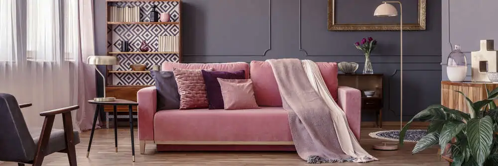
Warm grays give you more of the attractive greige and natural tones that have become so popular recently. Pair it with dusty pink for an outstanding visual effect.
13. Dark Gray
Even if it’s still a gray color, the vibes given by dark gray are completely different than those given by warm gray.
It’s a color that keeps you focused and often needs to be paired with lighter neutral shades to tone it down. It works great with light-colored furniture pieces or other tones of gray.
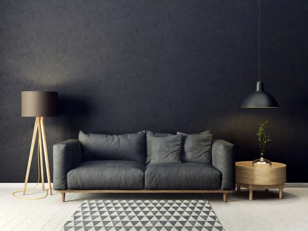
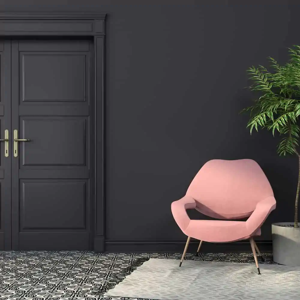
14. Black
Black paint is intimidating to some, but I promise that you won’t want to go back once you see what it can do for a room. If you pair black with soft timber tones, it can offer a lot of warmth to your area.
15. White
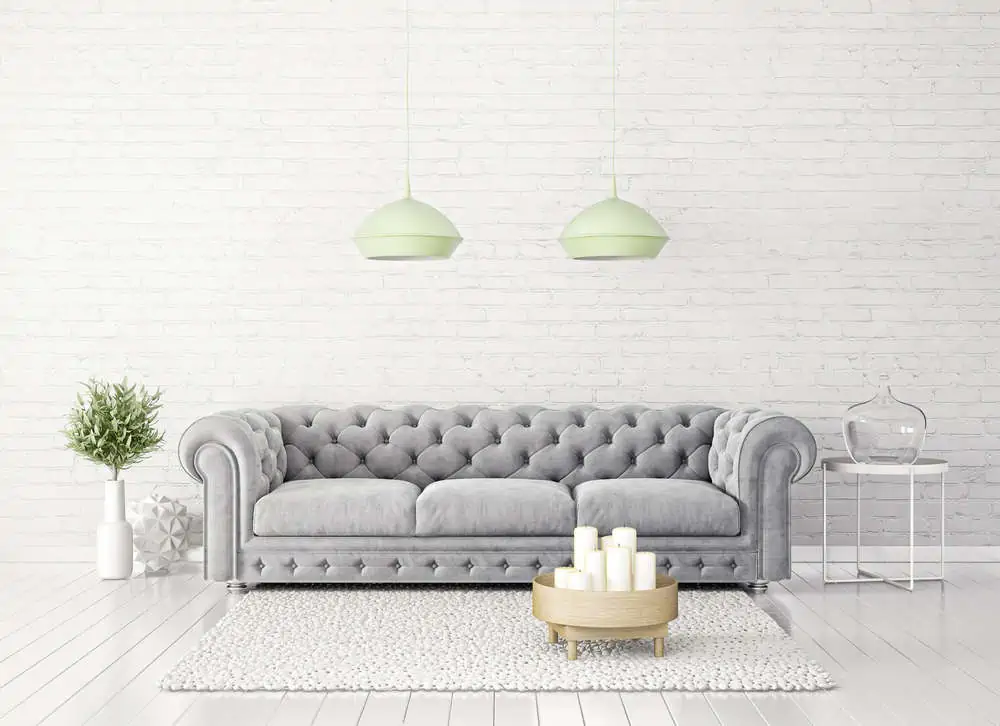
White is a blank canvas that opens up a world of possibilities in terms of indoor paint colors. Whether you choose white as a predominant wall paint color or you paint white trims to match a charcoal room, you can’t really go wrong with this choice.
What To Consider When Picking a Paint Color
If you’re still not sure how to pick a paint color that suits your home, here are some handy points:
- Use the color theory to examine potential color schemes.
- Use predominant neutral colors and play around with accent colors.
- Use your favorite art pieces as inspirations for colors.
- Try darker and lighter shades of the same color.
- Get as many paint samples as you can to determine what would work.
- Use phone apps to simulate how your house would look with certain colors.
In the End
From deep and rich shades of green to neutral tones of warm gray, these are the modern paint colors of 2024. They open up space in terms of pairing and creativity. The trending color palette is very generous this year, so you might as well put it to good use.