Are you ready to add some personality to your home but unsure which paint color to choose this time? Slate blue is a great suggestion.
Not quite navy and not quite gray, this color combines the best of both worlds. Learn how to integrate it into your existing décor with these slate blue color ideas.
Key Takeaways
- Slate blue is a warm color combining blue and gray, making it versatile for various room decors.
- This color can be used on walls, furniture, and accents, creating a cozy and stylish atmosphere.
- Slate blue pairs well with neutral colors, as well as bold colors like yellow and orchid.
- Popular paint options for slate blue include Benjamin Moore’s Slate Blue 1648 and Sherwin Williams’ Smoky Blue 7604.
What Color Is Slate Blue?
The best way to describe slate blue is by thinking of it as a combination between blue and gray. In fact, that’s how Benjamin Moore describes slate blue paint color, so everyone is just going with the flow.
It’s important to note that slate blue is a color that encompasses anything from light blue-gray to dark blue-gray. So don’t expect all the paint shades of slate blue that you meet to be identical.
Slate vs. Navy Blue
For some, it can be hard to tell the difference without a visual. So here are two images that show what slate and navy blue look like.
Slate Blue
Slate blue can vary in tone and hue, depending on what end of the spectrum it’s pulled from. But that dulled blue tone is always the common factor. It’s a common house paint color for both inside and out.
Navy Blue
Navy blue was named after the dark blue uniforms used by sailors in the Royal Navy since 1748. It was afterward adopted by other navies worldwide.
When comparing it with slate blue, it’s clear that the latter has a lot more gray. Navy blue is a lot more blue-ish.
Is Slate Blue a Warm or Cool Color?
Slate blue is considered a warm color. Although it’s a combination of two cool colors, it’s such a deep tone that it evokes a feeling of warmth. Plus, it works well with other warm colors.
Slate Blue Color Ideas
Thinking about giving slate blue a chance, but you’re unsure how to make it work? You don’t need to go big. Here are some slate blue paint ideas to help you get started.
1. Walls
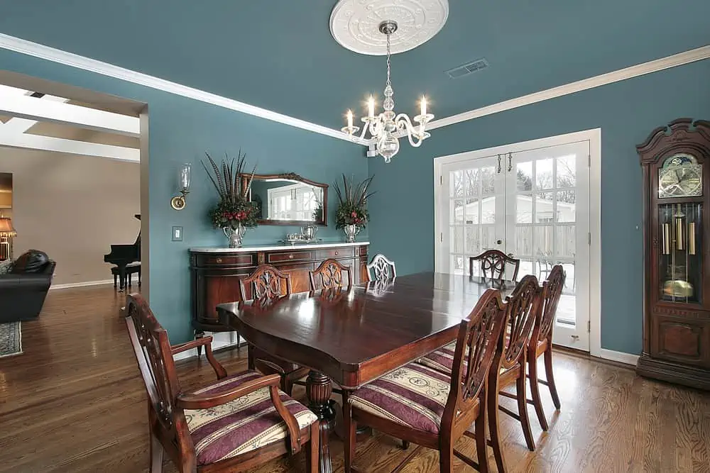
Slate blue walls work well in a lot of different room decor setups. While it may seem counterintuitive, you can pair this color with rustic furniture for a powerful room decor scheme.
And keep in mind that there are many varying shades and tones of ‘slate blue’. The color itself drags from one end of the spectrum to the other, presenting itself in cool and warm hues.
This wall color, for example, is cool and vibrant and would go really well in Bohemian or mid-century modern rooms.
2. Couch
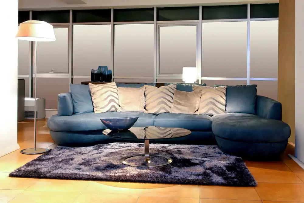
You can’t go wrong picking a slate blue couch for your entertainment area or living room.
Stains and dirt are less visible, and the color is easy to match with others. When you opt for a slate blue sofa, you can pair it with blush, espresso, gray, white, caramel, and even cream.
If you’re feeling particularly bold, how about throwing in some yellow accent pillows on top of the couch?
3. Wet Bar
The beautiful thing about slate blue is that it works with virtually every piece of furniture throughout the house.
In this example, we see it used on a large piece of cabinetry. It creates a beautiful contrast with the golden hardware and goes perfectly in a room with white walls. The wood countertops are a great addition, making everything come together very smoothly.
4. Patio Doors
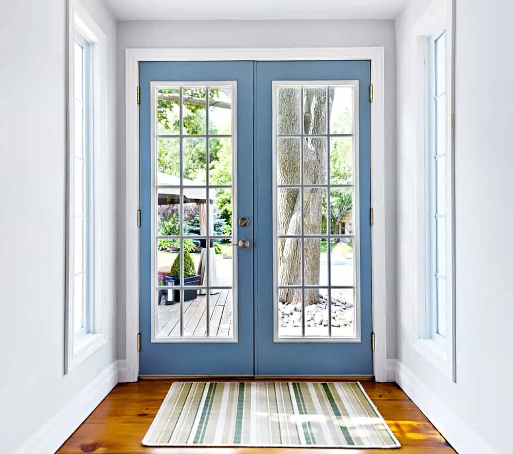
You don’t necessarily have to go for patio doors, as pretty much any door inside the house can be painted in slate blue.
However, when you have lovely scenery to gaze at through the window, the color of the wood acts as a gorgeous frame. It’s almost like looking at a painting. Plus, slate blue really gives old wooden doors a cottage-like appeal.
5. Fireplace
When you’re looking to create a cozy corner and want to install or have already installed a fireplace, why not paint that area in a slate blue color.
It will look dazzling once the fire is lit, taking away some of the coldness that people associate with slate blue. Even if you don’t have a fireplace, slate blue makes for a great accent wall color.
6. Curtains
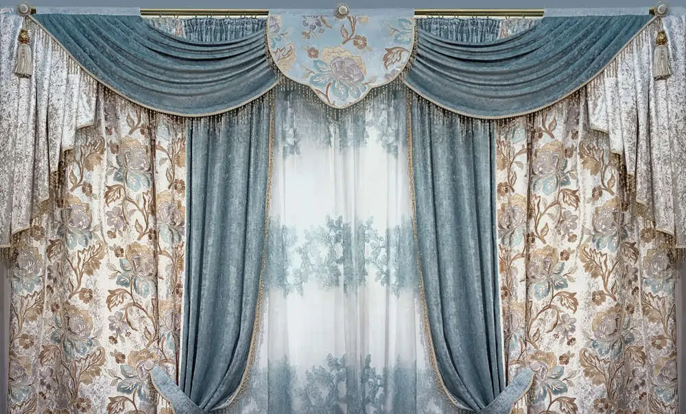
I fell in love with these slate blue curtains when I saw them. Something about this entire Victorian-style setup and the color combinations makes it feel like you’re in a palace.
Slate blue and gold is definitely one of the best color combinations, especially when you’re going for that luxurious vibe in your home.
7. Bookcase
I understand entirely if slate blue feels like an intense color and you’re not ready to fully commit to it. If you feel the need to try it out first, how about opting for a single piece, like this bookcase?
The thin exposed metal legs create a stunning mid-century modern furniture piece. Overall, this bookcase would look great in a room with too much white or neutral color.
8. Vanity
Throw away the idea that you have to use very light and neutral colors for bathrooms. You can create an oasis of tranquility and still opt for a lighter shade of slate blue. This is a great idea if you feel the standard version makes the bathroom too dark.
Notice how easy it is to match the vanity color with the wall while still maintaining that white wainscotting? The look attracts natural light inside the bathroom.
9. Armchairs
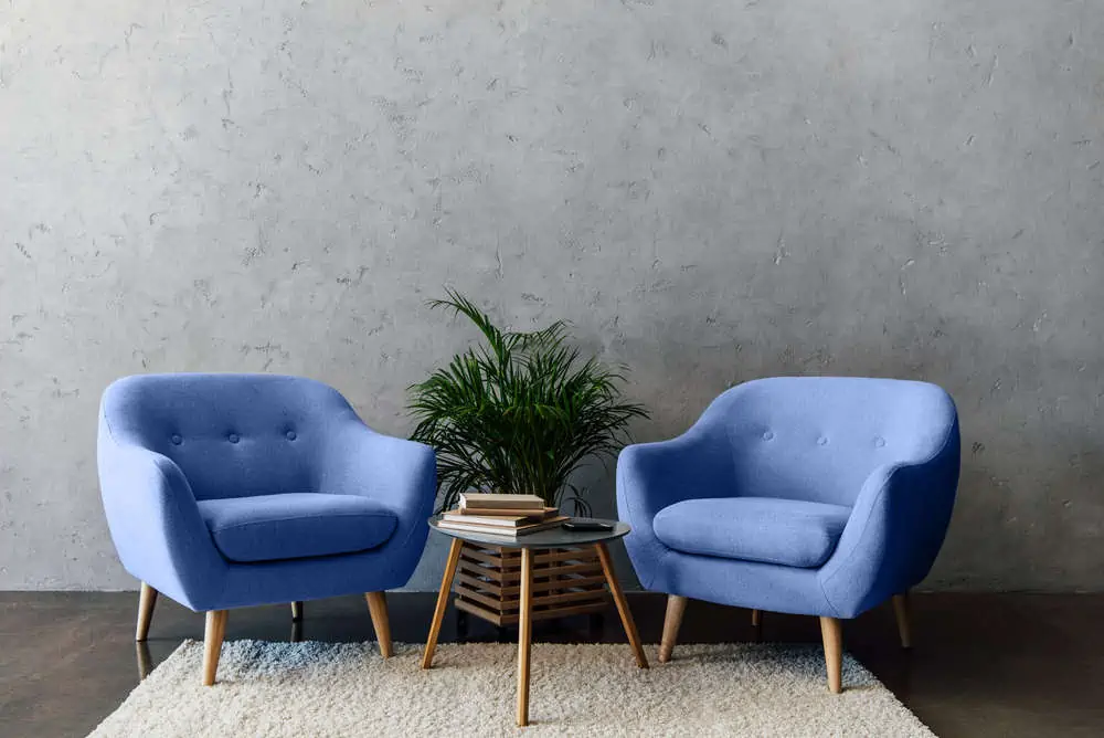
Slate blue armchairs can really make a statement in your living room. You can also opt for a single chair and use it as an accent piece in the bedroom or the entertainment area.
It’s a color that’s pleasing to the eye and would work well. A great idea if you feel like your interior decor is too dull and want to add a bit of personality.
10. Wall Art
Add a touch of slate blue into the room without fully committing to the colors by opting for wall art pieces.
You can go with something more abstract, like the example shown in the picture. If you’re into geometric patterns and abstract art, you can easily find such pieces. Check on Etsy or even make them yourself.
11. Kitchen Backsplash
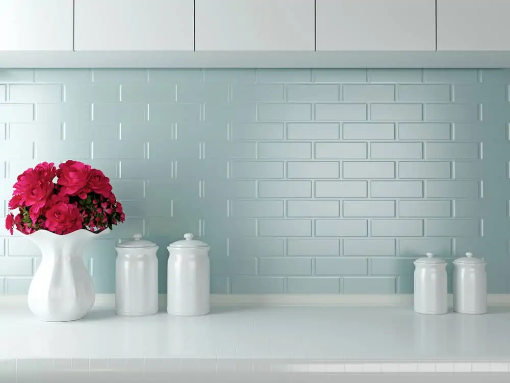
The kitchen is often where you don’t want to pick dark colors. This is because you need objects that can reflect as much light as possible.
You can always opt for light slate blue for something like the backsplash. It matches many different kitchen furniture pieces and works really well in spaces where white is a bit overwhelming.
12. Lamps
If you opt for a slate blue lamp, know that there are many different product styles to choose from. This vintage oil lamp has an old design. But the slate blue brings a nice modern twist.
13. Rug
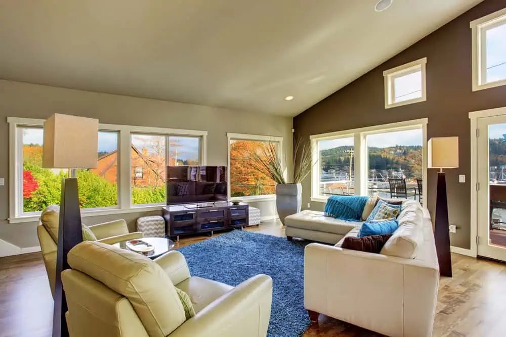
A slate blue rug or carpet might be an excellent idea when your living room or entertainment area is flooded with neutral colors. Get creative here and add multiple area rugs in different blue and gray shades.
Geometric patterns will never go out of style, so why not combine colors and go all the way?
14. Bedding Items
What better way to incorporate slate blue into your bedroom than by buying bed sheets in this shade? When you grow bored of the color, you don’t have to paint your walls or get rid of slate blue furniture. You simply swap the sheets with others of a different color.
Also, slate blue sheets don’t look as dirty (that doesn’t mean they shouldn’t be washed regularly).
15. Desk
Ever since the pandemic started, more and more people have started working remotely. That means they’ve invested in sprucing up their home office. If it’s time to redo it yourself, how about a desk in a gorgeous slate blue shade?
This looks like a vintage design. But the color and golden hardware elements make it a great choice for a more modern setup.
16. Flooring
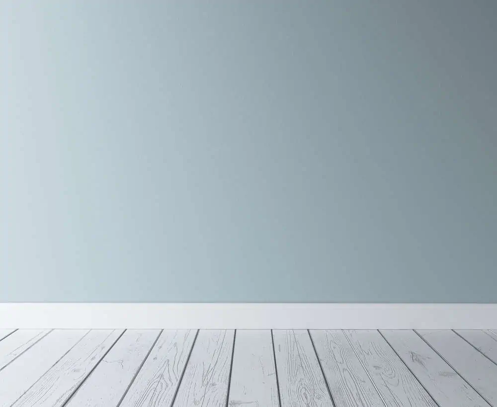
You can always give your floors a new coat of paint. This transitions it from a dull-looking cherry color to your preferred version of slate blue.
Notice how pleasant this light shade looks. The decor almost feels like a canvas that you can decorate with matching colors and customize just the way you like.
17. Throw Pillows
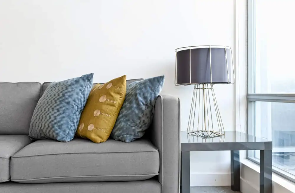
I love throw pillows because you can always change the covers and switch to a new color if you get bored with the old one. This gives you a great opportunity to try slate blue as part of your living room or bedroom decor.
If you’re feeling extra playful, you can opt for throw pillows with covers filled with patterns. Don’t be afraid to combine slate blue with mustard or yellow.
18. Mirror Frames

Incorporating slate blue into your bathroom decor is as simple as choosing a mirror frame in this specific color. If you can’t find one, just repaint any old wooden frame. And give it that tranquil vibe with which we all associate slate blue.
19. Bathtub
When you look at slate blue, doesn’t it just feel like a color that belongs in the bathroom? With this elegant tub, we can tell that slate blue is designed to calm the senses.
We often associate blue with water. This strengthens the idea that we should have at least one slate blue item in the bathroom.
20. China
Slate blue would make a perfect color for your china or whatever kitchenware pieces you use regularly.
You can pull out your slate blue china whenever you’re hosting a dinner party. If you’re a fan of coastal decor, you definitely want to place these items in a glass cabinet. It’s just complementary decor.
Decor Tip
Pair your slate blue china with rich, warm tones of brown, red, and gold.
Colors That Go with Slate Blue
Slate blue is a color that pairs really well with neutrals. Don’t take my word for it. Let’s look at some examples of colors that work well with the slate blue color palette.
Shoji White
When combined with shoji white, slate blue looks amazing. Especially when you use the latter as a predominant color and slate blue as an accent color.
Yellow Bird
When it comes to bold color combinations, yellow bird and slate blue are certainly worth trying. Instead of blending together, they’re in contrast with one another. Creating stunning pieces that will stand out each time.
Orchid
This is yet another color combination that’s definitely not for the faint of heart. Slate blue and orchid are two colors that will make their presence felt when someone walks into the room.
Best Slate Blue Paint Colors
As mentioned before, slate blue comes in many different shades. Covering tastes of both light and darker variants. Some of the most popular slate blue paint colors include:
- Slate Blue 1648 by Benjamin Moore
- Lookout Point 1646 by Benjamin Moore
- Mountain Slate Blue 10BB 18/106 by PPG
- Deep Arctic Night Blue 10BB 07/150 by PPG
- Smoky Blue 7604 by Sherwin Williams
Alternatives to Slate Blue
Can’t find slate blue paint or aren’t convinced this is what you’re looking for? Allow me to give you some suggestions. Slate blue has very noticeable steel gray hues.
So, we can search for paints that match it from the blue and gray spectrum. Some ideas would be:
Bottom Line
Once you see various slate blue color ideas, you begin to understand that the color is lively and pairs well with various neutral colors.
It even works with bold splashes of color such as yellow or purple. Due to the ambiguity of this color, it can be paired with either dark accents or classic pale colors.