Do you often dream about vacation days at the beach? Luckily, there are many ways to bring the essence of beach vacations into your home, and it starts with choosing the right paint colors.
Coastal paint colors have a softness and relaxing vibe to them, making them perfect for just about any living room space. But it’s key to ensure the colors go with the rest of your home. We’ve got tons of great tips and examples to share with you!
Key Takeaways
- Classic coastal style includes crisp linens, painted beadboard, stripes, and a color palette of whites, blacks, charcoal, blues, and neutrals.
- Beach color palette includes blues, whites, pastels, and neutrals to create a relaxing atmosphere.
- Popular coastal paint colors for interiors are light sand, ice blue, wheat grass, and sky blue, while exteriors often feature gray-blue, custard, sea blue, and warm gray.
- Consider natural light, accents, and matching furniture when choosing coastal paint colors for your home.
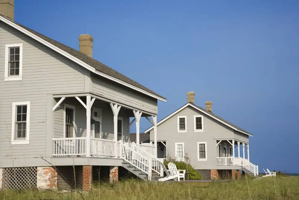
What is a Classic Coastal Style?
You don’t have to live near the seaside to give your house a coastal feel. If you follow a few easy guidelines, you’ll soon feel that the ocean is right outside your door if you follow a few easy guidelines.
It’s simple to obtain the classic seaside aesthetic if you keep it simple and brutally pare down your belongings.
Crisp linens, expertly painted beadboard, exquisite stripes, and a distinct color palette of whites, blacks, charcoal, blues, and neutrals give the design a refined sophistication. Beautiful accents, such as specimen coral, shells, nautical equipment, and coastal art, are common in classic coastal style. You just need to aim for a refined look.
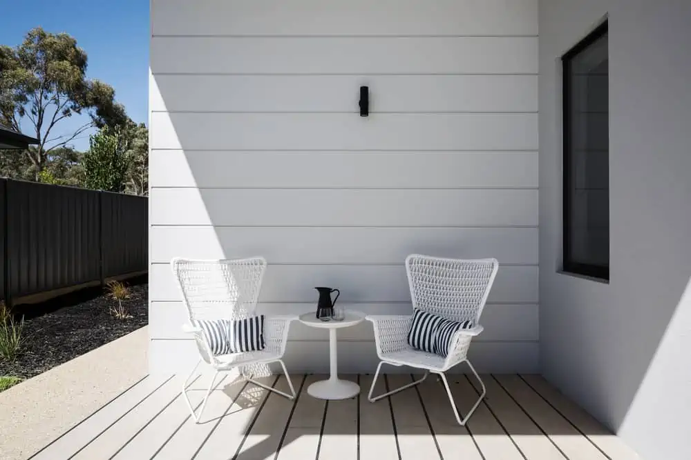
Lighting Matters
In a coastal property, you need to have a lot of natural light. Rooms should be bright, open, and spacious to avoid a claustrophobic or gloomy atmosphere.
What is a Beach Color Palette?
The beach color palette can be divided into four main color categories: blues, whites, pastels, and neutrals.
- Blue is often associated with the beach and sea.
- Elegant and refreshing, a white-dominated room is perfect for relaxing after a day at the beach in the scorching heat.
- As the sweltering sun prepares to set, the sky fills with a kaleidoscope of colors inspired by the sunset.
- Beaches in the early morning mist may conjure images of gloomy clouds above and an unending tan carpet beneath you.
Best Coastal Paint Colors
2024 brings forth a lot of bolder choices in terms of coastal paint colors, so let’s go over some suggestions.For Bathrooms
Beachy colors always work well in bathrooms for their airy energy.
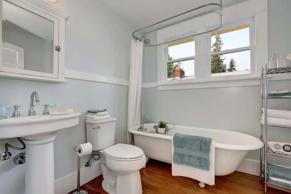
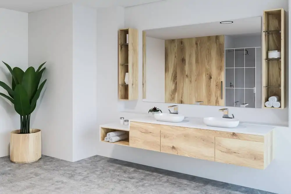
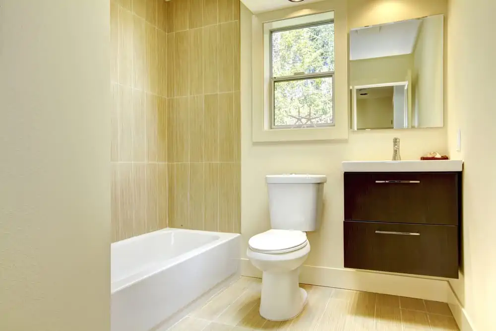
1. Light Sand
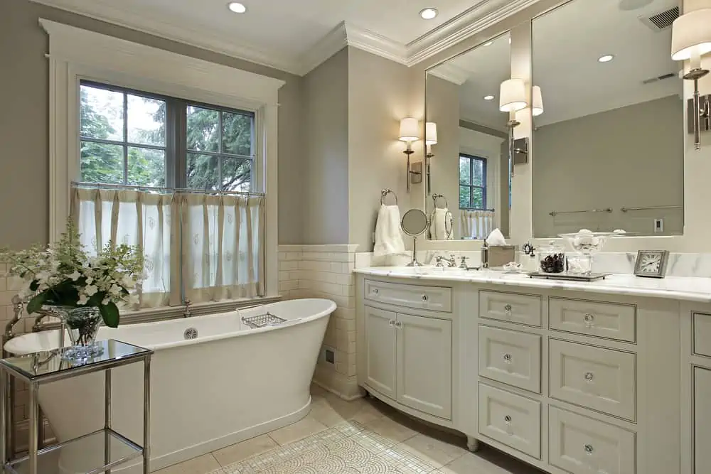
These gorgeous neutrals are precisely the colors you want in a bathroom that reminds you of sandy beaches.
Play around with different shades of off-white, beige, cream, and others. Marble countertop and mosaic-like floor patterns contribute to the vacation look reminiscent of Greek beaches.
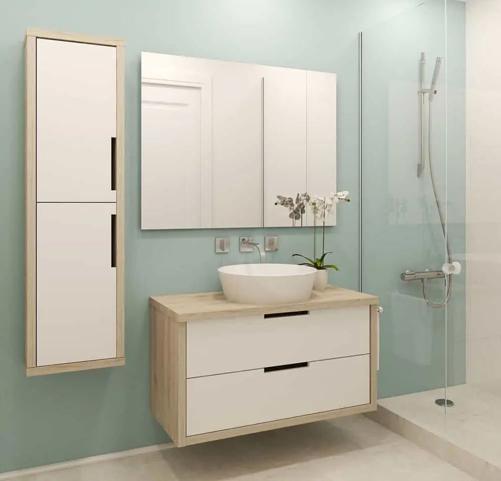
2. Ice Blue
Ice blue is the perfect bathroom color choice if you like to picture yourself on a warm summer day, dipping your toes into the cool water. It has a slight gray undertone which gives it a neutral look, making it easy to pair with accent colors, should you choose to do so.
3. Wheat Grass
This is a very delicate, very pale shade of green. It can work in a bathroom where you’re looking for a lighter and more pastel-like approach.
It’s an excellent pair for natural-looking wood cabinets but could also work with darker vanities. Wheat Grass by Sherwin-Williams is an excellent paint choice.
4. Robin’s Egg Blue
Also known as eggshell blue, the robin egg blue coloration is similar to that of the eggs laid by the American robin and can be described as cyan. Its greenish undertone reminds me of seafoam, while the blue feels like looking at the sky on a sunny day.
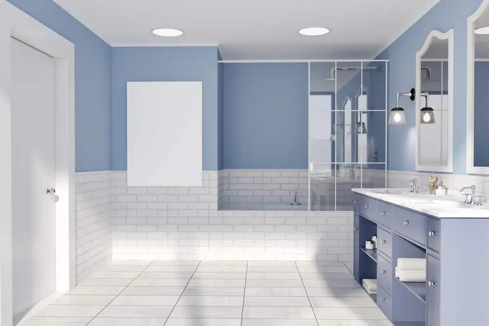
5. Sky Blue
There is nothing more soothing than a sky blue bathroom, especially if you’re going for that gentle coastal vibe. It gives the bathroom a minimalist look while posing as a suitable background for the light brown and white cabinets.
6. Clean Linen White
White is one of the primary color categories for a coastal-themed home. The combination here is spectacular because of the natural wood shelves and vanities. It almost makes me feel like I’m walking on a port deck.
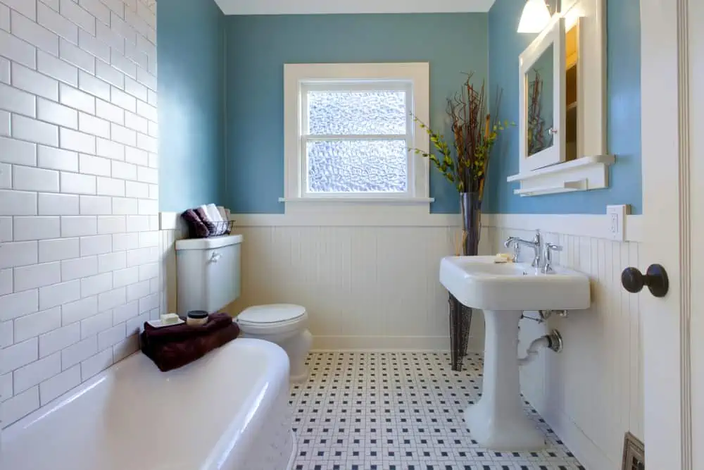
7. Marine Blue
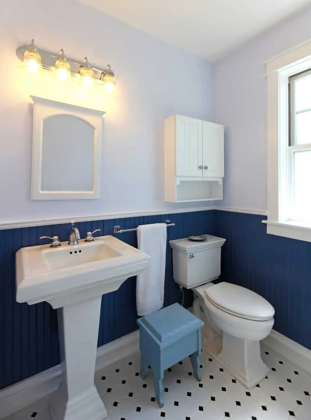
The beautiful thing about this marine blue is its versatility. The interior design in this picture showcases marine blue wainscotting paired with a lighter shade of blue for the walls and white furniture and bathroom accessories. The only thing I feel is missing here is some orange wall art, perhaps something with a sunset.
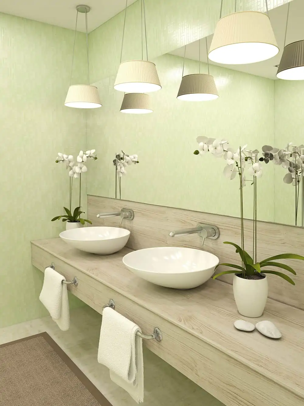
8. Mint
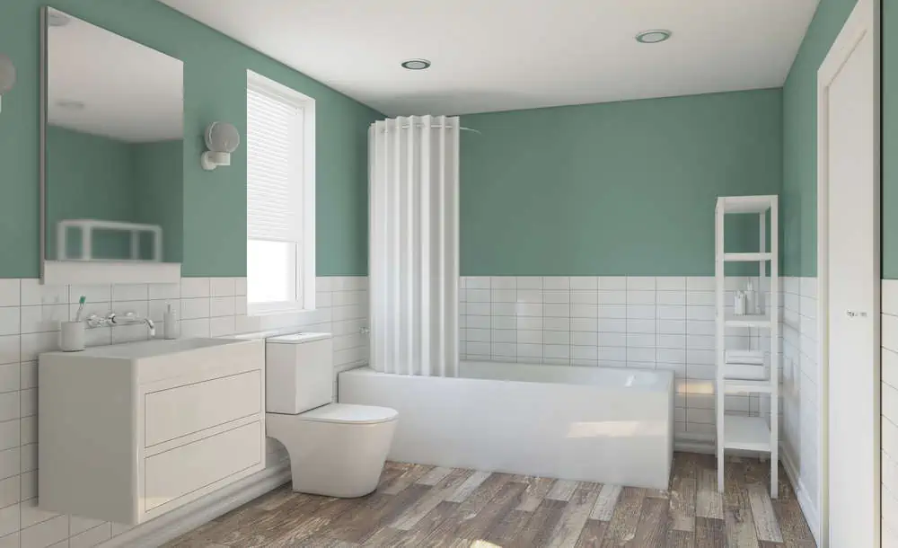
Mint is a color that works with many other colors, including pink, blue, and yellow. However, pair it with white, and you can’t go wrong. The predominant white found in the tiles and furniture could use a bit of color, so mint fits in perfectly.
9. Custard
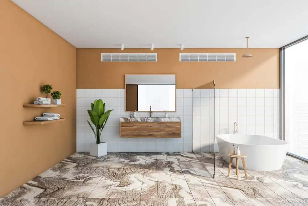
Custard makes a great choice for a neutral color if you want to go with a coastal-themed bathroom, but you don’t want anything too flashy. I’m in love with this flooring pattern, as it reminds me of the colors and ripples of sandy beaches.
10. Periwinkle
Periwinkle is a sort of pastel purple with some blue undertones. It’s the type of pastel that people don’t usually associate with coastal themes, but it feels very soothing to look at. Behr’s Periwinkle would make a great paint choice here.
11. Cream
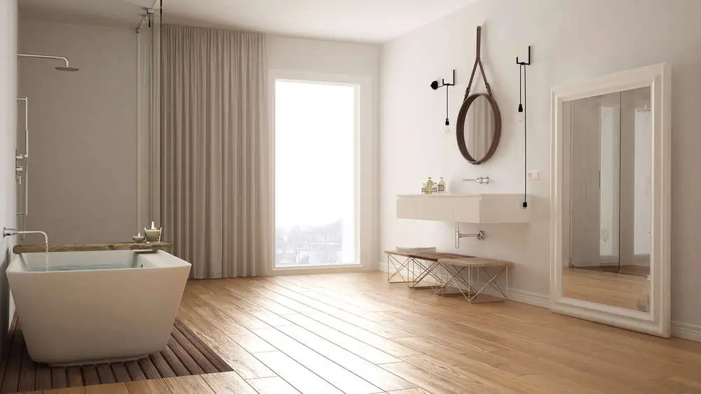
Cream reminds you of the sand and foamy shores. It’s the color of seashells and feels very calm. There are different shades of cream to choose from, so you can play around with the different tones in your bathroom.
12. Mauve
Mauve is the color of a beach sunset. Remember that purple and orange sky that almost looked like a painting? You can get those sunset vibes into your bathroom.
Mauve works really well with sea-green, but the white and brown tones found in this bathroom have a very soothing vibe.
13. Driftwood Beige
When you think about coastal decorations, driftwood pieces are some of the first to come to mind. So, it makes sense to have this driftwood beige in your bathroom, especially if you want to go with something simple but very relaxing.
14. Coral
Coral is another excellent color option for a coastal bathroom, but it can also be used alongside other themes.
When you combine coral with tiffany blue or white (as you can see here), the visual effect is spectacular. Coral Reef from Benjamin Moore would be a fantastic wall color.
15. Soft Yellow
Yellow is, beyond a shred of doubt, an excellent interior and exterior color for coastal houses. In this bathroom, the soft yellow feels like an entire forest.
The flooring and tiles perfectly match the wall colors, while the dark brown cabinets bring a little bit of accent color to the room.
For Living Rooms
Living rooms tend to be neutral with tones and shades, but these coastal colors seem to work.
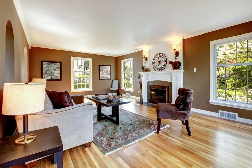
16. Off-White
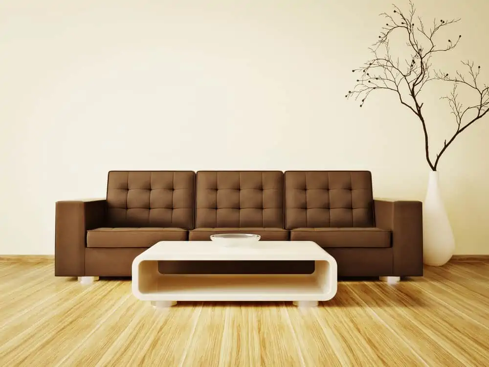
Because off-white is so close to the actual clean white, it’s so easy to pair with other colors. It suits all kinds of hardwood floor stains. And when paired with this gorgeous brown couch, the entire vibe feels very natural.
17. Turquoise
The colors turquoise and blue conjure images of clean ocean water. There is a hint of marine green in Sherwin-William Nifty Turquoise, conveying a strong sense of the sea. It’s a bold color that you can easily pair with golden artwork frames or metal furniture legs.
18. Wet Sand Brown
Is there anything more refreshing than walking on the warm sand to the shore until you finally feel the cool, wet sand underneath your feet? You can bring this coolness right into the comfort of your living room by using a color such as Cobble Brown from Sherwin-Williams.
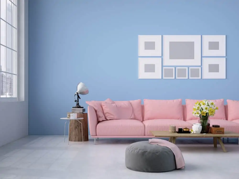
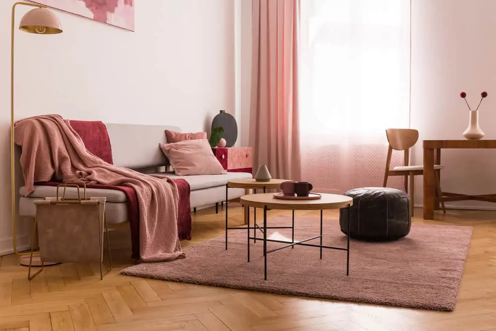
19. Pastel Pink
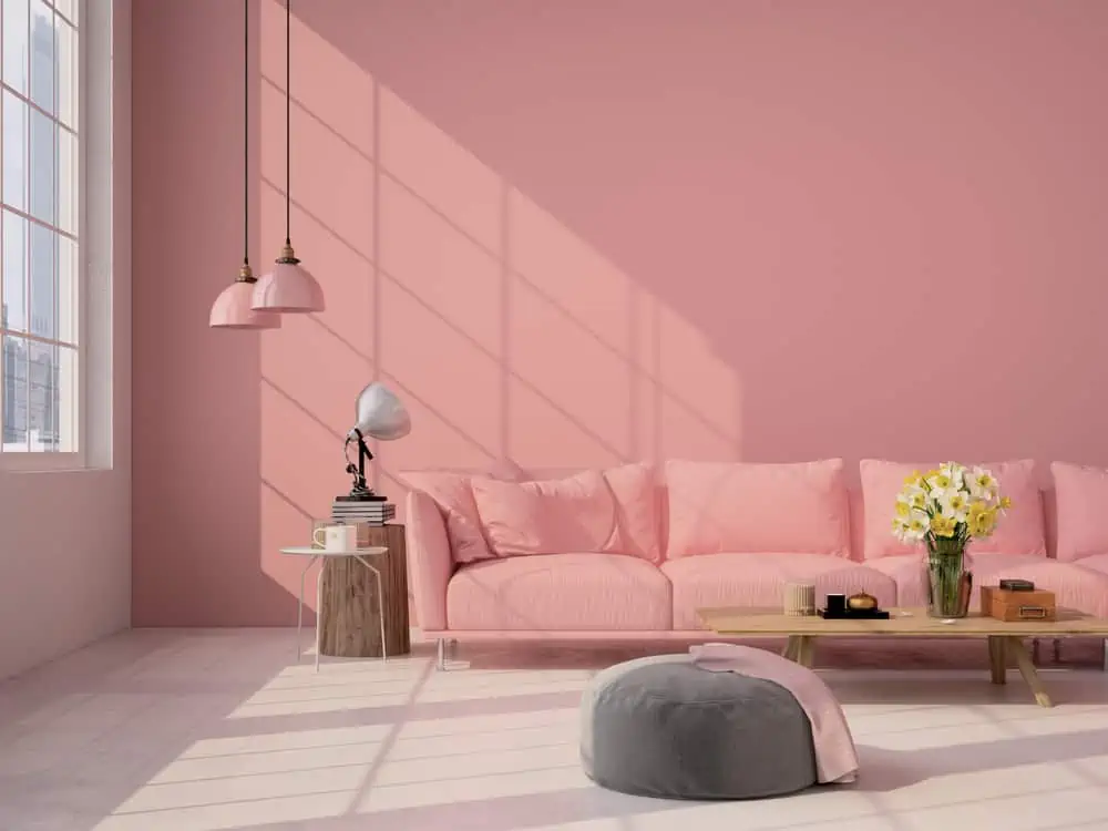
We go back to the idea of a relaxing beach sunset with this perfect pastel pink living room. Everything in this room comes together, from the matching shades to the perfect gray ottoman choice. It makes me wish I was down by the shore.
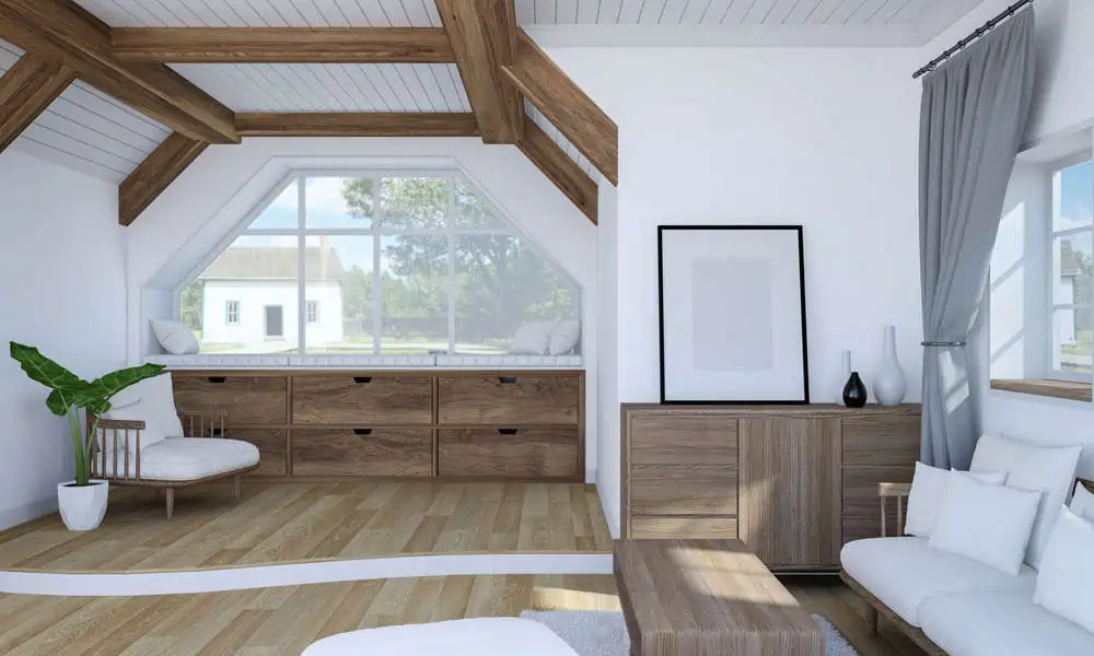
20. Cloud White
Cloud White is a warm white, which means it has creamy undertones. It might even sometimes appear more yellow depending on the lighting.
In this example, it helps create a gorgeous and clean living room setup, with exposed beams and furniture that matches the flooring.
21. Stone Gray
Stone gray is a color that reminds me of warm days by the river, skipping stones, and making the best out of our summer holiday. You can bring these beach theme energies closer to home with a paint color such as Stone Gray by Glidden.
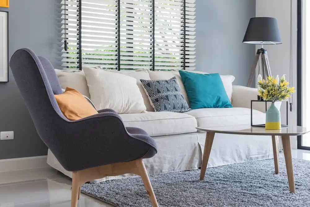
22. Gray-Blue and White Stripes
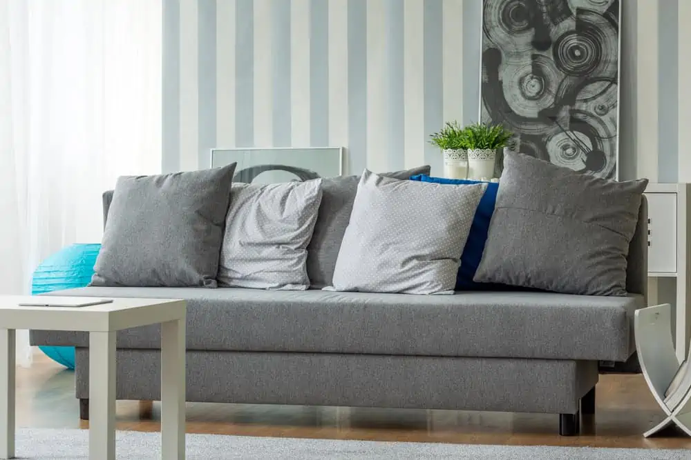
As mentioned earlier, stripes are excellent for adding texture to a coastal-themed home. You can either go with paint or wallpaper to get this visual effect. Pair the walls with a gray couch and some matching artwork, and it’s a vacation all year round.
23. Sky Blue
Blue is the go-to choice for people who want a nautical theme inside their living room. Plus, you can choose from so many shades.
You can have many different approaches to a coastal interior. I love the throw pillows that also remind us of the sea.
24. Pastel Sage
Pastels can also be an excellent choice for a coastal-themed living room, especially when you’re going for a traditional look like the one you see here.
The different neutral shades and patterns make for a very playful decor, while the pastel sage itself reminds us of foamy ocean water.
25. Shell
This color needs to be introduced because it’s all in the name. Shell is a yellowish-white color that you expect to see while walking on the shore.
Because it’s so muted, you can combine it with different wood furniture colors. Its pale shade leaves plenty of room for playing with textures.
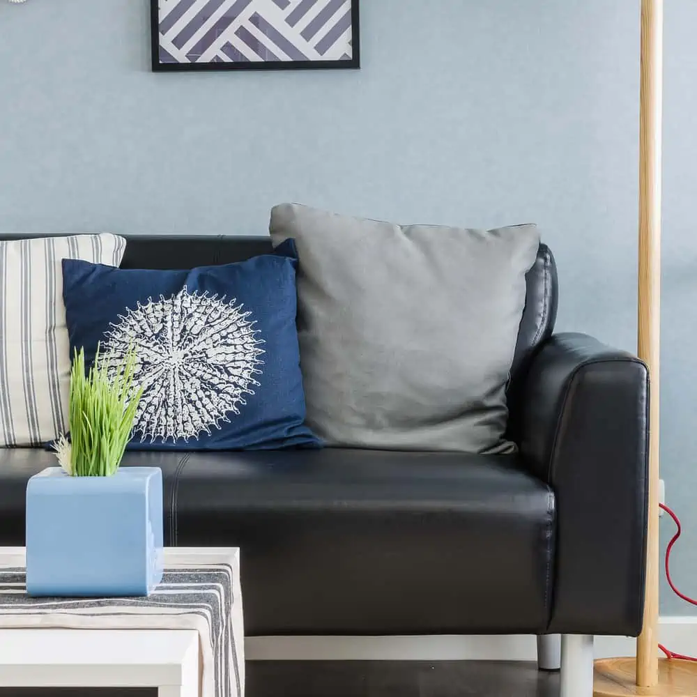
26. Steel Blue

With its noticeable gray undertones, steel blue is another shade of this coastal-favorite color that you get to benefit from. It works really well with gray furniture and decor pieces. It would have also worked here if the wall panels were painted white.
27. Pastel Periwinkle
Sometimes, all it takes to recreate an ocean sunset is some properly-chosen pastels. You can play around with pastel periwinkle while adding some pastel pink to the setup as well.
28. Wheat
This color would work really well in different setups: from coastal to cottage vibes. The natural appearance of this wheat paint makes it easy to pair with all kinds of textures and patterns. Use wicker furniture for the coastal vibe, and don’t forget glass coffee tables.
29. Baby Blue

Baby blue is the beach and sky. It’s probably one of the best paint color choices if you want a coastal-themed home that’s easy to achieve. Pair it with different shades of gray for either airy or anchored looks.
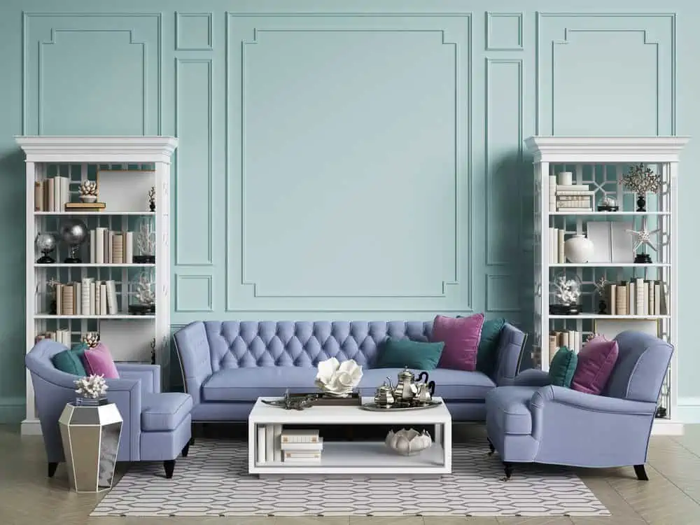
30. Pastel Mauve
Sherwin-Williams’ Mauve Finery is the go-to color for a setup like you see here. There’s no way that this pastel color won’t soothe and inspire the senses. You can go for a monochromatic room approach or use more gray or darker accent colors throughout the room.
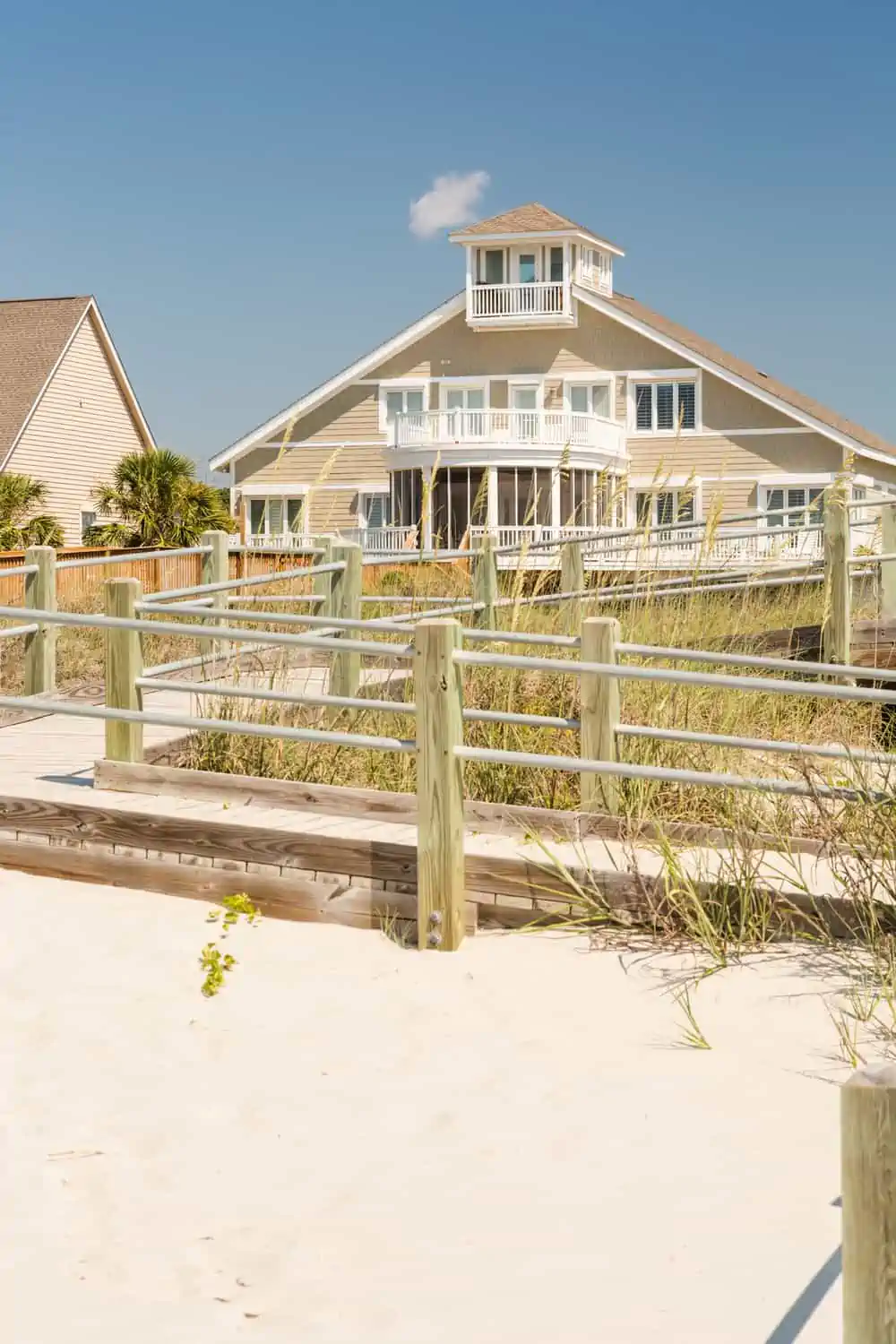
For Exteriors
You can bring the beach inside but also display it outside with these coastal exterior colors.
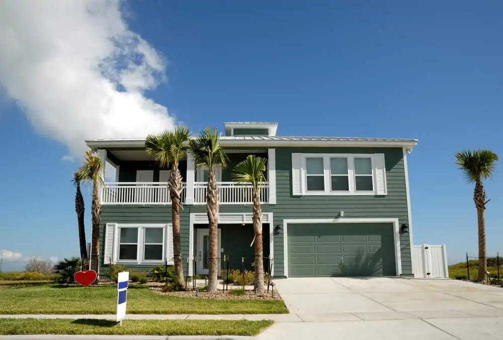
31. Gray Blue
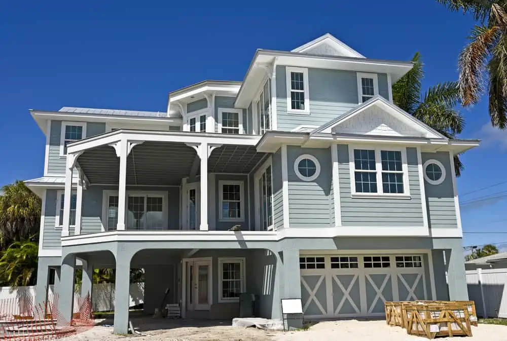
Gray-blue is a fantastic beach home color choice since it blends in with the surroundings no matter what time of year it is.
A winter landscape painted in yellow or blue may seem out of place, yet the color gray varies with the light and may be used year-round. Mountain Stream by PPG would make a suitable paint choice here.
32. Custard
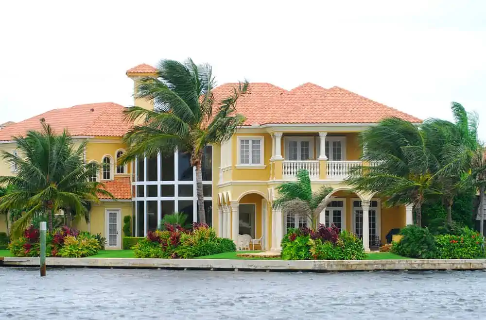
As a deeper and richer chase of yellow, custard is a sunny and sandy color. It works well on a house exterior when paired with orange, brown, or different shades of red (in either the shingles, shutters, doors, or window frames).
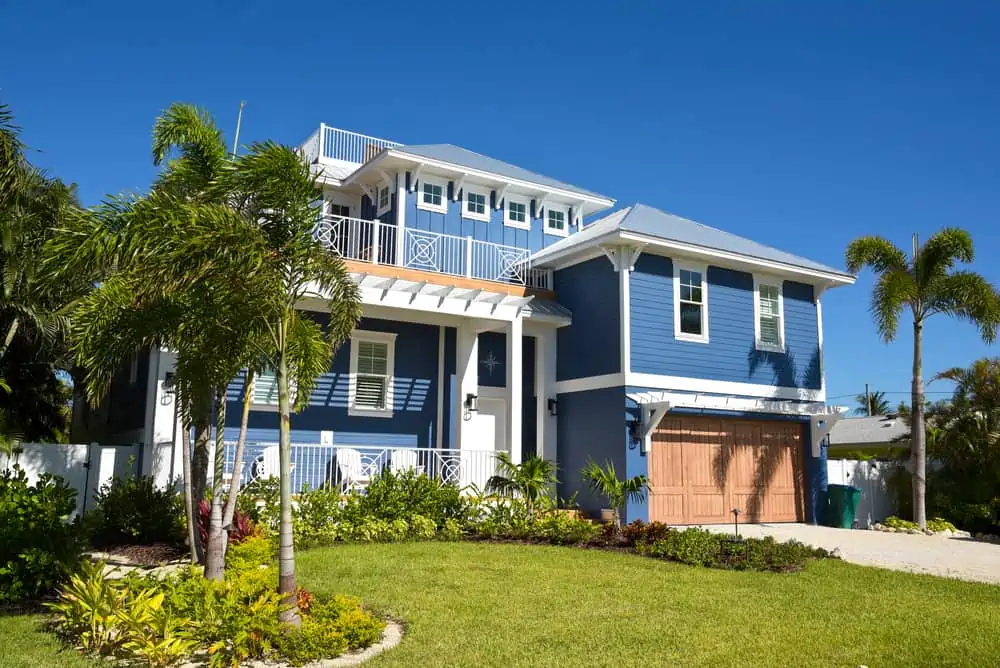
33. Bright Blue
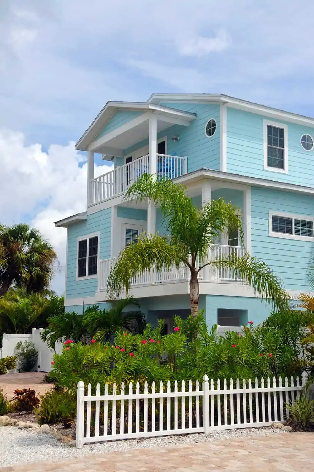
Blue is a color that you can’t go wrong with when dealing with the siding paint of coastal houses. It allows you to play around with its different shades. A bright blue can give your home exterior a welcoming and relaxing vibe, as it reminds us of clear summer skies.
34. Sandy Brown
Use Sandy Brown from Benjamin Moore for a neutral house exterior color that feels like you’re entering a vacation house. It gels with both lighter and darker colors. You can play around with white trim (as seen in the picture) or opt for a dark shade of chocolate brown.
35. Light Sage
Coastal homes benefit from the calming effect of sage green. It complements the different shades of green found in the area, like the grass and plants along the shoreline and the blue-green ocean water.
Because it is so prevalent in nature, green is a neutral exterior color that allows a house to blend in with its surroundings.
36. Creamy Yellow
Because of the sunny sky and golden sand, we frequently associate yellow with the beach, making it a logical choice for the outside of a beach house. You may use yellow to brighten up the atmosphere of the exterior of your home and make it more inviting.
37. Sea Blue
As a medium-blue hue, Athens Blue from Benjamin Moore features a very high saturation level.
When used on the house’s siding, it evokes the deep blues of the Mediterranean city, after which it is called. It contrasts well with cool, bright whites to create a nautical contrast that’s both evocative and refreshing.
38. Mint
Mint is a great choice in terms of beach house paint colors. I love the contrast between the deep red shutters and the mint siding, as it feels like the house has a lot of personalities.
39. Light Coral
While this color is seen in the ocean depths, it isn’t seen as often as other shades in the area. As a bright and cheery color that contrasts with the natural colors of coastal areas, it is an eye-catching choice for beach houses’ exteriors.
40. Peach
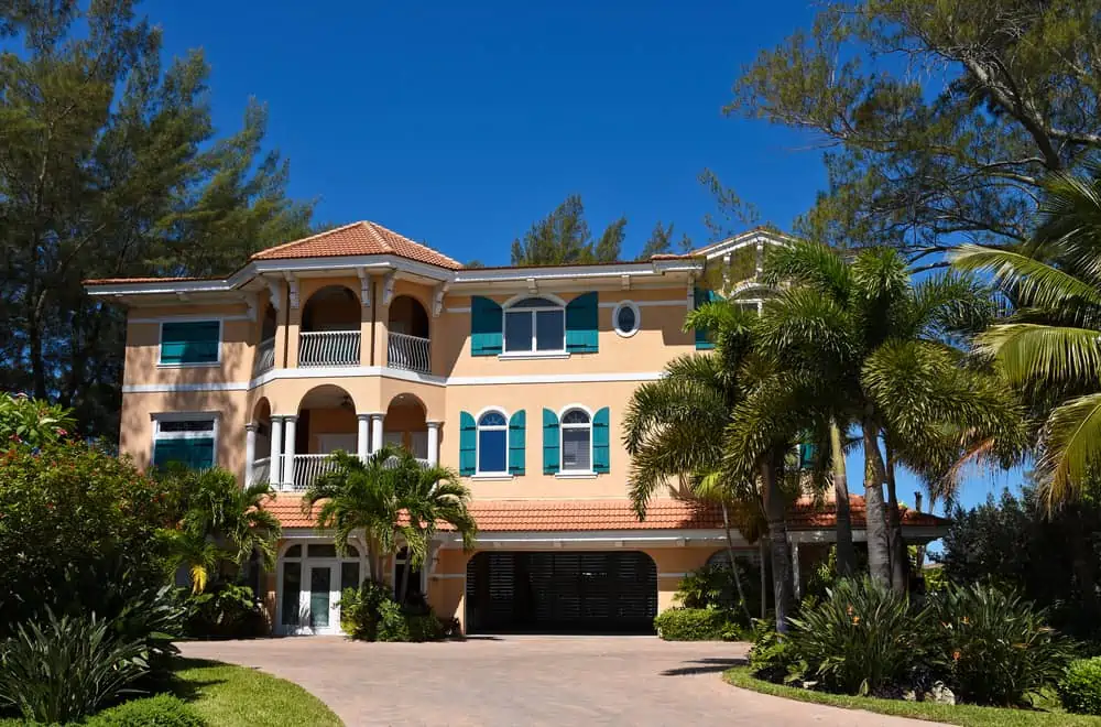
This peach house with teal shutters makes me feel like I’m walking on the streets of Tuscany. It’s a color combination full of personality that draws attention rather than blending in with the crowd. If you want this color on your house, choose Cape Sands by Valspar.
41. Warm Gray
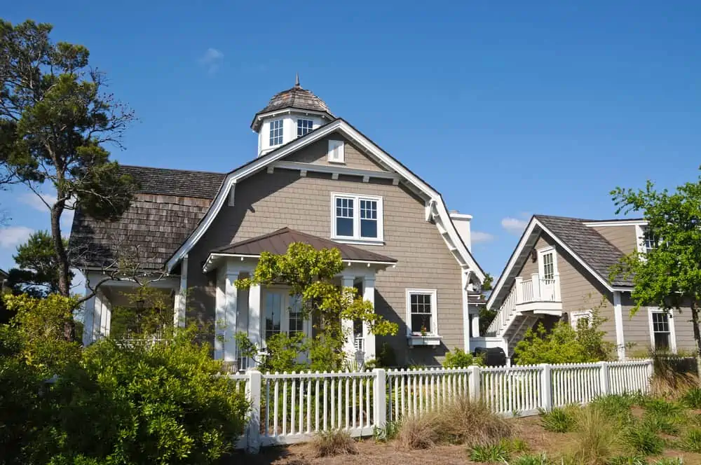
Warm gray falls under the category of neutral beach house colors that would go really well on the exterior of a coastal home. The color reminds us of shells and rocks found close to the water. It pairs like a charm with white trim and that white picket fence.
42. Light Gray
Since soft light gray is a more subdued shade of gray, it will not fade as rapidly as darker shades of the same color. Bright light in the summer makes a gray exterior appear modern, while dim light gives a seaside house a moody appearance during the winter months.
43. Clean White
Choose white for a small beach house since it creates the illusion of a larger property.
White makes the house look bright because it allows sunlight to bounce off the surface. You can pair it with other coastal colors, from pastels to darker shades of yellow.
44. Brown
You might think of brown as a counter-intuitive color choice for a coastal-themed house exterior, but it’s actually one that works really well. With its neutral and natural-looking shade, this darker shade of brown would work well with white trims and shutters.
45. Mustard
Mustard is a deep and rich shade of yellow, which is sometimes found overpowering by homeowners. But it’s one of those beach house colors that makes me think of a really hot summer day. Choose Lemon Curd by Valspar if you want this shade on your house.
How Do I Make My House Look Coastal?
Looking for more tips besides coastal paint colors to give your house that beachy vibe?
- Use throw pillow covers with nautical stripes.
- Gather bamboo and driftwood and use them as decoration across the house.
- Consider whitewash accents because they make the house look more natural.
- Take advantage of table decor and add hurricane candle holders, nautical or striped tablecloths, and coastal-inspired napkins and plates.
- Use wicker furniture and decor pieces wherever you can.
Final Words
Coastal paint colors are often whites, yellows, blues, and pastels. The colors chosen for your beach house’s interior are supposed to reflect the same hues you see as you relax in the rays of sunshine.
They have a traditional beachy vibe and a calming effect. It’s never out of style to paint your house in coastal tones, so use the colors of the sea, sky, sun, and sand to your advantage.