Are you convinced that your front door doesn’t match the aesthetic appeal of the rest of your home? Or maybe it’s just in need of a makeover?
Then it’s time to switch to a new color. If you’re unsure how to pick a front door color, we’ll show you the trends. Plus, we share expert opinions and how to make a choice that matches your personality.
Key Takeaways
- Consider potential restrictions such as Homeowner’s Association rules before choosing a color.
- Choose a color that complements your home’s current style and aesthetic.
- Consult the color wheel to find colors that work well together and match your home’s exterior.
- Opt for good-quality exterior paint to ensure durability and protection from the elements.
What Color Should I Paint My Front Door?
You may be ecstatic to begin exploring your color possibilities and fantasizing about front door designs. But I’ve got some things for you to think about before starting your search for paint swatches. Nobody said choosing front door paint colors would be easy.
Planning things beforehand will help you avoid becoming emotionally attached to an entry door color that is inappropriate for your home.
Consider Potential Restrictions
You’ll want to ensure that there are no limitations on the color of a front entry door. Some neighborhoods have a homeowner’s association or Covenants, Conditions, and Restrictions (CC&Rs). These may restrict residents from using specific exterior paint colors on their properties.
The concept is that limiting the exterior color palette in the neighborhood will result in a more uniform community appearance.
Stick to Your Home’s Appearance
So, you’ve determined the permitted shades for your front door. The final item to consider before proceeding with your color selections is the general external concept of your property.
Limit your color choices to those that complement your home’s current aesthetic. Spend your time examining color swatches that match your home’s primary and trim colors.
Color Meanings
When choosing a front door color, you want to make sure you get it right the first time.
Psychology has associated certain colors with human mindsets, mood levels, and motivation for the longest time. This extended to interior design, making color picking a more personalized experience.
Blue
Blue is a significant color in interior design philosophy, as it has a tremendous effect on the human mind. Blue evokes serenity and tranquility and can be a very soothing color. It can be used in bathrooms to create a spa-like quiet ambiance.
Red
The color red is associated with strength, passion, and danger and is also considered a lucky color in Feng Shui. It may be both warm and inviting, as well as energizing.
Yellow
Yellow is the hue of warmth, intelligence, sympathy, and prosperity, based on interior design color psychology. A yellow-hued space might appear pleasant, welcoming, and airy. Avoid using it in big doses since it can be overstimulating.
Green
As we all know, green is the hue of nature. Additionally, it represents hope, good fortune, and abundance. It is a cool, pleasant color that pairs well with a wide variety of other hues. It complements white beautifully and is suitable for living areas, offices, and bedrooms.
Orange
Individuals who adore red but dislike its harsh influence can safely substitute it with orange. This vibrant, youthful hue is great for a child’s room, dining area, office, or living room.
It is a symbol of bravery and hospitality. Additionally, it helps you feel energized, daring, and sociable.
Black
The color black is associated with evil, bereavement, and death. It is, however, the hue of knowledge. Black is always utilized sparingly in interior design theory in conjunction with contrasting, complementary hues.
When appropriately applied, it may provide depth and a sense of timelessness to a room. Avoid using enormous amounts of black, as it can appear oppressive.
White
This refreshing, tranquil hue is frequently employed in interior design theory, where it can evoke thoughts of innocence and youth. White may amplify the appearance of tiny areas. Additionally, it can impart a sense of vitality, freshness, and crispness to interiors.
Front Door Color Ideas
Looking for some visual inspiration? I’ve got you covered.
Trendy Colors
These are popular and commonly used today. The risk with picking a trendy color, though, is that it might not be in style in a year.
1. Cottage Red
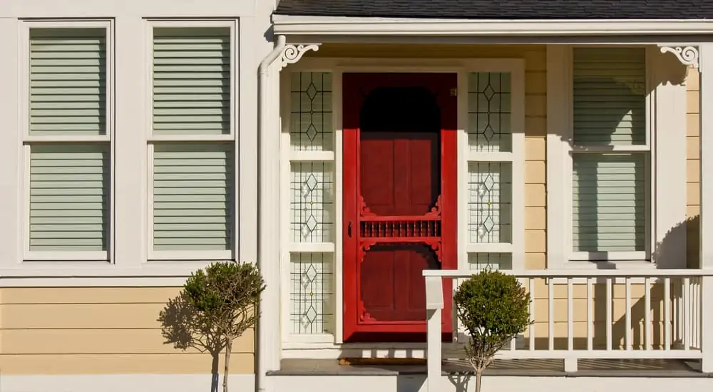
A vibrant red door may be all you need to lift your mood each time you enter your home.
As a warm and inviting color, cottage red embodies all the wonderful characteristics of red without being as dramatic or intense as a scarlet shade.
A smooth fiberglass front door complements cottage red perfectly, as the exquisite glass artistically breaks up the bold hue.
2. Sage Green
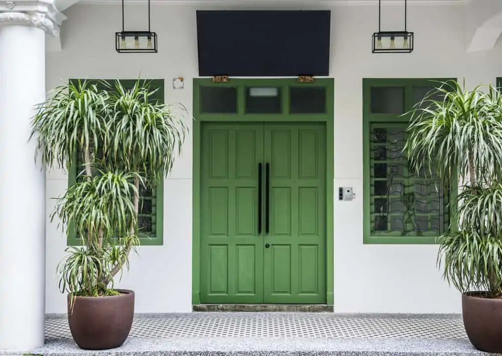
Sage green is a well-balanced color that works well in natural and urban settings. It is an excellent accent color for a front entrance due to its adaptability. A sage green door has a relaxing effect while also adding a splash of color to a home.
3. Turquoise
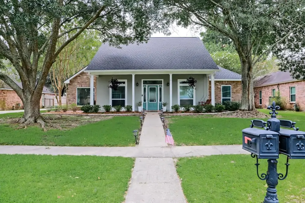
A turquoise entrance door immediately adds visual interest while preserving a natural connection to the sky’s blue hue. This color suggests that you are a practical person who likes a little whimsy.
As a soothing and inviting color, turquoise also welcomes people inside and helps them feel at ease. Consider complementing your striking turquoise door with a more neutral hue, such as beige.
4. Poppy Orange
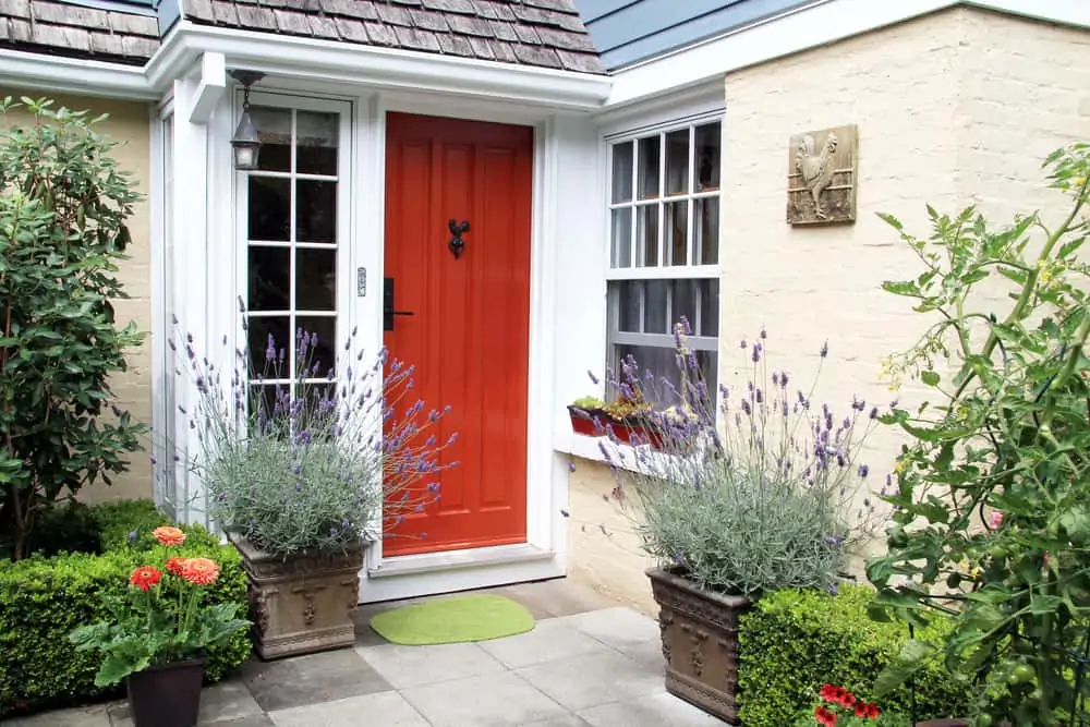
Orange is another refreshing alternative to the traditional red door. A reddish-orange tint, such as poppy orange, can achieve the ideal combination of brightness and deep red undertones.
It’s a versatile entry door color, as it may serve as a warm complement to a rustic wood front door or as a playful accent color in modern urban residences.
Classic Colors
You can never go wrong with a classic color. It’s elegant and timeless and goes with almost any style.
5. Black
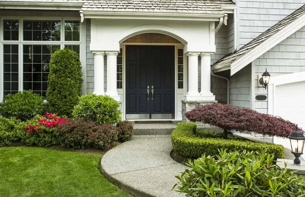
It’s difficult to go wrong with black, which may be the king of door colors. A black door makes a statement without being intrusive.
It is stately, bold, elegant, and formal. As trends change, black remains timeless, ensuring that you will continue to profit from this color for years to come.
6. Red
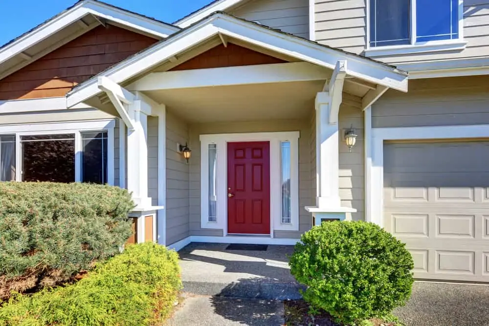
This color allows you to personalize your entrance and give it the vibe that most suits you. While a brilliant red can be considered current or classic, a subdued red or burgundy can be considered rustic or cozy.
7. Yellow
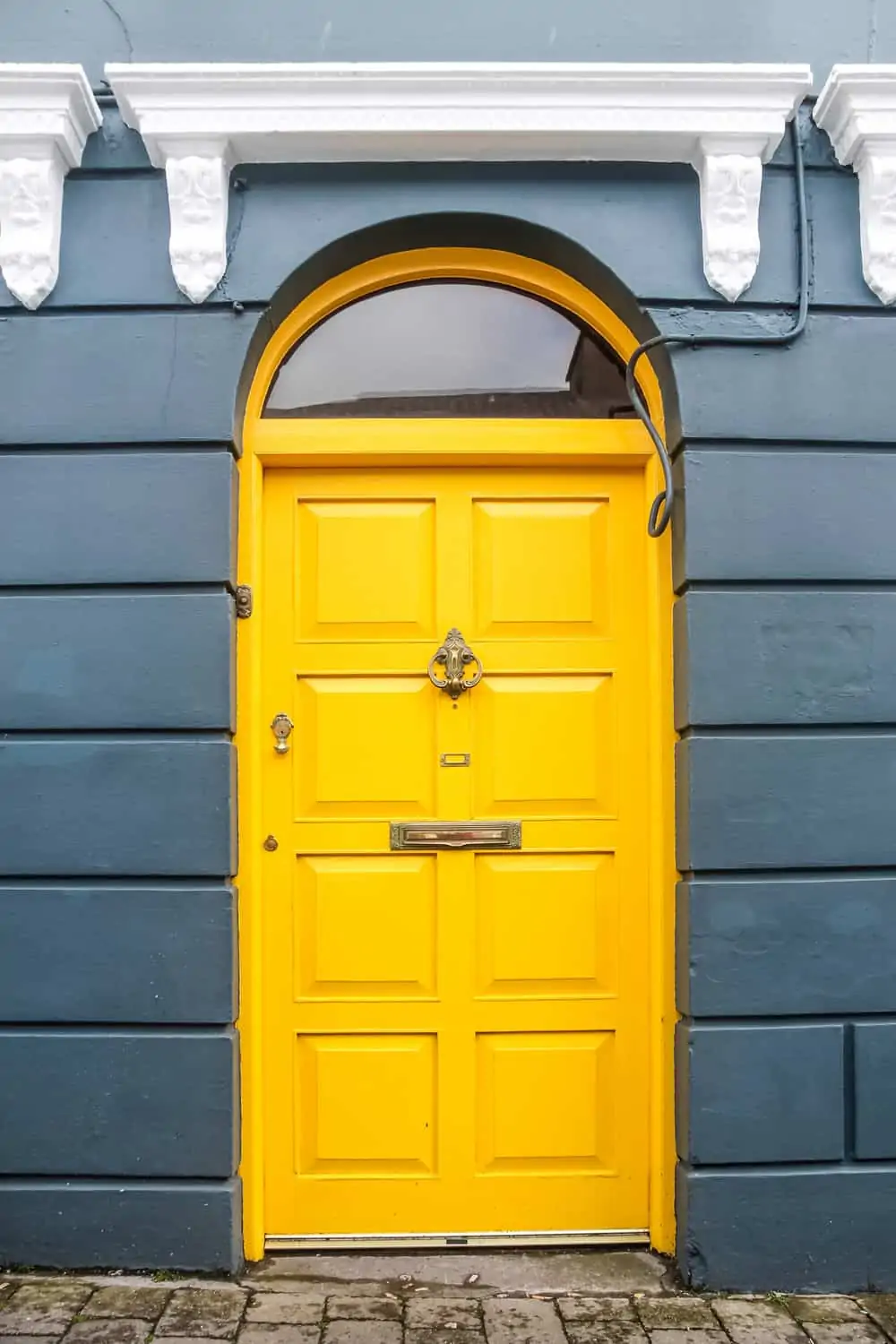
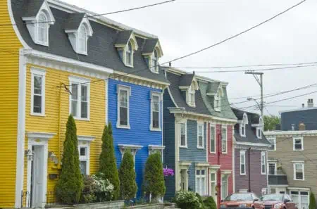
Whatever shade you pick, a yellow front door is brilliant and bright, openly greeting the world. Yellow works well with a home’s exterior that is predominantly gray, white, black, or blue. It also looks great on various types of stone and brick.
8. White
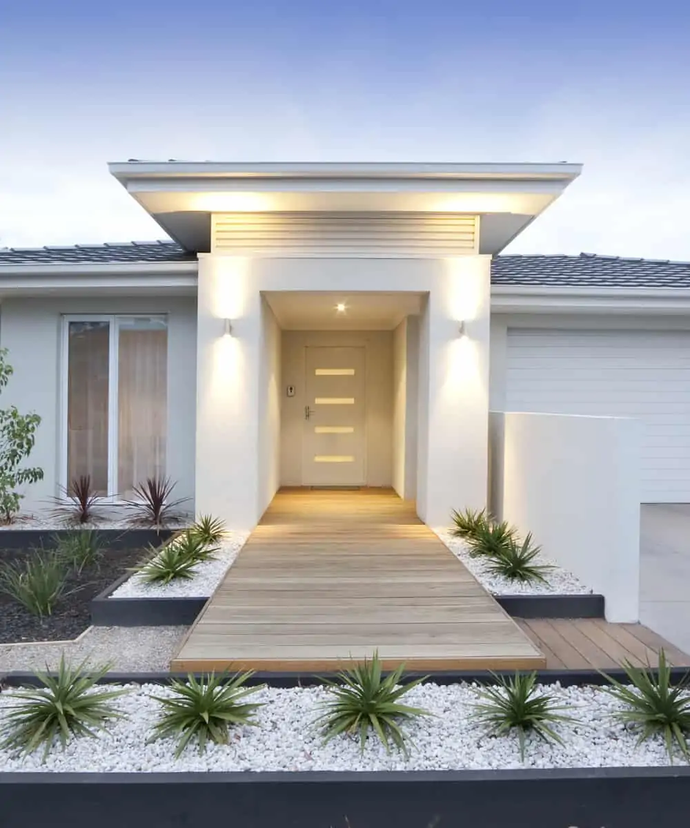
White is ideal in neutral front door colors. It’s bright and inviting and pairs well with virtually any exterior color. Because white is often linked with cleanliness or tranquility, it is an excellent choice for creating a welcome atmosphere.
Colors For Brick Houses
Brick houses are a different story altogether. You have to consider the overall aesthetic, as well as the texture and tone of the brick.
9. Burnt Orange
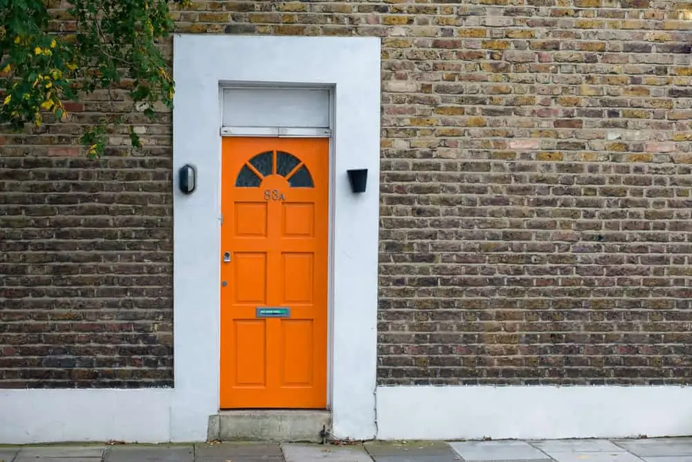
Orange has a similar mood effect to yellow and is known to attract attention and elicit feelings of excitement. If you enjoy having dinner parties, an orange front door might encapsulate the vitality that exists within your home.
Because orange is a close match to the red brick on your property, experiment with several hues to determine which one pops without completely blending in.
10. Smokey Blue
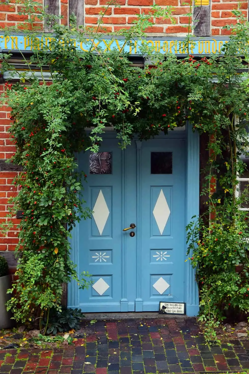
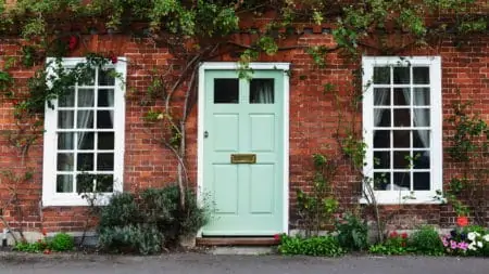
This mature shade of blue is both relaxed and elegant. A smoky blue front door transforms a red brick property into a haven from the rush of city life.
You can enhance this classic design by including vines or vibrant seasonal shrubs. Add a bench to your patio or adjacent to it to create a space for peaceful contemplation.
11. Eggshell Green
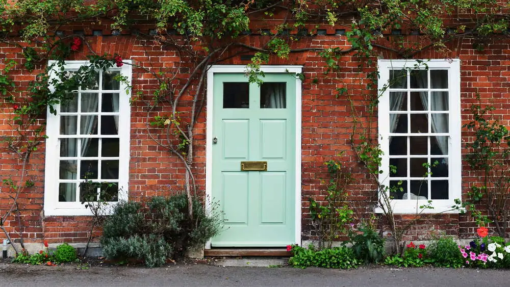
Eggshell green is a delicate shade that evokes spring and new growth thoughts. This vibrant shade is ideal for sunny porches and charming rocking chairs.
I love how it evokes a sense of equilibrium, energizing both you and your guests. This shade of green works best with particular colors of red, so experiment with your options.
12. Navy
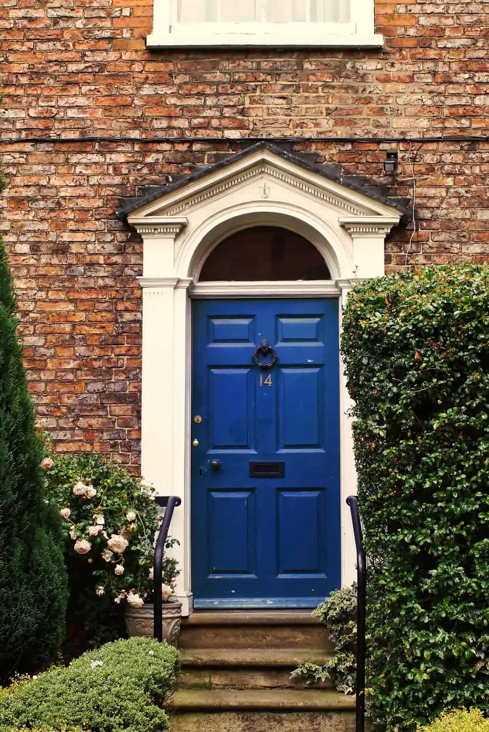
Contrast your home’s red brick with an even more brilliant blue. This rich color is eye-catching and is certain to attract attention.
A dark blue front door conveys a sense of security and comfort, which makes it an excellent choice for a family house. A dark blue front door creates a majestic entry when paired with a green plant.
13. Peach
Peach is a lovely tint for the front entrance of a red brick house. This warm hue pairs well with other oranges, pinks, and reds.
This can evoke a southwestern vibe, infusing the space with warmth and friendliness while maintaining a soft and welcoming atmosphere.
Accent Colors
Sometimes you just need a pop of something to bring out the beauty of a front entry.
14. Purple
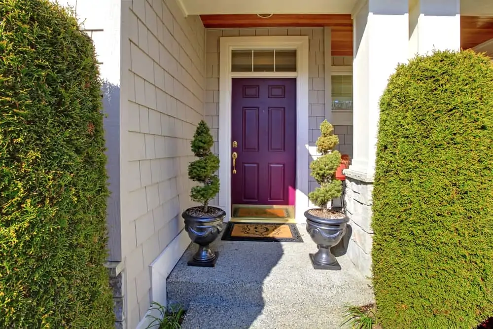
Purple is an attractive color for a front door. A purple front door infuses the front of the house with vibrant color. It’s super effective when paired with a neutral-colored home.
15. Sunshine Yellow
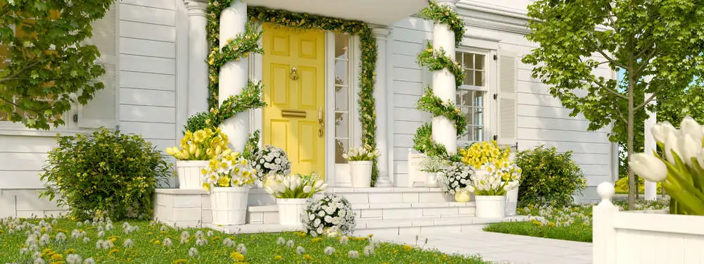
A yellow door demonstrates that even with a classic property, you may make a striking choice of front door colors. The vibrant, cheerful hue infuses the red brick walls with light and warmth.
Tips For Choosing a Front Door Color
Don’t just blindly pick the first color that stands out to you. Take these tips and apply them to your decision-making process.
Examine the Color Wheel
A color wheel can be found online. The color wheel demonstrates which colors complement one another the best. Pick a timeless color that goes well with the exterior of your property.
Look for Subtle Matches
You don’t have to match your door to the exact color of your paint or siding. Choose subdued exterior colors. For instance, if porch railings are painted yellow, you could create a matching yellow door to tie everything together.
If you have grey siding but a beautiful front garden of purple flowers, paint the door purple to pick up that subtle connection.
Don’t Be Afraid of Bold Colors
If you’re hoping to make your door stand out, consider a bolder shade. Purples, oranges, and intense blues can create stunning hues. Consider a vibrant and slightly uncommon color if your personal style leans toward the bold.
Pick Quality Exterior Paint
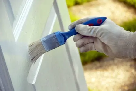
You’ll need exterior paint to protect your door from the elements and dampness. You could also choose a paint that includes a primer to save priming the door separately.
High-gloss paint is more noticeable than matte paint. However, it more readily reveals damage to the door, fingerprints, and brush strokes.
The majority of front doors are painted with a matte finish. While it will not be as polished, it will conceal fingerprints and brushstrokes better. Additionally, it is more subdued and blends in better with the current paint.
Best Front Door Color Apps
Picking the right paint color usually goes one of two ways. You know what you want and go for it, or you feel lost because you have no clue how to mix and match hues. Thankfully, there’s an app for that (or several).
Home Harmony
Home Harmony lets you submit a photo and explore a selection of Behr paints by hue. Then you can test it out virtually on your front door with a single swipe on the screen.
Paint Tester
Simply take a photo and upload it immediately to Paint Tester to access a range of paint possibilities from many brands.
FAQs
I know, I know. When did picking a door color become such a process? Don’t get overwhelmed! And if you have more questions, hopefully, this next section will help ease your mind.

Should You Paint or Replace a Front Door?
If your door just looks ugly or outdated, a fresh coat of paint will solve that problem.
Pro Tip
If your door has suffered damage beyond repair (or is too expensive to repair), you might want to consider replacing it.

Should a Storm Door Match the Front Door Color?
Storm doors have glass panels that allow you to see the color of your front door. There is no requirement to match the door colors, but most storm doors are painted in neutral hues.

What is the Most Popular Color for a Front Door?
Classic colors are usually the most popular choice amongst people who don’t want to take any chances. They include black, green, blue, red, brown, or gray.

Should a Front Door Be the Same Color Inside and Out?
It should because, otherwise, opening the door will expose the two colors simultaneously, which might just end up looking bad.

What Color Front Door Adds Value?
Housing experts suggest that the color blue is the most valuable front door color.

Are Yellow Houses Out of Style?
Wrapping It Up
When learning how to pick a front door color, it’s important to go beyond the trends. There’s no point in picking the latest sage green if you find the color to be repulsive. Instead, mix your personality with the style of your home and choose a color that YOU want to look at.