Have you ever dreamed about bringing Tuscany’s sun and heat into the comfort of your own home? While some may think it’s outdated, the Tuscan style has never been more sought after.
It adds an element of warmth and softness to any space. It also blends well with several different styles. Whatever your reason for longing for that Italian vibe, let me talk you through your choices for Tuscan paint colors.
Key Takeaways
- Tuscan style is inspired by nature and features earthy colors like golden yellow, terracotta, green, and brick.
- Popular Tuscan paint colors include Interlude by Benjamin Moore, Honeycomb by Sherwin Williams, and Garden Sage by Sherwin Williams.
- To decorate a Tuscan style home, use rustic elements, exposed ceiling beams, natural stone walls, and earthy color schemes.
- Modernizing a Tuscan kitchen can be done by updating countertops, painting walls a fresh color, changing knobs and hardware, and updating appliances.
What Does Tuscan Style Mean?
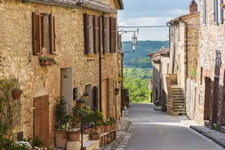
Tuscan-style interiors are inspired by natural features found across the region. Tuscan-style interior design is popular because it evokes a serene, rural atmosphere.
Perhaps the most appealing aspect of it is its simplicity. By integrating comfortable objects that are worn and loved, a room can feel warm and inviting without being pretentious.
When Was it Popularized?
Travelers from other countries went to Florence and took architectural inspiration from Tuscan-style dwellings back home with them as early as the 1600s.
This was the beginning of the Italian Renaissance’s influence on other countries. 1840 marked the approximate arrival of the first Tuscan-style residence built in England. Surprisingly, America had also recognized the elegance of the Tuscan villa and begun to construct homes in the design.
Homes were extremely big, with a variety of Italian-inspired aspects to add to their overall charm and design. Some people prefer this style of home over others, such as Gothic or Greek Revival architecture.
It wasn’t until 1855 that the fashion for the style began to wane. However, Tuscan-style homes have grown in popularity again in recent years. They might be spotted in locations such as Cincinnati, Ohio, and even as far away as California at times.
Common Colors
The colors used in the Tuscan color wheel are derived from nature. Golden yellow, terracotta, green, and brick are Tuscan paint colors that can be seen in abundance throughout the city.
A visual cooling effect is provided by the addition of blue and green to locations experiencing high temperatures. When painted, surfaces retain a splash of color even after the finish has worn away.
Common Materials
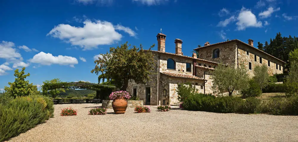
The outside of a traditional Tuscan villa is most often constructed of limestone or sandstone. Both materials are readily available in that region of Italy and come in a variety of colors. The usage of terracotta roof tiles is widespread across Tuscany.
Tuscan Paint Colors
Any of these tones and textures would be a good choice to add a touch of Tuscany to a space.
1. Interlude by Benjamin Moore
When you add Interlude by Benjamin Moore to your Tuscany color palette, it feels like moist sand under your feet. Warm and flexible, this neutral color is a great choice for any room.
It can serve as a means of linking colors from one room to the next in a home decorated in the Tuscan style. It’s a paint choice that works very well for dining rooms, kitchen walls, and entertainment areas.
2. Honeycomb by Sherwin Williams
Sherwin-Williams Honeycomb, a gorgeous gold paint hue, is ideal for furniture and accent walls in Tuscan-inspired decor. It has a very warm hue and would fit perfectly in a family dining room.
You can successfully combine Honeycomb with off-white baseboard colors. You can also create gorgeous contrasts when paired with dark-colored furniture.
3. Garden Sage by Sherwin Williams
With its lush green hue, Garden Sage by Sherwin Williams is reminiscent of Tuscany’s rolling hills and cypress trees. Garden Sage is a more inviting shade of sage green than most of its contemporaries, and it works nicely with deep russets and reds.
4. Bicycle Yellow by Behr
Adding a more vivid shade of yellow is perfect if you love the Tuscan style but sometimes feel that the color choices are somewhat muted.
Bicycle Yellow by Behr conjures up memories of sunflowers and sunny days. Tuscan paint color schemes can be enhanced by using Bicycle Yellow as an accent.
Try it in an eating area, sunroom, or even the front entrance. Visitors will be cheered up at any time of year by the presence of yellow.
5. Yellow Duckling by PPG
When you look at Yellow Duckling by PPG, you’ll be transported to Tuscany’s endless fields of golden sunflowers.
You can use this bright and cheerful color to decorate your kitchen, breakfast nooks, sunrooms, or even the exterior of your home. Create a beautiful Tuscan color combination by combining light or dark blue tones.
6. Bracing Blue by Sherwin Williams
There’s something about this Bracing Blue by Sherwin Williams that makes it perfect for pretty much any room in the house.
It’s a soothing shade that you can choose for living room and bathroom remodeling. It can easily be combined with shades like Double Latte or Icicle, creating an oasis of relaxation in the room of your choice.
7. Bottle of Bordéaux by Benjamin Moore
The grapes of Tuscany are always present in the region’s colors. The golden hues of the dying grasses contrast beautifully with the wine-inspired Tuscan colors around harvest time.
In contrast to Tuscany’s very warm colors, Bottle of Bordéaux is one of the more modern Tuscan colors and offers a refreshing change of pace.
8. Paprika Sprinkle by Valspar
Paprika Sprinkle is a bold color, but it’s never overpowering or jarring. This is an excellent dramatic color choice for a Tuscan-style dining room or living room.
It can be combined with different cold and warm colors, creating a marvelous ambiance. It’s perfect for bold homeowners.
9. Magnificent Mediterranean by Behr
Inspired by the rich fruit trees, golden sun, and fresh air of Tuscany, Behr Magnificent Mediterranean paint is perfect for that romantic interior vibe. It depicts the color pallet on an outdoor patio as if you were in Northern Italy. You can also feel the breeze when looking at it.
10. Crimson by FIXALL
If you want a more fierce version of the Bottle of Bordéaux, you need to feast your eyes on Crimson by FIXALL. It is a powerful color that would work really well for accent details.
Pro Tip
With the anti-skid version, you could paint entrance steps or stone pathways. The contrast with neutral exterior wall colors would be perfect.
11. Lavender Lining by Microblend
Lavender Lining is a shade of purple that is not overpowering. Soft lavender bushes grow in a Mediterranean climate. And warm colors of the Tuscan landscape thrive when paired with touches of cold color to create a harmonious whole.
The paint and primer combo is a great pick for a Tuscan kitchen. In contrast to dark wood cabinetry and natural stone pieces, it has a very rich appearance.
12. Maroon by Microblend
Tuscany’s interior design is rustic, with thick wood beams adorning the ceilings of many of the region’s residences.
Maroon paint and primer offers the appearance of dark, worn wood, which is prevalent in the Tuscan style of architecture. This color could be utilized as an accent wall to add drama to a room. Or you can use it as a backdrop for a fireplace that would otherwise be simple.
13. Titan’s Glory by Microblend
A warm and rustic paint and primer color, Titan’s Glory is the ideal backdrop for a Tuscan-style interior design scheme. It’s not only beautiful as an accent wall, but it can also be used to warm up a kitchen or dining area.
The color Titan’s Glory can even be used as a front door color to carry the Tuscan-style color scheme outside.
14. Palm Leaf by Sherwin Williams
Muted greens like Palm Leaf are one way to reinterpret Tuscan scenery when you feel the need to move away from the stronger hues.
It works for interior and for exterior paints, as it can be paired with a wide variety of neutrals. Consider using it together with Alabaster or Dried Edamame, both from Sherwin Williams.
15. Gazelle by Prestige
The brown-sugary color called Gazelle has a very romantic vibe to it. It would make an ideal color for both interior and exterior decor.
Some people might be bold enough to use this in the bedroom. But it feels more like a dining room and kitchen color. To create stunning contrasts, you can either go with white furniture or dark and rich shades of brown.
16. 912BM-PCM White by Prestige
Your room’s color palette likely is the most out of date, making it the most important element to consider while updating your home.
Don’t attempt to locate another bold color that will work with your black cabinetry and Travertine floors. Instead, opt for a warm neutral color that will complement your decor. The Tuscan style will be substantially lightened and brightened by painting the walls with 912BM-PCM White by Prestige.
17. Aged Pepper by Prestige
At first glance, it appears lighter gray. But, when compared to granite countertops, you’ll notice that it actually has blue undertones.
An excellent complement to warm golden hues, Aged Pepper is a foolproof choice for Tuscan kitchens, hallways, and bathrooms.
18. Mediterranean Night by PPG
Remember to take in the light blue sky and the colors of the Mediterranean Sea, which range from aqua to deep-water blues.
Tuscan blues like Mediterranean Night can be used as a primary wall color. Or try it on an accent wall to bring a dash of color to a room. For a warmer color scheme, choose a terracotta or gold hue for the walls with blue accent colors.
19. Brick Dust by PPG
Color combinations should be used to produce a welcoming and rustic atmosphere. This is where Brick Dust comes in.
The colors of Tuscany are generally rich. But there is no reason why you couldn’t incorporate bright and neutral hues into your design. Combine them with traditional Tuscan colors if lighting or personal tastes makes darker colors less appealing.
20. Ochre Dream by Johnstone’s
Earthy tones such as ochre, terracotta, and rust are used to design roof and floor tiles, and even earthenware containers and pots. Pick Ochre Dream if you want a Tuscan kitchen with a lot of personality.
How Do You Decorate a Tuscan Style Home?
You’ve decided that you’re ready to bring the Tuscan Style into your home. These tips on furnishings, decorations, and design should help you on your way.
- Don’t use anything that looks brand new or sparkly.
- Rustic wooden shutters are frequently used to shield deep-set windows that are framed by sandstone.
- Natural stone walls are best left to their natural state.
- Walls painted with Venetian plaster, color washing, or fake painting techniques are applied to stucco surfaces to give them an aged, well-loved appearance.
- Don’t be afraid of leaving your ceiling beams exposed.
- Don’t cover your windows and allow as much natural light inside as possible.
- Always go for earthy colors.
- Rugs are great for Tuscan-style interiors because they help create a cozier atmosphere.
FAQs

What is the Difference Between Tuscan and Mediterranean?
A Tuscan interior design emphasizes just Italian influences. But Mediterranean interior design draws on Greek, Spanish, Turkish, and even Moroccan as well as other European and North African styles.

Is a Tuscan Kitchen Outdated?
It depends on who you ask, but also on your style. As a reminder of the home’s past, you may want to try remodeling your Tuscan kitchen to a more contemporary style.

How Do I Modernize My Tuscan Kitchen?
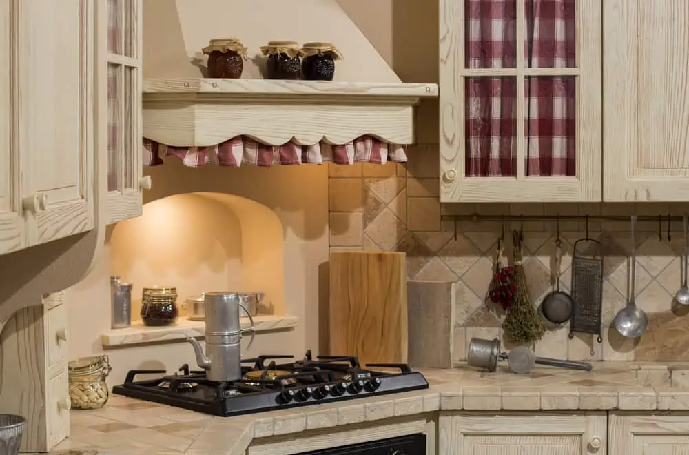
You’re not required to remove every architectural or design aspect that is a nod to this outmoded home type. Things such as wrought iron accents, exposed brick, and travertine floors can stay. But to add a modern touch to a Tuscan kitchen, you can try the following:
- Update your countertops to a modern stone.
- Paint walls a fresh color.
- Change the knobs and hardware.
- Update your appliances.
What’s Your Favorite Tuscan Color?
Some people argue that you don’t have enough room to play when it comes to Tuscan paint colors. It’s true that you might not have that many colors to play with. But you can easily combine them with so many other colors and enrich the vibe throughout the house.