Are you a fan of cozy interior decor, but you also like the idea of having old and worn-looking furniture? Chances are you’re going to love shabby chic decor. Playful and traditional, shabby chic relies on colors and finishes to give off that welcoming vibe.
We’ll show you some of the best shabby chic paint colors for walls, furniture, and decorations. Use them as inspiration to add flair to your home!
Key Takeaways
- Shabby chic is a mix of baroque splendor and rustic appeal, often featuring distressed furniture and pastel colors.
- Common shabby chic colors include blush pink, mint green, cream, and lilac, perfect for walls and furniture.
- Decorations in shabby chic style often involve antique furniture, crystal chandeliers, and French bregeré chairs.
- Shabby chic paint colors can be mixed and matched, allowing for creativity in designing a cozy and welcoming space.
What is Shabby Chic?
Overall, shabby chic is a mix of baroque splendor and rustic appeal. The style adds antique furniture, faded finishes, and gleaming ornamental accessories.
The shabby chic movement is also known as the French country style. It’s a bohemian vibe that has emerged as one of the most in-demand fashion trends among the hip, young, and fashionable. It’s as much a reflection of one’s overall way of life as it is a choice in décor.
Background
During the eighties and nineties, the shabby chic aesthetic grew increasingly fashionable. The shabby chic style gained popularity after designer Rachel Ashwell launched a boutique of the same name in New York City.
She began collaborating with mass merchants such as Target to make shabby chic style products more widely available to the general public.
Various trends have emerged in the years after Ashwell’s rise to stardom. Even designer Carrie Leskowitz predicted it would only be a matter of time before shabby chic resurfaces.
Characteristics
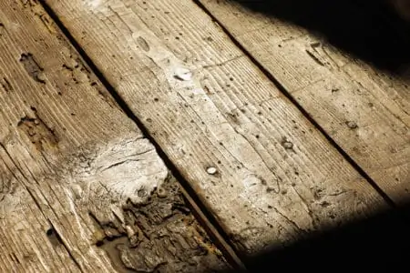
Furniture that has been distressed and painted with chalk paint is the most common note of the style. But you also see floral patterns, subdued colors, and ruffles in the shabby chic aesthetic.
The old or laid-back nature of the shabby chic style distinguishes it from other styles. An air of romance permeates the room while also feeling grounded. The more wear and tear a piece of furniture has had over time, the better it will blend into a chic space.
What Colors are Considered Shabby Chic?
You mostly see pale pinks and creams, but the style offers many other colors.
Blush Pink
Blush pink is one of those shabby chic paint colors most associated with the shabby chic aesthetic.
Adding a touch of elegance to your home is as simple as using blush pink as a paint color. It doesn’t matter if it’s on the wall or a piece of furniture; a dash of blush pink transforms a room.
Mint Green
It’s the perfect shade for a shabby chic look since it is vibrant and cheerful when mixed with neutrals like white and gray.
Add it to your home, and you’ll notice an immediate change. Mint green, a color rarely seen in the home, shows that you’re willing to stand out from the crowd.
Cream
Often, the simplest solution is the best. It’s a lovely, neutral color with milky undertones that are perfect for a wall or furniture item in the home. Cream is a shabby chic color because of its long conventional and classic use history.
Lilac
Lilac is a gorgeous purple tint that every home should have. It is somewhat lighter than your regular lavender color.
This color allows you to get creative with your shabby chic painting ideas, especially for decorative pieces or bedroom furniture.
Coral
This is a lovely neutral color for interior design because it is neither too pink nor too pale. This color is a must-have in the shabby chic aesthetic. It can be used as an accent or as the primary hue on walls or furniture.
What is Shabby Chic Decor?
The shabby chic aesthetic that is currently popular is distinct from the popular aesthetic decades ago.
Decorative nail heads, skirting, and tufting may still be in style. But the non-essential accessories like garlands, giant rolling arms, and heavy swags that typified the previous design are no longer in style.
Furniture and accessories like crystal chandeliers and French bregeré chairs put “chic” in “shabby chic.”
Shabby Chic Paint Colors
You just can’t go wrong with these color choices. One thing I love about shabby chic colors is that you can mix and match too.
1. Worn-Out Blue
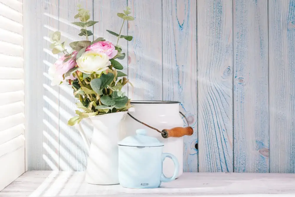
Elements that characterize the shabby chic style often have that worn-out appearance. Even if you opt for new wooden pieces with a fresh coat of paint, you can still give them that distressed look to make them look older. This faded light blue is excellent for a shabby chic style home.
2. Withered White
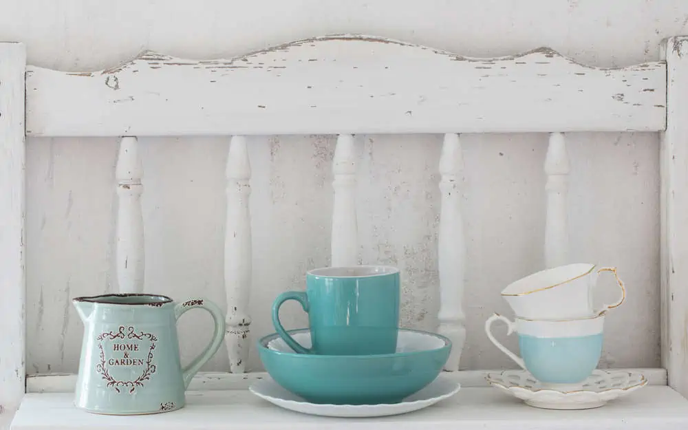
White isn’t always the go-to color for shabby chic decor. However, it’s one of those shabby chic colors that you can’t go wrong with. It goes with everything and always encompasses the soft aesthetic of the trend.
You can use this as a wall color for your shabby chic decor and pair it with pastel blues for a calming effect.
3. Princess White
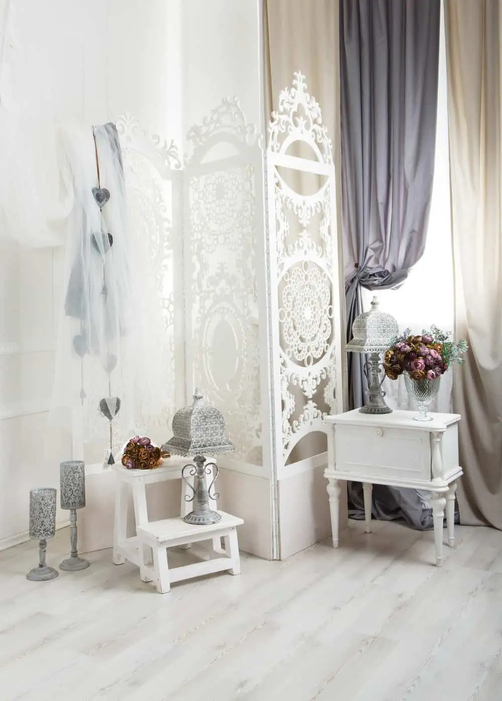
An array of white tones is used in the design of white furniture to evoke a vintage-inspired, shabby chic aesthetic. To give your wooden furniture an aged appearance, paint with white, then use an antique finish to seal it in place.
4. White Paint & Glass Elements
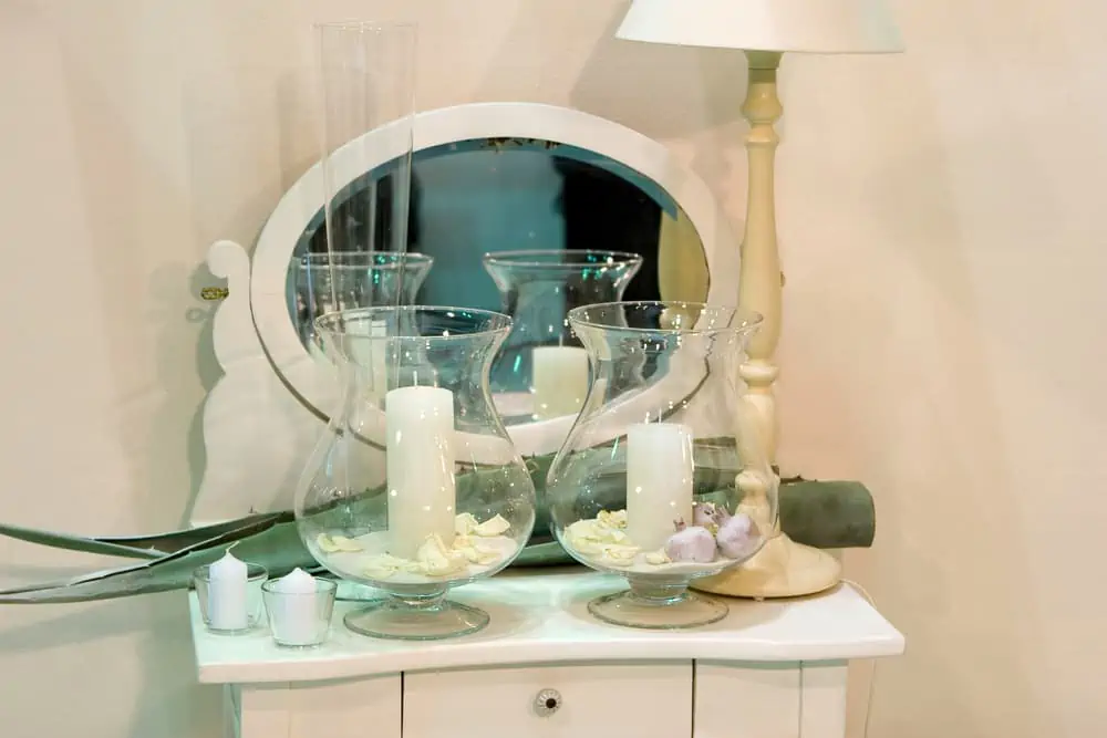
The beauty of glass is that it’s so versatile it can be used to decorate in multiple styles. White is making a strong presence once again. You see it in wall paint, furniture, the lampshade, and even the candles used to make these glass decorations.
5. Distressed Green Metal Chairs
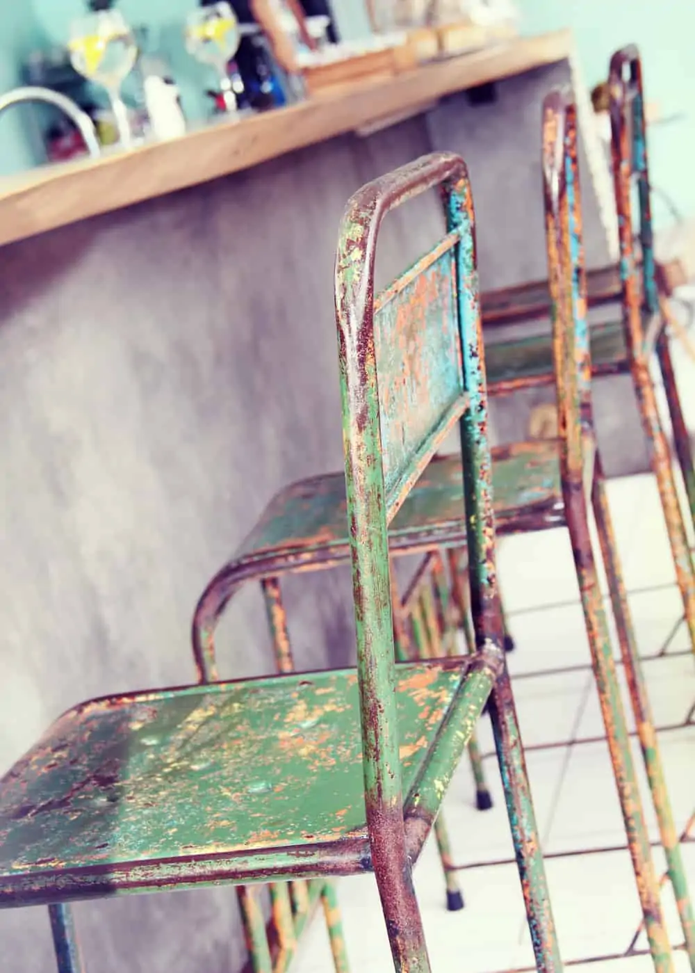
We return once more to this distressed furniture style while working with worn-out metal. This deep forest green paint color looks stunning on every piece of furniture. It perfectly complements the shabby chic style you’re going for, no matter how light or dark it is.
6. Shabby Chic Accent
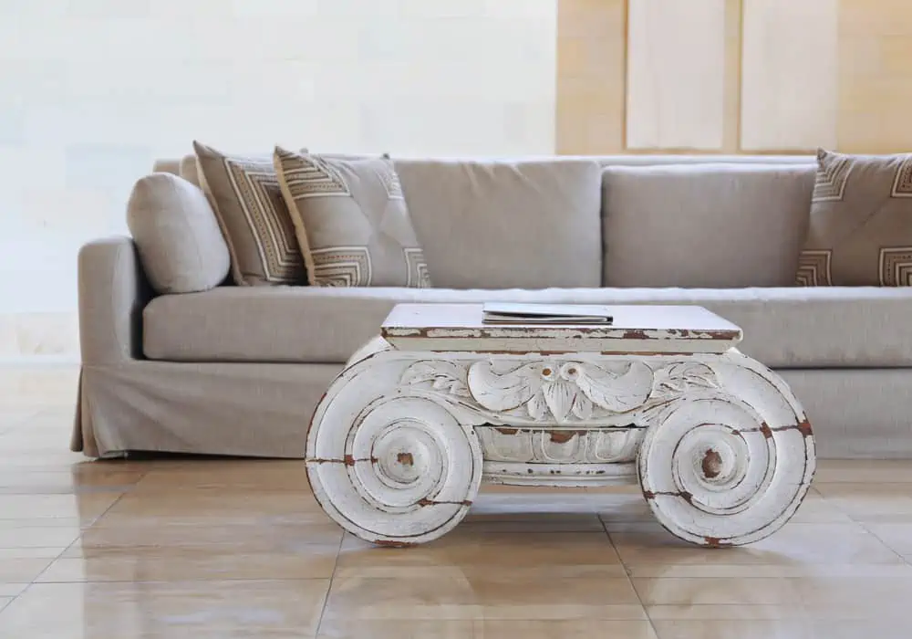
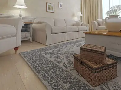
Neutrals make excellent paint choice colors for people who want to bring the shabby chic style into their homes.
Notice how well this distressed white coffee table looks on the beige flooring and is paired with another neutral couch in the background. It allows you to play around with tones of white, beige, and cream as much as you like.
7. Drops of Color
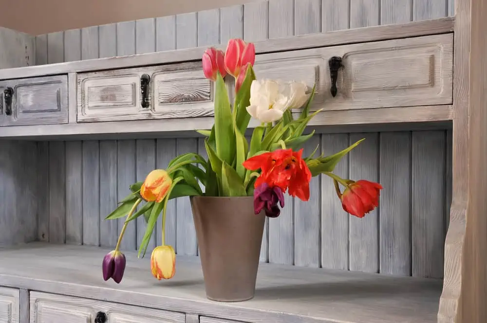
We’ve talked about how neutrals make great color options for your shabby chic décor. But that doesn’t mean you can’t add splashes of color here and there.
The distressed furniture in brown, off-white, and gray tones is brought to life by something as simple as a bouquet of colored tulips.
8. Sanding Decor
To instantly give your items an antique feel, lightly sand the exposed corners and edges using 150-grit sandpaper.
You can also refurbish your old furniture by painting it white and sanding it down. Play around with bronze decor pieces and stone vases, and be generous with the multitude of flowers.
9. Shabby Chic Easter Pastels
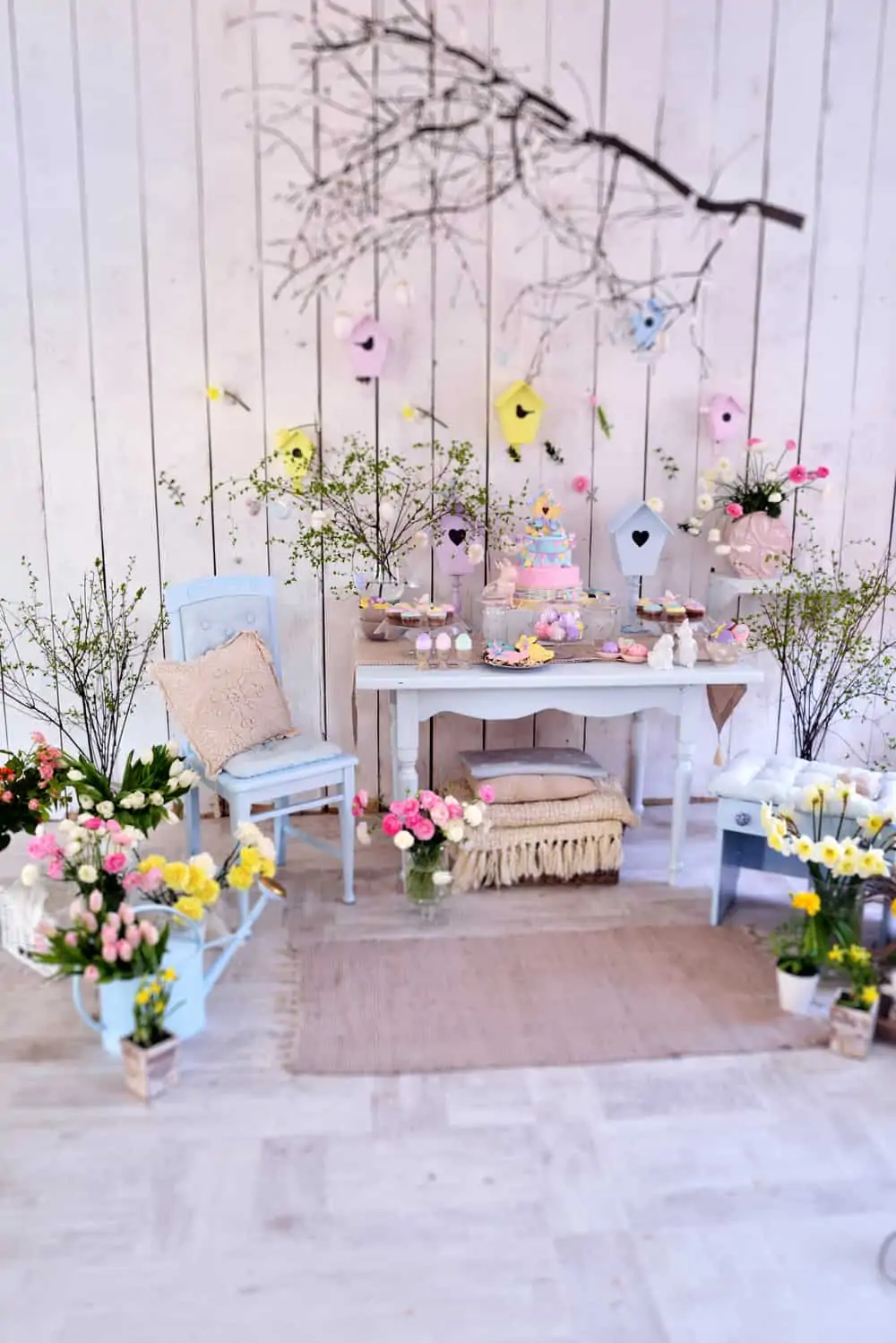
Shabby chic furniture with a soft pastel color palette has a vintage feel. Eggs decorations, flowers, and cute birdhouses in delicate pastel tones can enhance the shabby chic pastel palette.
Notice how well natural elements combine with pastel colors for those looking to get that gorgeous shabby chic decor for the holidays.
10. Vintage Drawers, Metal Accents
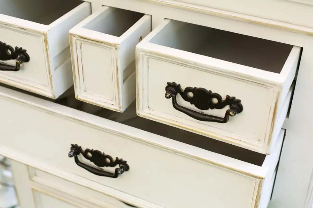
If someone asked me to describe the shabby chic style in three words, my choices would be delicate, vintage, and welcoming. These drawers seem to meet all my expectations. Overall, the neutral paint color is combined with the dark metal accents, resulting in a distressed look.
11. Colors All-Around
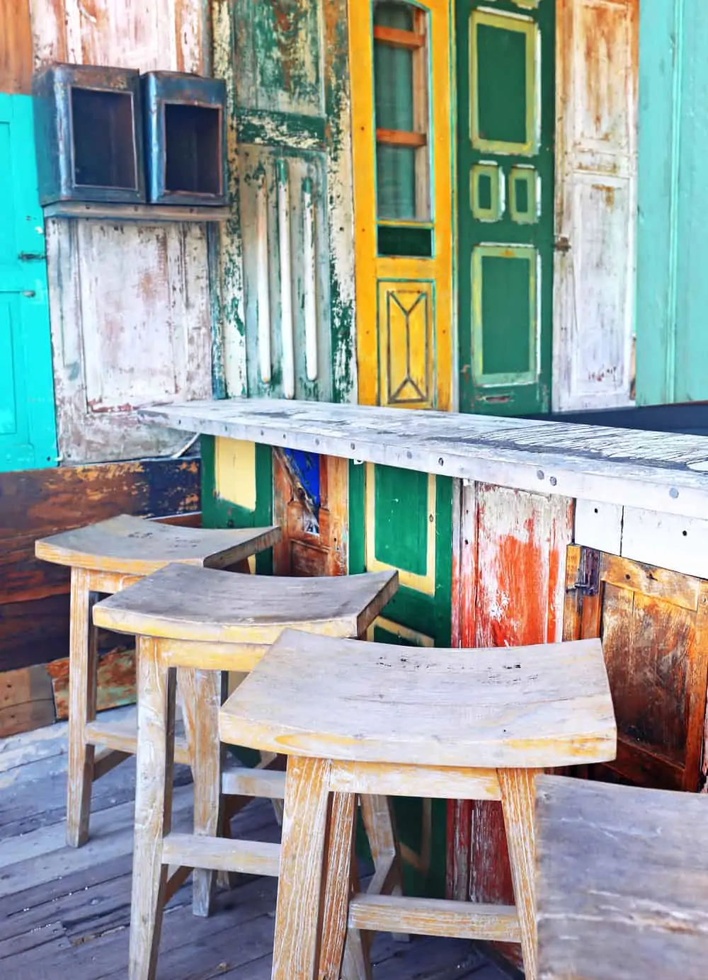
While scouting through different shabby chic setups, you’ll see that it doesn’t have to be all white and beige all the time.
Consider going for a multicolored paint job when you have a wooden wall or a bar like this one. Use contrasting shades of green and yellow, improvising as you go.
12. Elegance in Simplicity
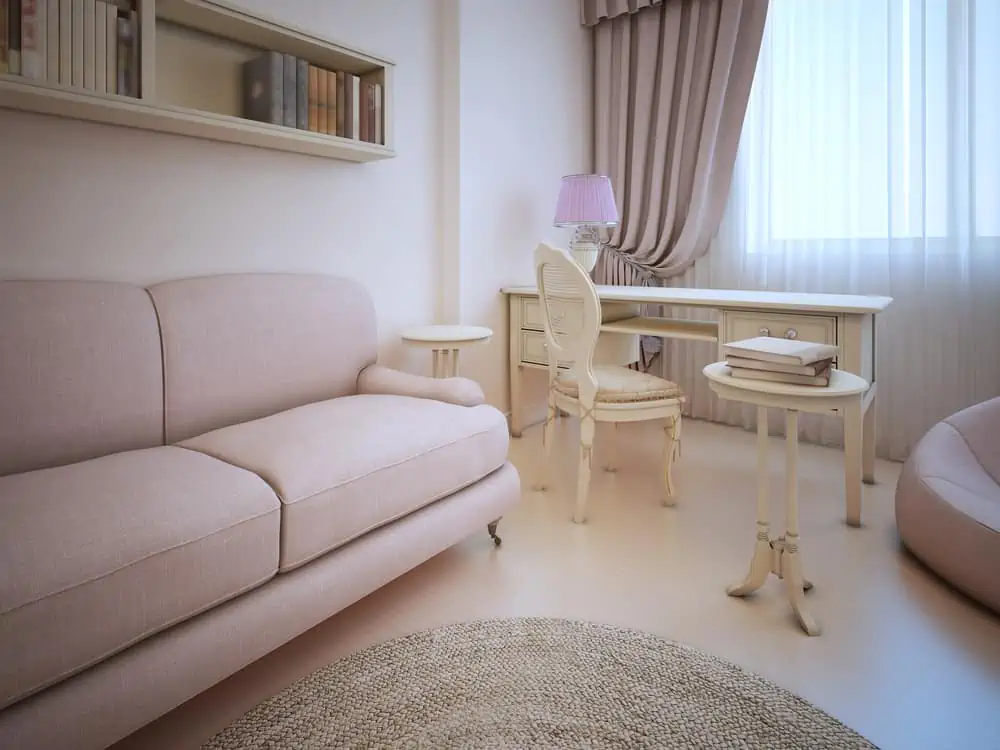
You might picture something grand and exquisite when you think of shabby chic. In fact, you can achieve that shabby chic interior design look without going for anything too glamorous.
Start with a neutral background. Shabby chic interiors are recognized for their furniture and accessories being full of personality. Start with white for your walls, go with distressed furniture, and choose an upholstered couch in a neutral tone.
13. Pack a Punch
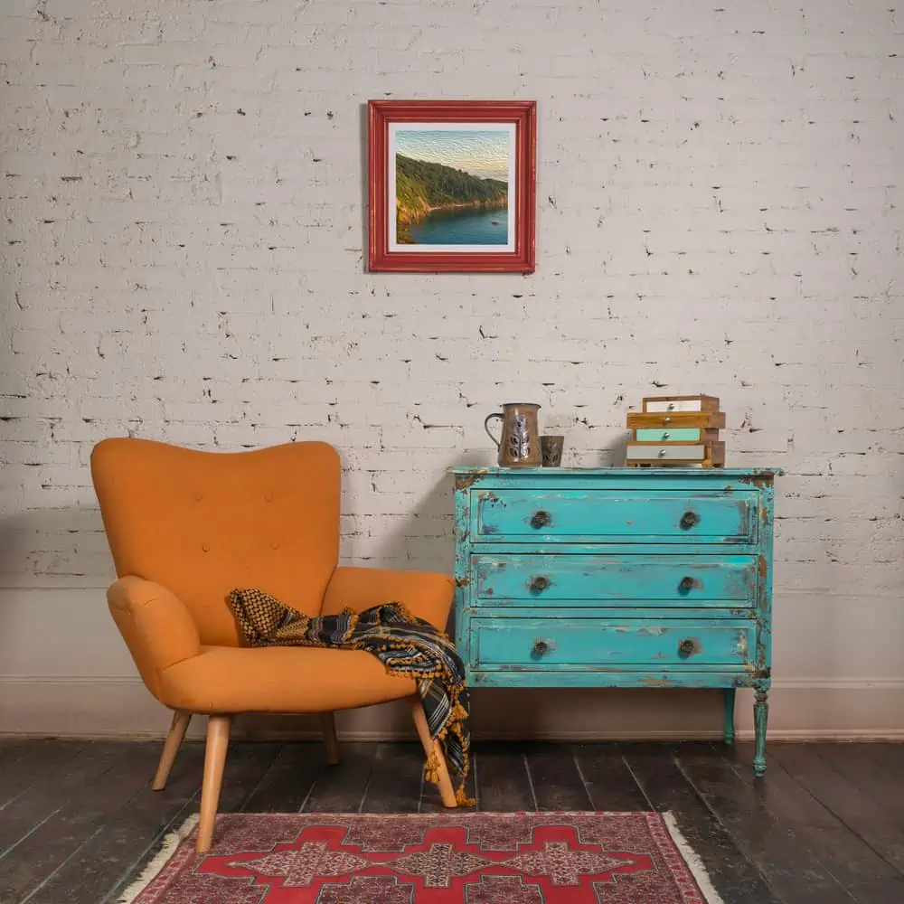
This lovely style allows you to go bold if that is more fitting to your personality.
Go crazy with bold orange chairs and opt for turquoise cabinets for more contrast. Choose wooden frames in brick or mahogany shades. It’s all about combining the right colors to get the results YOU find aesthetically pleasing.
14. White Entryway Bench
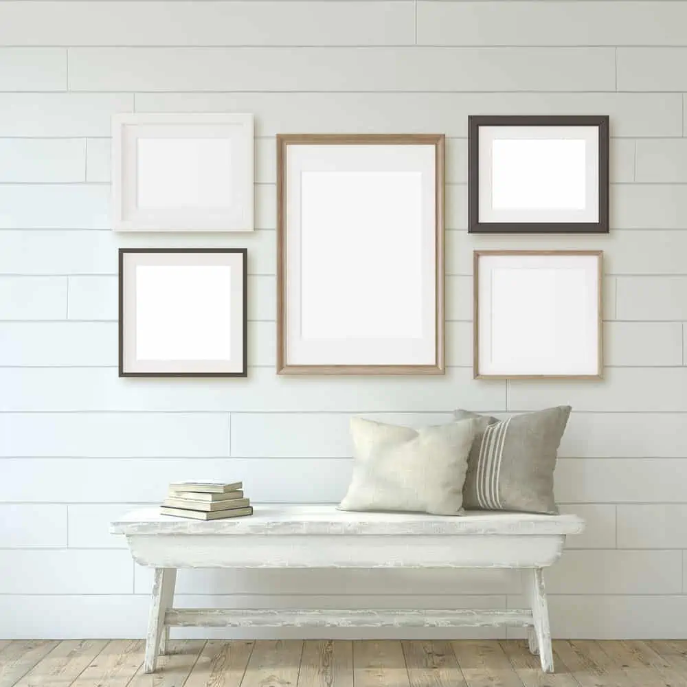
Shabby chic is a style that borrows many elements from other styles, including vintage and farmhouse. In fact, this entire setup is a combination of farmhouse and shabby chic. Repurpose that old wooden bench and give it a distressed look.
Traditional milk paint is great for a chippy effect, but it doesn’t give you any control over how the paint cracks and deteriorates as it ages. To get started with some paints, you’ll need to wash the area, sand it down, and prime it.
15. Go with Green
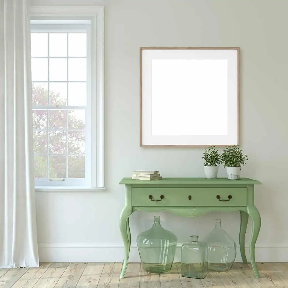
Shabby chic is a style that often uses light colors that would look great with shades found in nature. If you’re not big on indoor plants, consider painting some of the furniture green.
Color Recommendation
Love the look of this console? Grab some Exotic Bloom by Benjamin Moore and start painting!
16. Luxury Shabby Chic
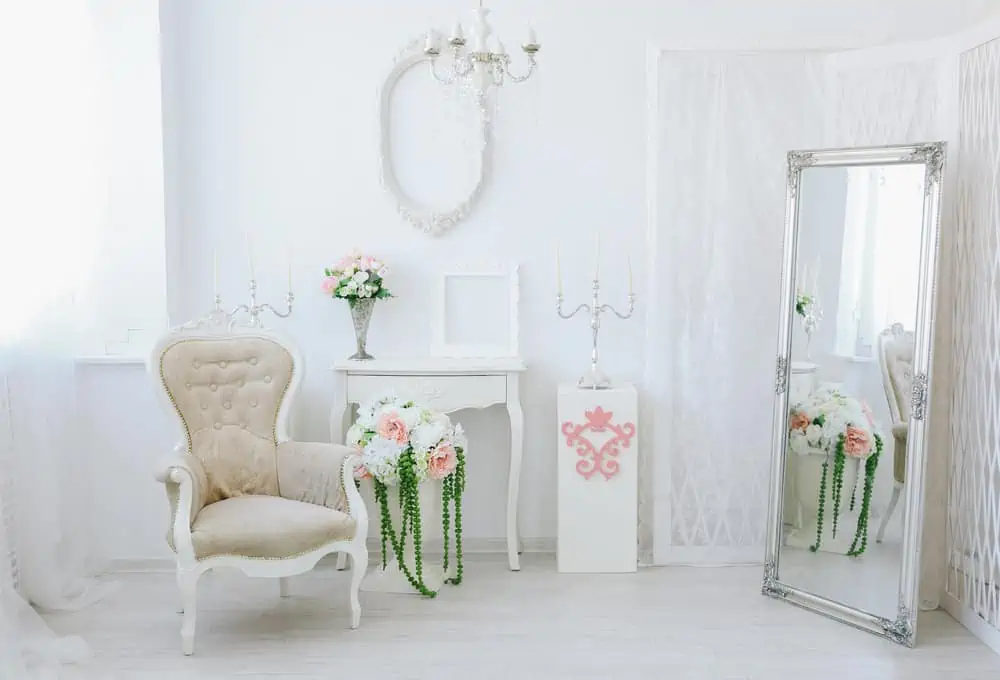
Nothing beats the freshness of a white wall that has just been painted. White is as close as you can come to an artist’s canvas if you want to start from scratch with your shabby chic decor.
Natural light can infiltrate the room and be reflected off the walls, providing a sense of space. White is often the go-to color for many interior design projects to keep things simple.
17. Antique Wood
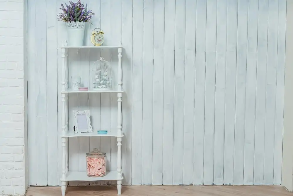
We see distressed wood resurfacing once again, with a paint job that looks much older than it is. Characteristic of the shabby chic style, layers of older paint are resurfacing. But you can paint any piece of furniture or a wall and give it that distressed appearance.
18. White All-Around
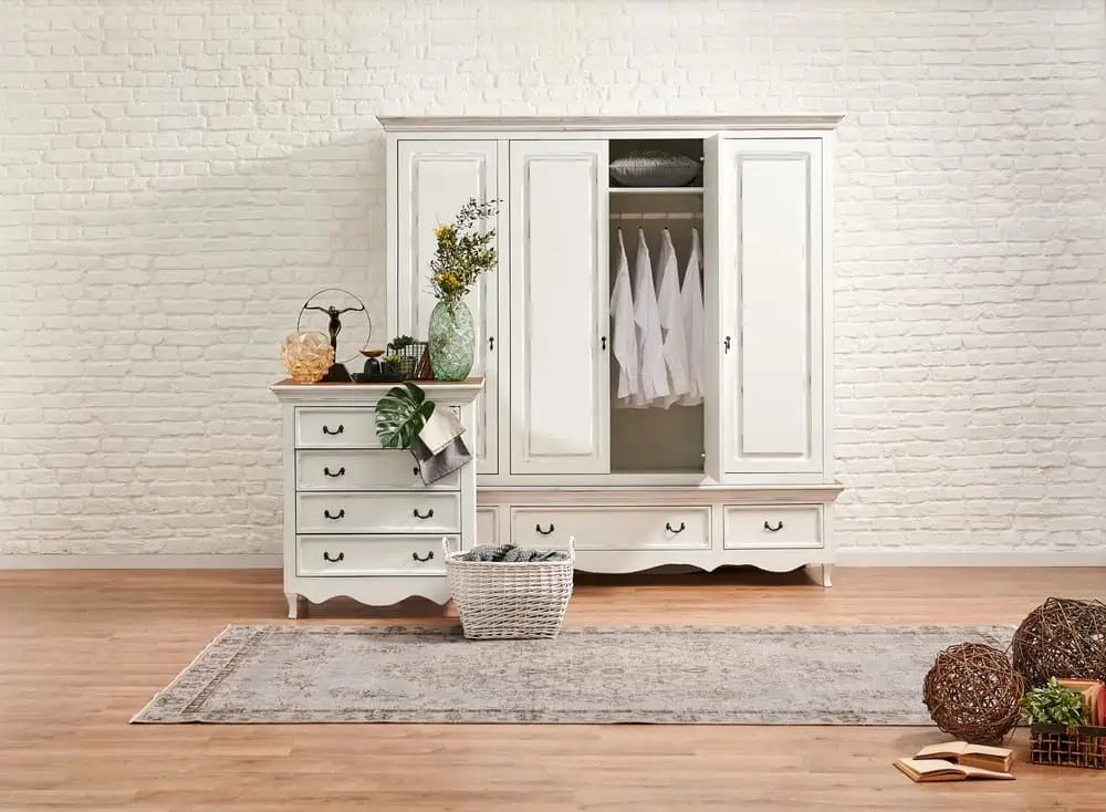
Some of you might be fans of brick walls, but they could interfere with the idea of what a shabby chic bedroom should look like. Get some white paint and start redoing the walls! Shop for antique-looking furniture in white or give that a fresh coat of paint.
19. Friendly Fireplace
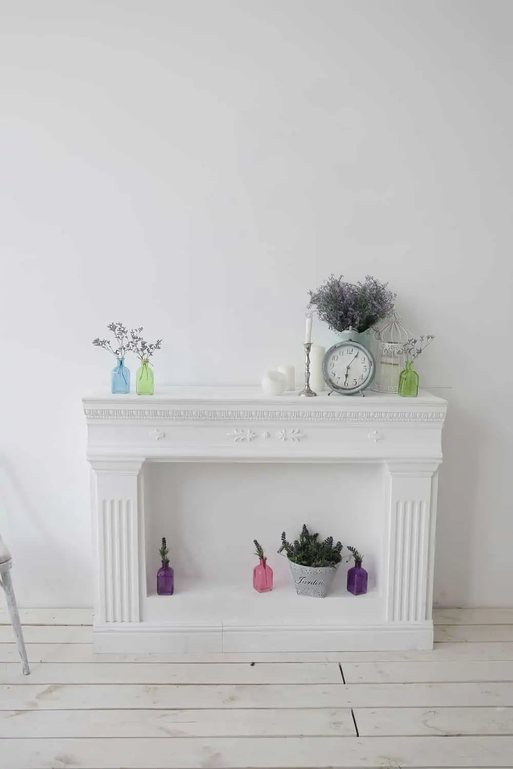
Turn that old fireplace that you never use anymore into the focal point of your shabby chic room. When you have a white fireplace against a white wall, you have plenty of room to play around with the colors of your decorations.
Pastels are a favorite here, but you can also choose more natural colors, like forest green or lavender.
20. Think Blue
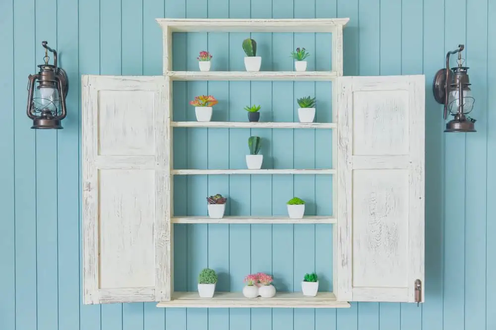
Shabby chic’s white furniture would look astonishing against a blue wall. In this case, we’re referring to the sea-infused blue, which is light enough to dispel any notions that it will make a room feel cold.
The farmhouse-style hanging lamps complement the delicate but vintage decor, offering great color contrast and balance.
21. Blissful Blue
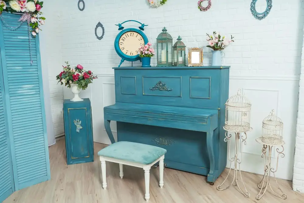
You’ll want to cover your house in these soothing light blue and light green tones since they’re so one-of-a-kind.
This multidimensional blue is versatile enough to be used as a paint color on the walls yet distinct enough to be utilized on furniture and accessories. It is the perfect color choice for your shabby chic living room furniture.
22. Beige and Pastels
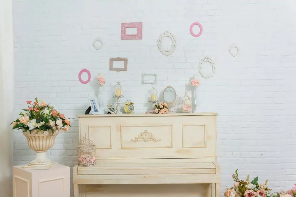
Muted as old white and pastel blue, the shabby chic aesthetic always strives for a more understated and refined appearance.
This setup you see right here is perfect for the style. The textured white brick wall is all about those shabby chic vibes.
I love how it’s paired with cream furniture and pastel pink frames. This really looks like a dreamy setting.
23. Classy White Interior
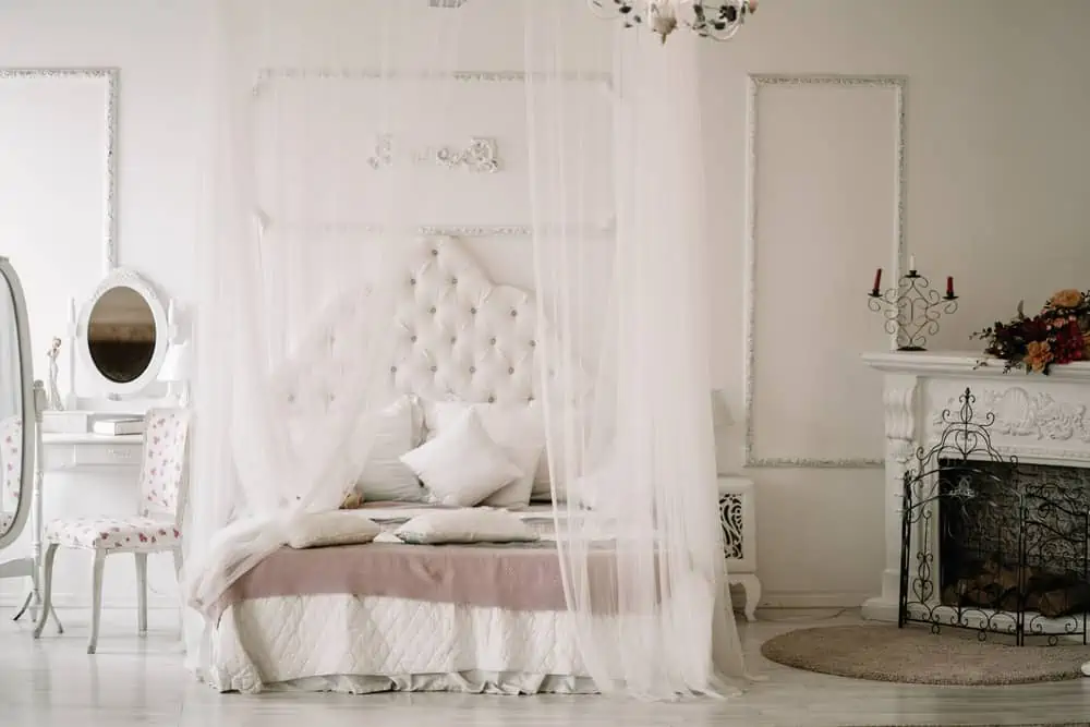
Shabby chic style can also be classy, and white is the perfect color for achieving that dreamy look. As you can see, white dominates this bedroom. It’s perfect for your morning skincare routine, from the upholstered headboard to the white vanity.
24. Bold Orange
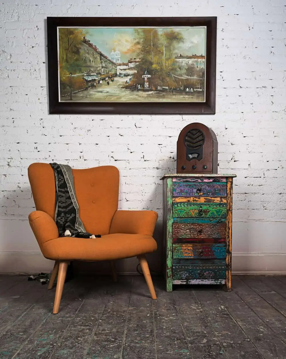
If you’ve mistaken shabby chic for boho at least once before, I feel you. There are a few elements that make these two styles somewhat similar. But remember that colored furniture pieces and bold color choices aren’t breaking any rules.
This shabby chic decor uses a burnt orange accent chair paired with distressed furniture in red, green, blue, and yellow. The old ratio and vintage-looking painting are perfect for this decor.
25. Color Contrasts
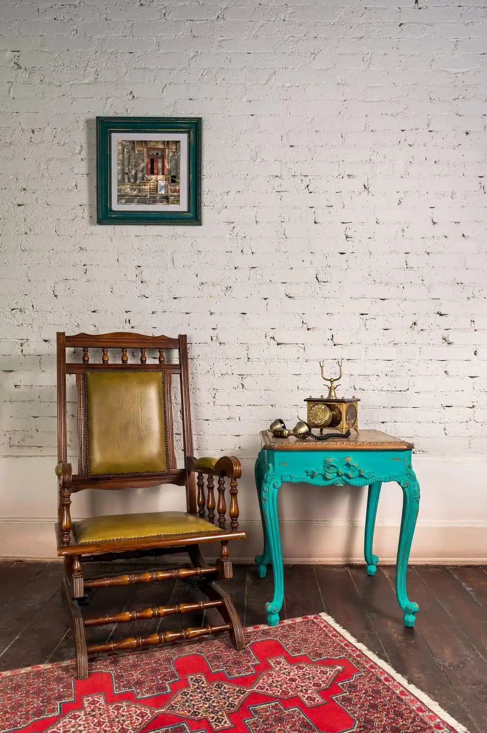
The colors in this picture are a combination of shabby chic and French cottage style. The white-painted walls create a clean background for the turquoise end table.
The rich golden hues of the chair’s upholstery bring a touch of class that’s characteristic to the French cottage-style decor. Consider Sherwin Williams Nifty Turquoise for this paint job.
26. Shabby Patio
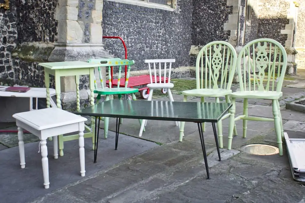
Many people picture beige linens and pastel China cabinets when thinking about shabby chic decor. Play around with your color choices if you don’t want to overdo it with very bold tones.
The soft pastel green you see in these exterior chairs works perfectly for a delicate outdoor setup. It’s like a walk in the park.
27. Shabby Chic Window Bench
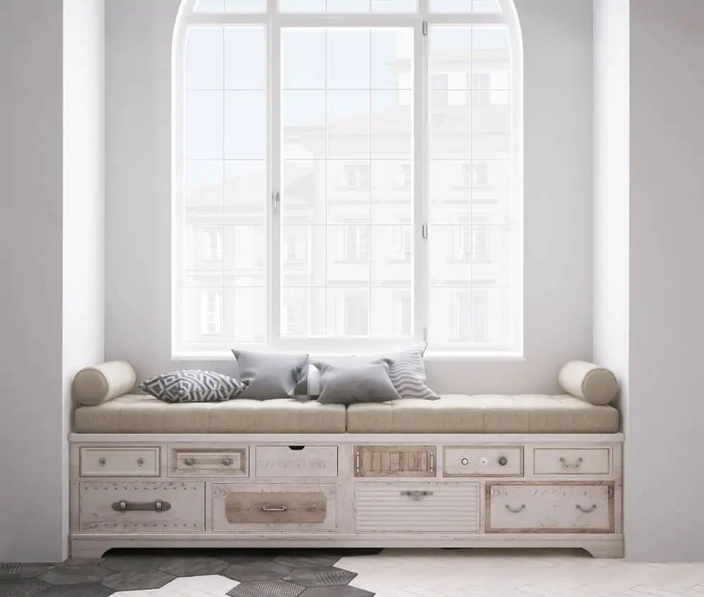
Wooden elements are at home when it comes to shabby chic. Imagine making your own bench with old-looking drawers that will give you a cozy place to read by the window.
The white walls are more inviting of natural light, while the combinations of off-white paint and beige cushioning make this place a sight for sore eyes.
28. White Details and Decorations
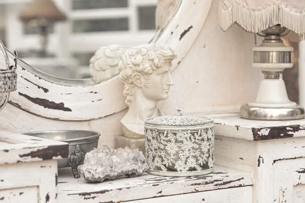
This combination of white and distressed wood is gorgeous if you’re going for a shabby chic design. The details are astonishing, offering a view of a monochromatic vanity table where wood and metal are the primary elements.
29. Beige and Blue Decor
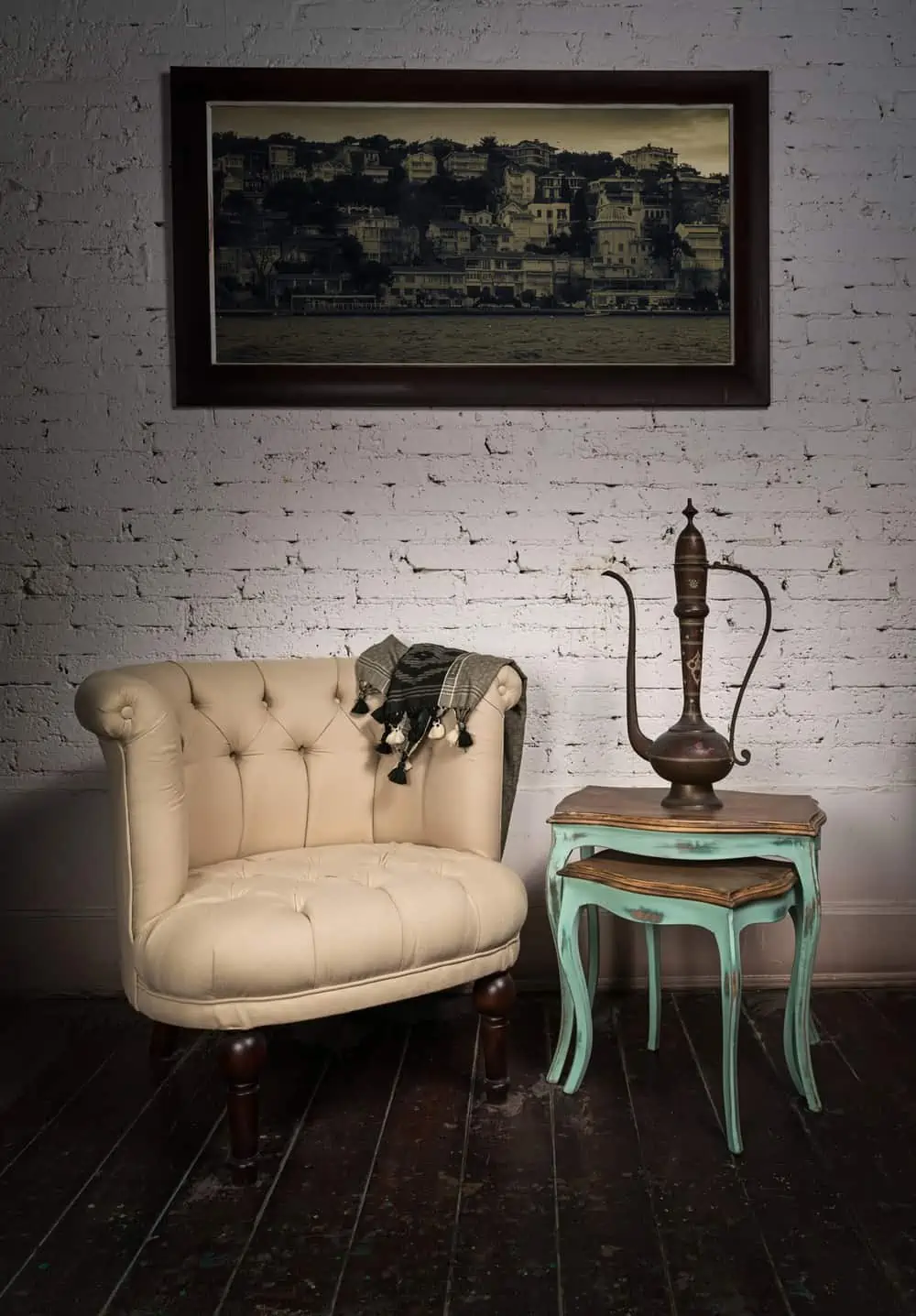
It’s impossible to go wrong with beige. Beige is a fantastic complement to our shabby chic color schemes and may be used on walls, furniture, or everywhere else.
Go for a nice neutral color, which can easily be paired with white walls and other blue pieces for that shabby chic color scheme.
30. Yellow Cabinets
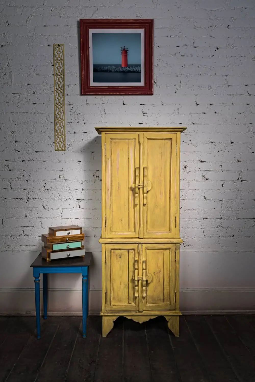
Light yellows are a terrific way to incorporate the sunshine and warmth of summer into your home’s design. Paler yellows are used in the shabby chic style, but they won’t be as overbearing as bright yellows. Sherwin Williams Yellow Twist can work wonderfully here.
FAQs
Shabby chic often gets confused with other elements and styles. So this extra info should help you better understand before you dive in.

Is Shabby Chic Still Popular?
Shabby chic has made a spectacular comeback because of the adorable elements that keep making an appearance.

Is Shabby Chic the Same as Boho Chic?
In contrast to shabby chic, the bohemian style incorporates vivid and vibrant colors, patterns, and materials. Boho adds a bit of punch to shabby chic when it comes to design.

What is the Difference Between Shabby Chic and French Country Style?
While often considered the same, there are some differences between these two styles. Mainly, shabby chic is focused on giving furniture pieces a distressed but delicate look.
French country is about embellishments, floral carvings, and polished furniture in pink, ivory, gold, and white hues.
Shabby Chic is Here to Stay
This style has a very specific vibe, but you have plenty of room to play around with shabby chic paint colors. White often acts as the main color for the canvas, allowing you to make stunning contrasts or choose similar colors that create a more neutral look.