Looking to redecorate the living room, but you’re short on ideas? From flashy and vivid to muted and calm, the paint choices out there are overwhelming.
If you’re not sure where to begin looking for paint, you’re not alone. This is why we think these 50 living room paint ideas might help for painting inside the house.
Key Takeaways
- Play up natural elements with neutral colors like beige, brown, and cream to create a warm and inviting space.
- Experiment with bold colors like lime or coral to add a unique flair and make a statement in your living room.
- Opt for a neutral base color and add pops of color with accessories and accent pieces for an easily customizable space.
- Try a monochromatic color scheme for a calming and visually appealing room that’s easy on the eyes.
Living Room Paint Ideas
Are you aiming to wow with a vivid pop of color or tone it down with a neutral shade? These 50 living room paint ideas should inspire you to transform your living room space into a home retreat. These tips can be applied to painting a drawing room, living room, or even a bathroom.
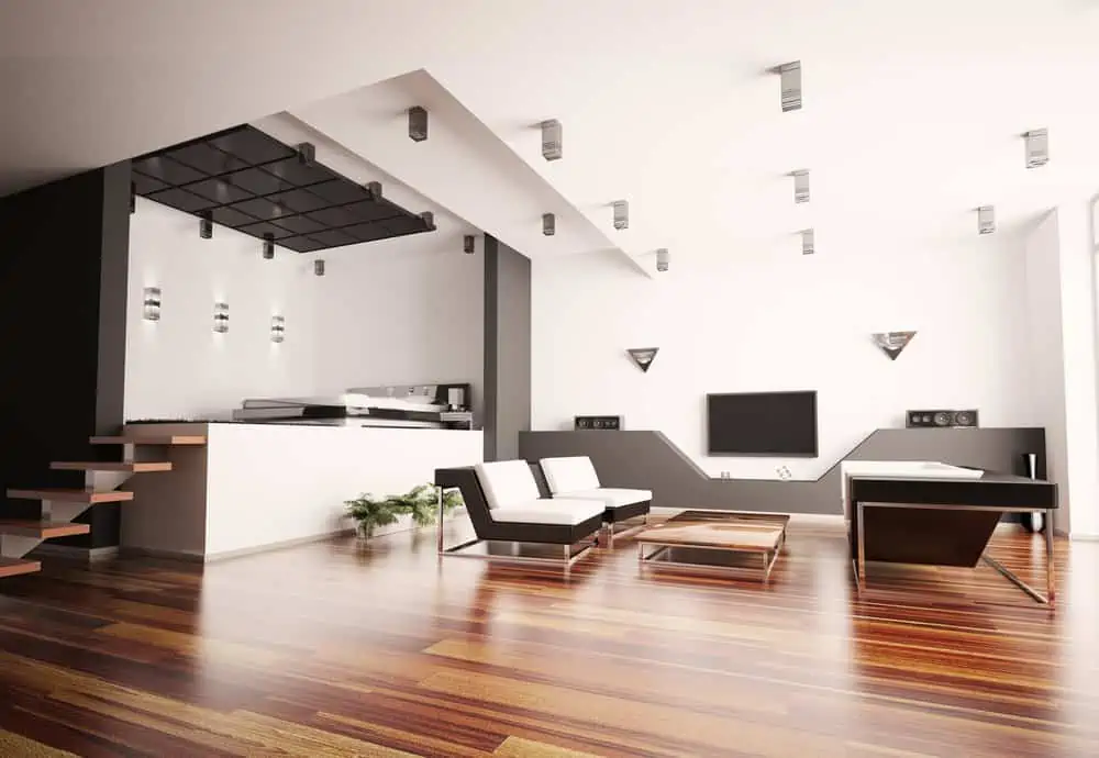
1. Playing Up Natural Elements
One of the best parts about decorating the living room is that you can paint them in the colors that suit your mood.
When you have large windows like these, you can opt for exposed brick accent walls and choose matching neutrals across the room. Tones of yellow, brown, beige, and cream are all welcome here.
2. Go Bold with Lime
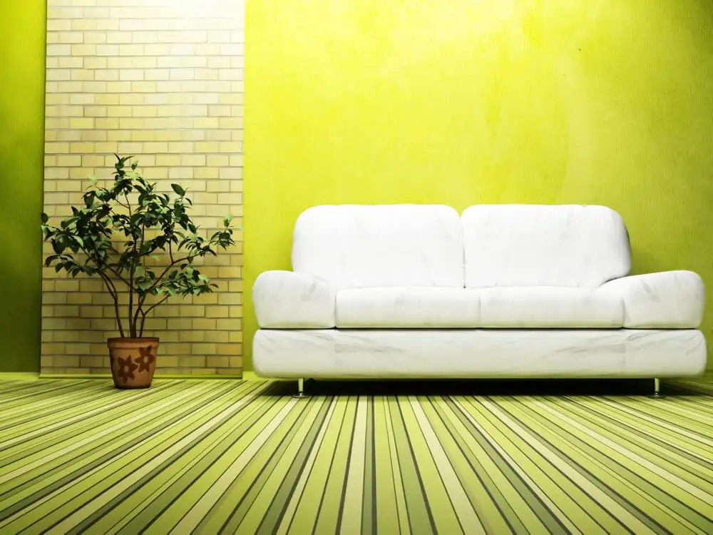
Lime isn’t a common go-to choice for living room paint colors. But, you have to admit, it gives the room a certain pizazz.
You can go with lime when you want to brighten up the space and make it more playful. Benjamin Moore’s Exotic Lime seems to be up to the task.
3. Keep It Neutral and Add Color with Accessories
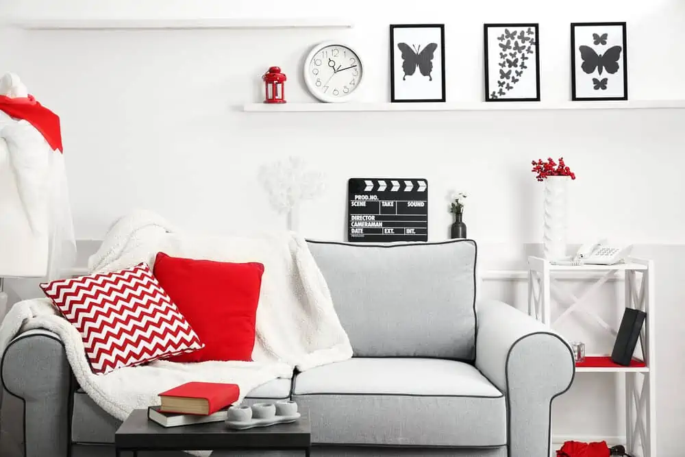
Opt for neutrals if you’re not sure what colors you want to see in the living room just yet.
One of the benefits is that you easily match them with accent pieces in different colors and experiment with how the room looks without having to change the entire wall color. White walls with red throw pillows? Never been easier!
4. Monochromatic
Some people don’t like colorful living rooms, and we’re perfectly okay with that. Monochromatic rooms anchor the senses, and there are no color combinations to keep you distracted. That’s relaxing for some people and could work in bedrooms and even home offices.
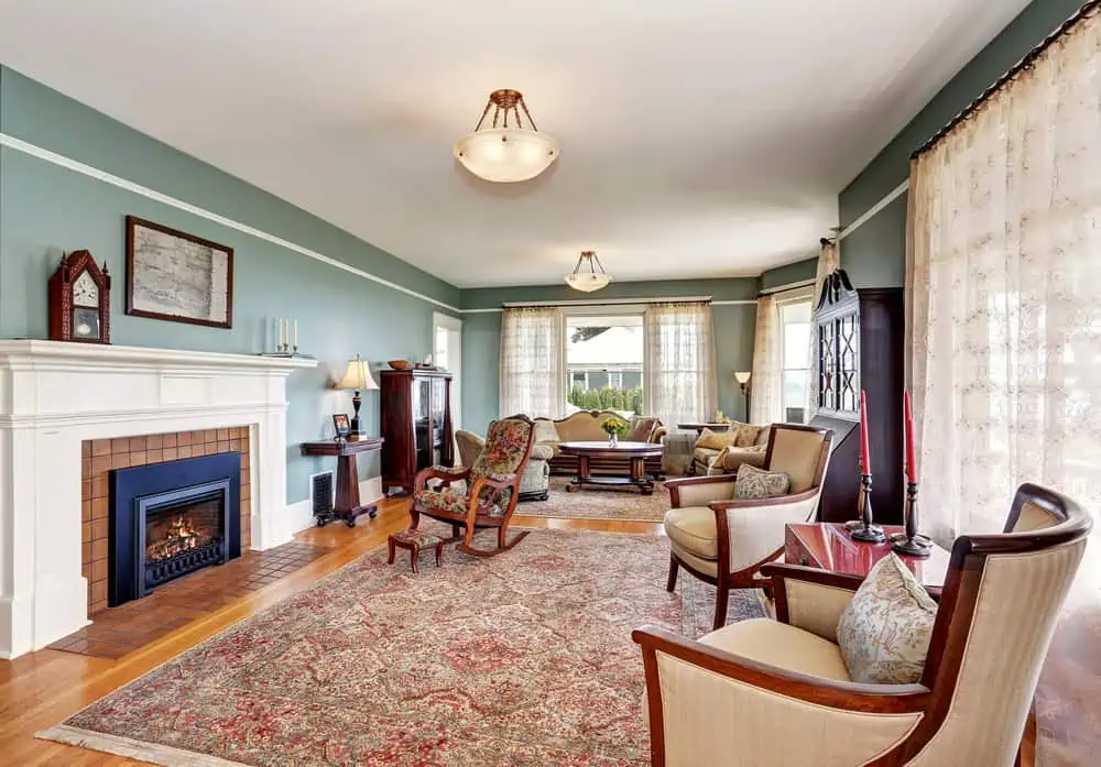
5. Warm and Cozy Browns
One of the many colors found in nature is brown. When you use this color in interior design, you invoke a sense of serenity and make your living room feel like part of the surrounding world.
You can go with dark chocolate brown tones if you’re feeling bold, but warm and cozy browns are a safer option.
6. Deep Coral Accent Wall
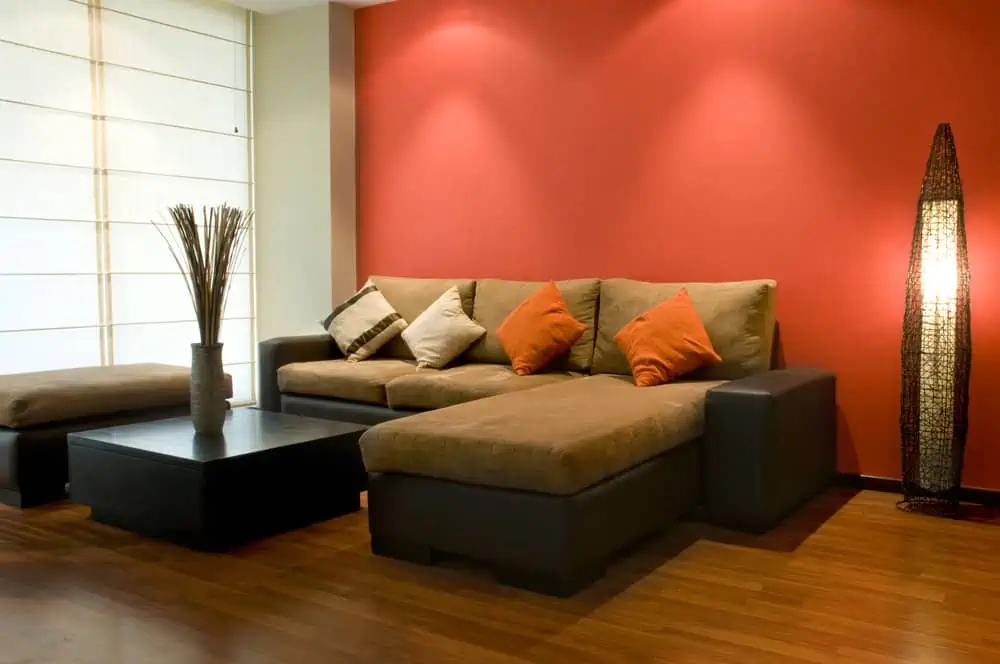
Coral adds a certain richness and warmth to a living room. You can always paint it on an accent wall if the color is too overwhelming. Its undertones of pink, orange, and red can be paired with shades of gray. Consider Collective Coral from Dulux for a paint color similar to the image.
7. Monochrome Scheme with a Pop of Color
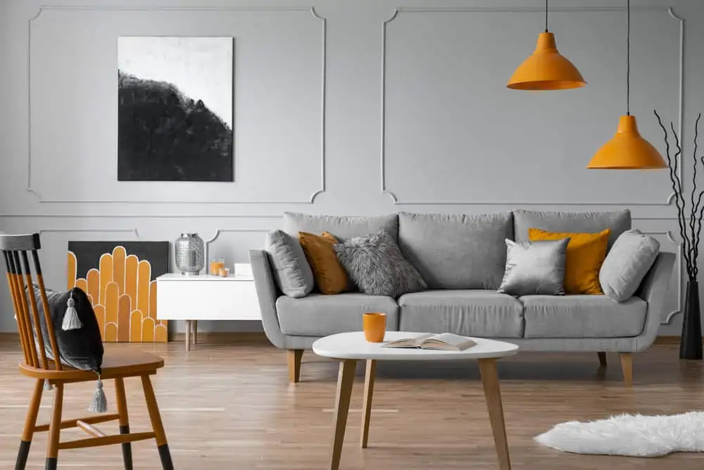
Sometimes, the simplest color combinations can render the most stunning visual effects. If you don’t want a living room that’s too flashy, use warm and light gray tones as base wall colors and an accent color scattered across the room (in this case, orange). It’s a soothing color combo.
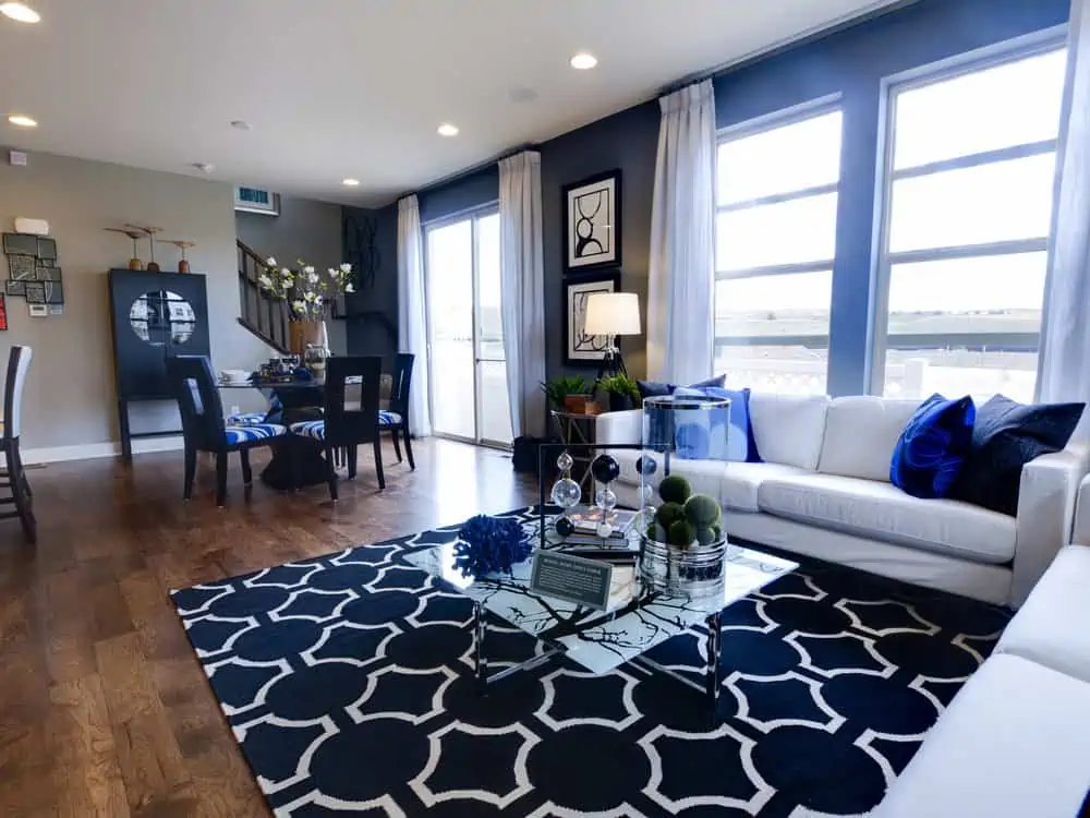
8. Cerulean Blue All Over
Cerulean blue is a living room color that might surprise you. Even though it’s a bold color, you can combine it with other bold colors (such as apple green) for rooms that make a statement.
This versatile blue shade has a deep and rich hue and should only be considered if you’re a true dreamer!
9. Burnt Orange
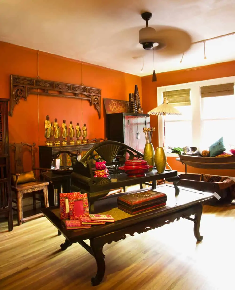
Nothing is more magnificent and opulent than a living room painted in burnt orange. From an accent color to a bold brown, this hue of orange is classy and inviting.
It works as an accent wall color, but you can go deep and paint all the walls burnt orange. Pantone’s Burnt Orange is a fabulous shade to try.
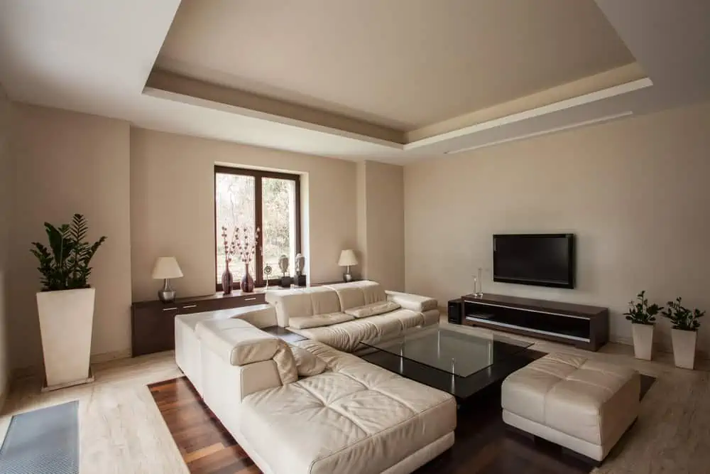
10. Painting the Tray Ceiling
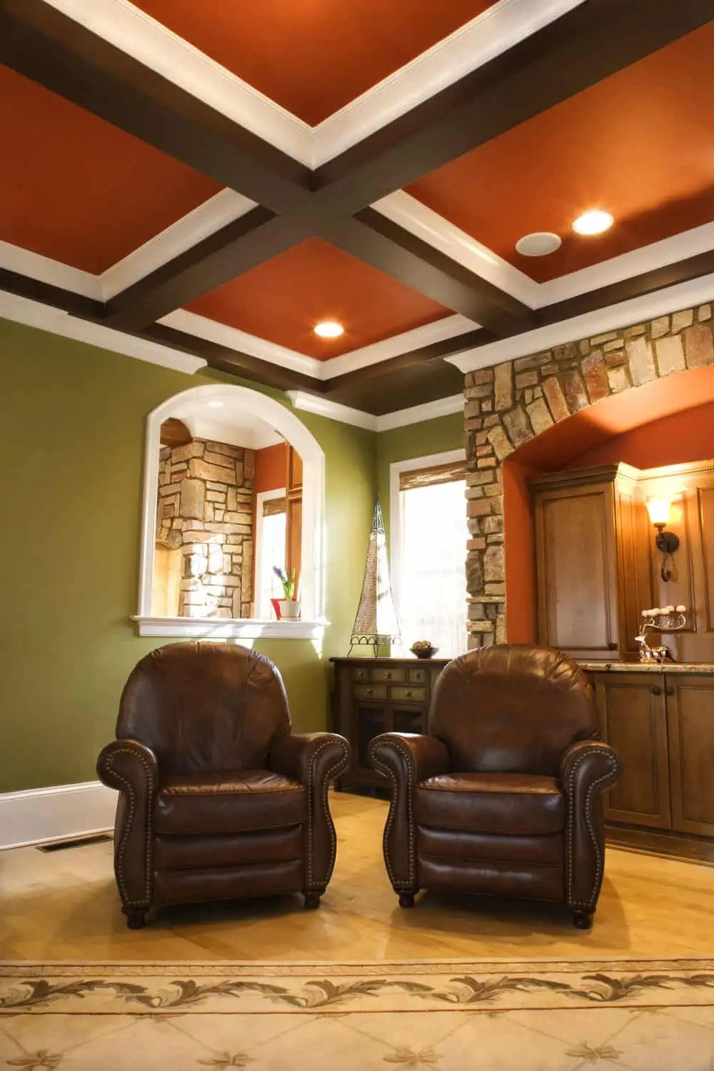
If you’re looking for unique living room paint design ideas, how about painting the tray ceiling? The best way to add depth to a room with a tray ceiling is to paint it rich and vivid colors.
Whether you choose brown with orange undertones, burnt orange, or deep blue, the visual effects can be astonishing.
11. Lilac Gray
Soft lilac is a terrific way to add a dash of femininity to a room and is an appealing alternative to the blush pink that has been so fashionable in recent years. Lilac is a calming color that may be used with grays to create a sophisticated look.
12. Hint of Mint
Mint colors have the advantage of being highly adaptable. If you’re looking for a way to spruce up a minimalist living space, shades of mint are a great option. Mint and gold are a beautiful combination for the living room, and it’s easy to achieve.
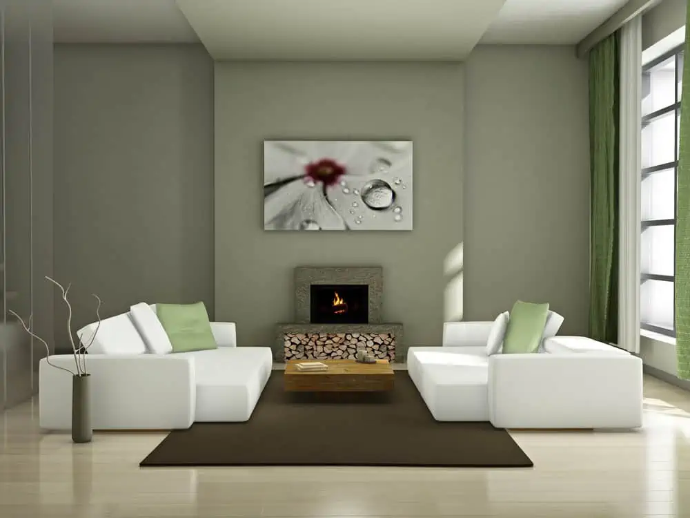
13. Blue Wall of Windows
Accent walls are a great way to integrate a color you like into the decor without fully committing to the color. Especially so if you choose a bold paint color that could be overwhelming when painted on all the walls. Use the accent color to draw the eye to stand-out features, like the view or a feature fireplace.
14. Black Doesn’t Mean Gloomy
Living areas with black walls can create a cozy, ambient, and intimate atmosphere. The lack of natural light in a small living room makes black a wise choice because it emphasizes the negative aspects of an area’s shape. Install some LED strips of light for an even cozier ambiance.
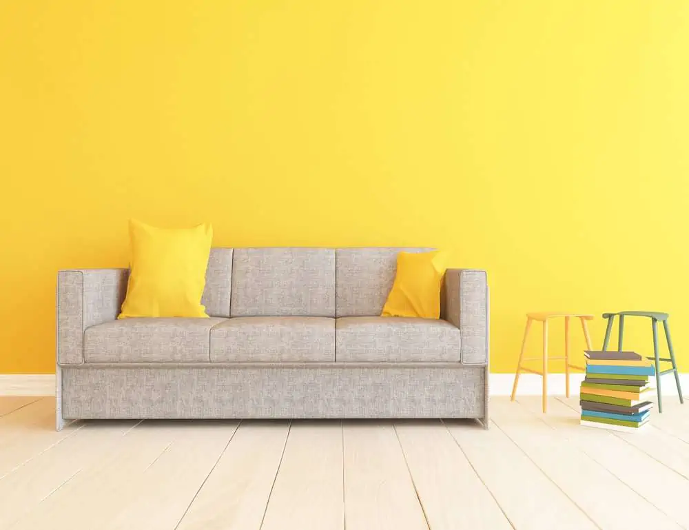
15. Yellow Doesn’t Have to Be Bold
A muted shade of yellow will create a cozier, more subtle, and toned-down appearance in the living room. It’s a great option if you’re not looking for that energizing yellow vibe. Butter Up by Sherwin-Williams would make an excellent paint color choice.
16. Use Paint Techniques to Add Texture
If texture-free walls bore you, there are multiple ways to remedy that. And using a sponge painting technique is one of the easiest ways to add visual interest to the walls.
17. Use a Darker Version of the Color for Wainscotting
A lot of people choose to paint the wainscotting in the same color as the walls for a traditional look and feel.
You can also choose a darker version to make the molding stand out and create more visual interest in the room. This works particularly well if you have wainscotting that’s rich in details.
18. Highlight the Trim Work
Trim work makes the dream work. Well, maybe that’s not the exact saying, but you have to admit, highlighting the trim work shown in this picture does look dreamy. Just make sure to pick a trim color that works with the wall color.
19. Add a Pop of Color in Small Nooks
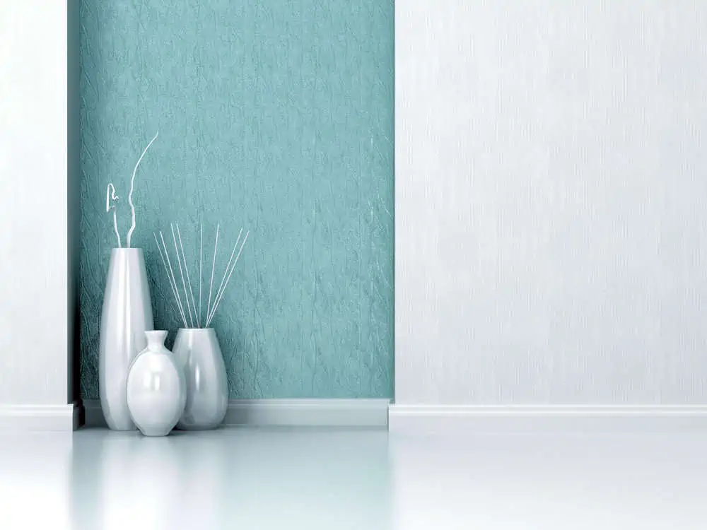
You can add color to any room, regardless of the paint job. Notice how well these silver-finish floor vases go with the blue textured walls.
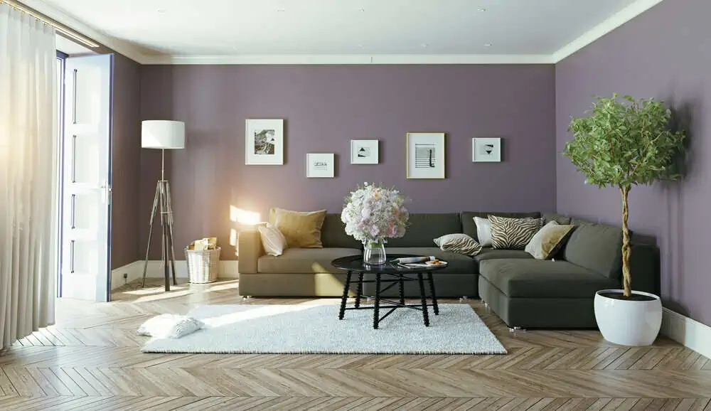
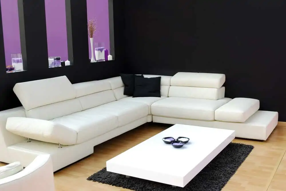
20. For Purple Lovers
Purple is one of the most adaptable colors for decorating the home. The color ranges from the deepest eggplant hues to dramatic royal purples.
It also includes mauve, lavender, and delicate lilac. Purple Hyacinth from Benjamin Moore is a color you might want to try if you’re into purple hues.
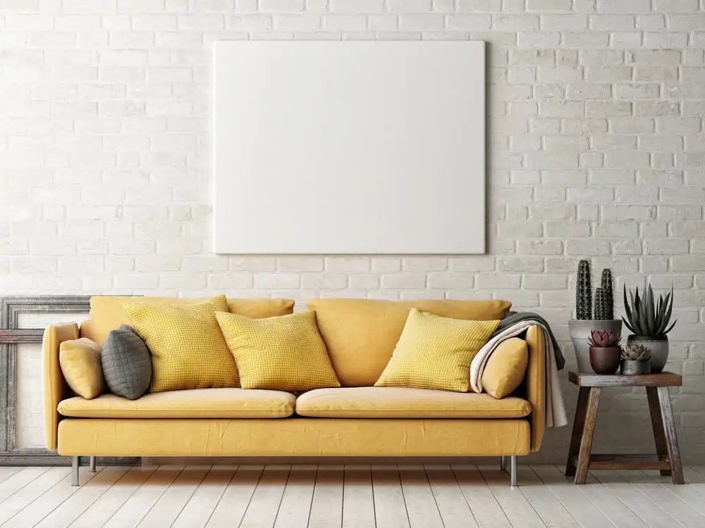
21. Hello Yellow
Yellow is one of those living room design ideas that never fails. To warm up a cool space, choose warmer tones, while pale yellows are ideal for rooms that get plenty of direct sunlight. Tone ideas for painting a yellow living room can range from rich and earthy to pale-off-white.
22. Dusty Rose
Dusty pink in a living room is the color of royalty. When paired with golden accents (such as intricate paint frames or floor lamps with golden details), it’s almost like turning your living room into a castle. Rosé by Sherwin-Williams could be your go-to color in this case.
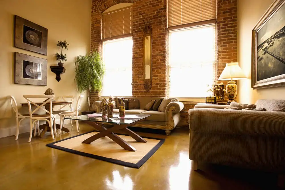
23. Painted Brick
Do you have exposed brick walls and are looking for living room painting ideas that highlight them? Painted brick has always been and will continue to be stunning.
It lets the brick’s texture and character shine through without interfering with your chosen color scheme. It can create the perfect backdrop for a colorful couch, a china cabinet, or even a fireplace.
24. Painting Ledges to Appear as Furniture
Do you know what a cool trick for living room decor is? Painting the ledges makes it seem like the room has more furniture pieces than it does.
This is a neat trick for a large living room if you want to make it look fuller without tripping over that ottoman nobody uses.
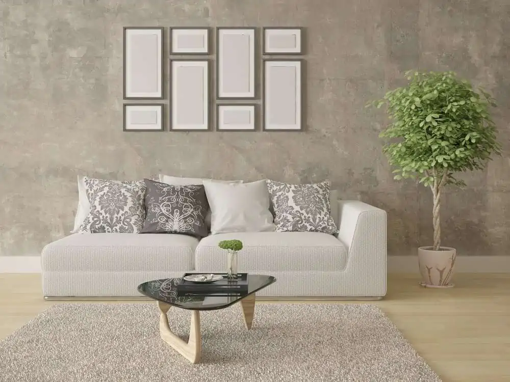
25. A Neutral Scheme
Neutral colors can be a great starting point for creating a warm and inviting living space. Neutrals can be paired with a variety of different colors and are great for both monochromatic and more colorful room approaches.
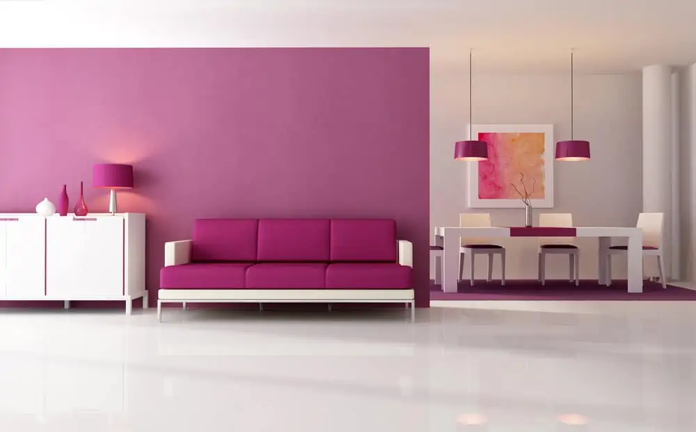
26. Pink Doesn’t Mean Girly
You no longer have to limit the use of pink paint to your daughter’s room. With the proper shade of dusky pink paint, you may create a fashionable, sophisticated atmosphere for adults as well.
Pink is also a versatile color and has a lot of positive attributes. It doesn’t matter if you’re trying to create a lively space or a calm haven; pink is the color of choice.
27. Go Nuts with Sage Green
Green dominated interior design in 2021 and 2022 has already pulled out the red carpet. Sage is the type of green shade that could be used in just about any room of the house. Sage green is a great color to experiment with if you’re just getting started with the trend.
28. Choose Two Bold Accent Walls
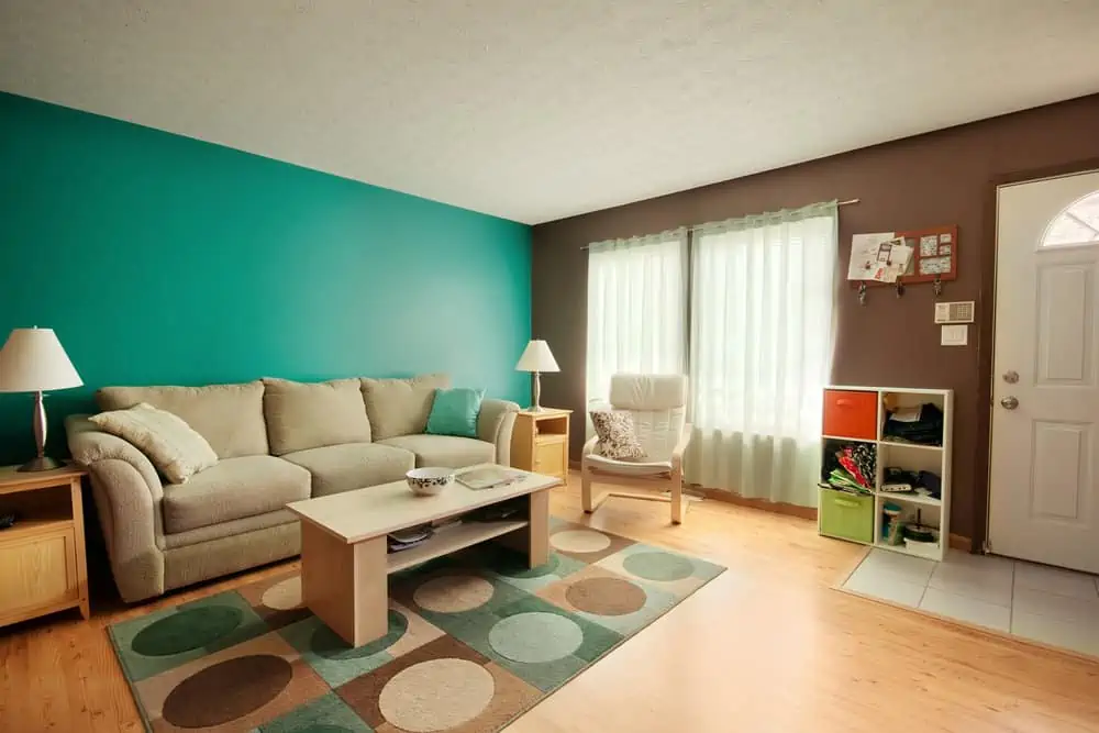
If used correctly, paint colors can bring subtle refinement or dramatic contrasts to a room’s overall mood. The colors don’t need to be from the same color family. If you want to make a feature of a wall, you may choose to paint it a different color.
29. Keep It Light and Airy
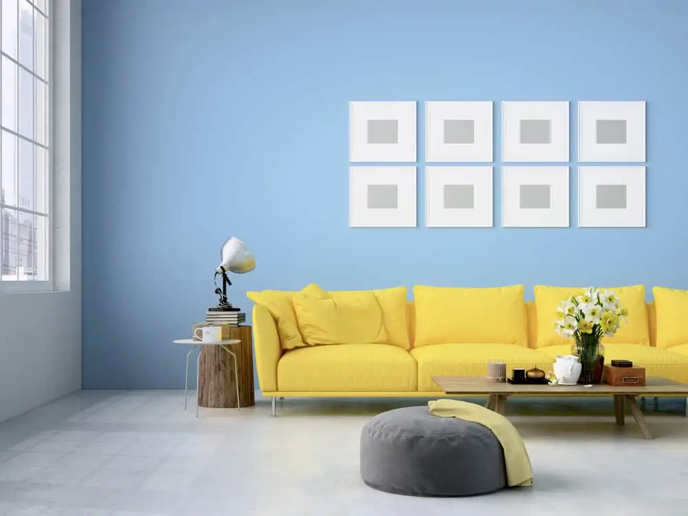
When you choose light and airy colors, like this combination of light blue and yellow, it feels like the living room is brighter and gives you more room to breathe. The color choices aren’t random; they are reminiscent of sunny skies and golden wheat fields.
30. Bubble Gum Pink
Isn’t it true that pink just makes people happy and upbeat? If you want to create balance and contrast with other fascinating colors, pick this color.
It doesn’t matter if it’s a few accessories, a large piece of furniture, or an entire wall; it just adds a burst of excitement to any room. PPG’s Bubblegum Pink is pretty awesome.
31. Bold, Brave, and Red
When used in living rooms, red creates a cozy, inviting atmosphere perfect for unwinding.
Red is an excellent color to use in a living room because of its ability to take on a variety of tones, allowing you to get a variety of appearances. Notice how well it would work even in a more Victorian setup.
32. Add Texture and Definition with Painted Panelboard
When it comes to living room design, wall paneling is a great way to incorporate your particular style while also providing a sturdy and classic look. While adding texture and depth to your walls, living room paneling also adds longevity and insulation. Check out Living Stream by Behr if you like this particular wall color choice.
33. Can’t Go Wrong with Gray
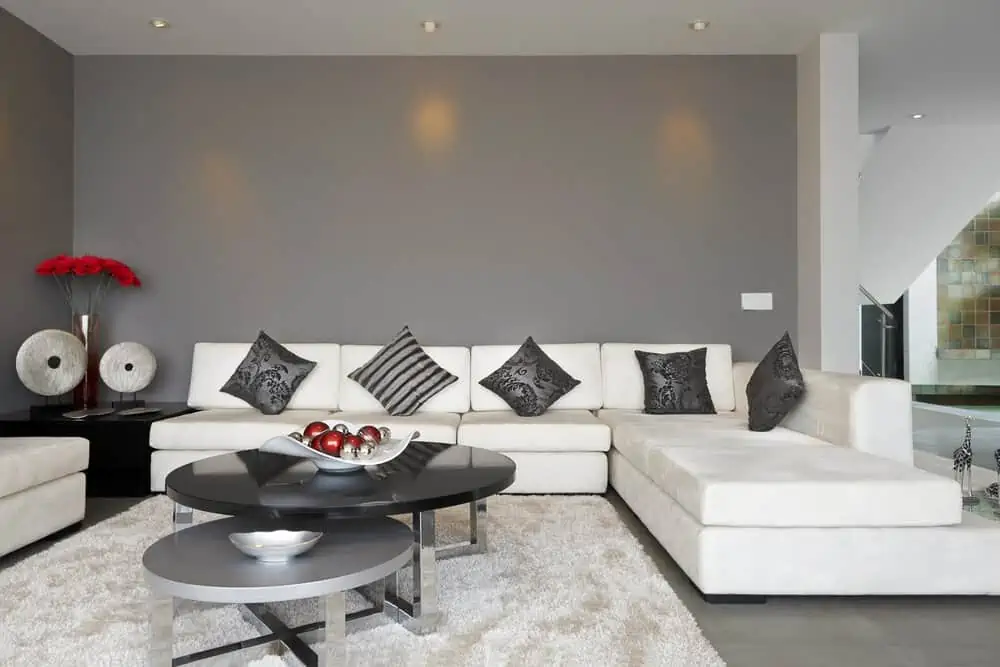
It’s not surprising that we’re drawn to gray living room designs. It’s a color that can be worn in a variety of ways because it comes in a variety of shades. There’s a shade of gray to go with just about any plan you can dream up for your living room.
34. Mix Dark and Modern with Rustic Elements
People think that modern and rustic have no place being together in a room. That couldn’t be more false. Notice how this room has a little bit of everything: industrial lighting, exposed metal and wood, dark colors, rustic wooden furniture, and modern lines.
35. Have Fun with Varying Green Tones
Green is the type of living room color that you can never go wrong with. It’s a soothing and fresh color choice that transports you to the middle of a forest.
You can mix and match tones of sage, emerald, mint, or forest green. Throw a couple of plants in there, and it’s like enjoying a breath of fresh air while sitting on the couch.
36. Create Patterns with Trim and Paint One Color
You can create interesting wall patterns if you paint over trim (whether in the same color as the walls or a different one). Go with a single paint color and paint over the trim. The patterns will be more discreet and won’t draw that much attention away from other room elements.
37. Carry Color Across Walls, Shelves, and More
Create a sense of unity in the living room. Just use the same color for the built-in shelves as you did for the walls.
This makes the room come together. And, since the shelves blend into the decor so well, the displayed items are highlighted.
38. Create Contrast with Blue and Coral
Blue and orange are commonly used together for a stunning impact because of their complementary hues.
Coral and navy blue may be matched to create an equally striking combination. Coral’s freshness and the way it breathes new life into classic-yet-dark navy are two reasons behind this.
39. Mid Century Modern Mixed with Charcoal
If you’re looking for a dramatic alternative to the lighter neutrals, consider charcoal gray as a stylish substitute for black.
This mysterious color could fit into a mid-century modern living room, where sleek lines and clean furniture need elegant backdrops. Graphic Charcoal by Behr is the obvious choice here.
40. Muted Red
Red is a terrific way to create a huge statement in a living room, but countless other color options exist.
Red has the power to instantly alter your mood, whether it’s used sparingly or as an accent color. Muted red is a more discreet alternative to basic powerful red versions, so it fits a living room that aims for intimacy.
41. Textured with Paint and Spackle
If you want a textured wall, you can employ many different techniques using paint and spackle. Regardless of the color you go with, you can choose the sponging or the ragging technique.
But first, add some raised texture with spackle. This gives the wall depth. Then apply paint.
The color is applied with a sponge over a solid basecoat in this method. The texture of a synthetic sponge is more uniform, but the texture of a genuine sea sponge is more irregular.
42. Paint a Mural
We love this idea because it makes the living room more personal than any simple color ever could.
You’d be adding more of something you like, something that truly represents you. You can paint the mural yourself or hire an artist to do it. It could be a design that matches the room or something that speaks more about your personality.
43. Carry the Eye Upward with All Over Pink
Bold decisions can pay off in the end. This pink ceiling in the living room serves as confirmation. It gives off a very Bohemian vibe and would work well even in more traditional/rustic room setups. Kiss and Tell by Behr might serve as a starting point.
44. Let Your Paint Color Show Off Your Décor and Architectural Elements
When you’re out and about thinking about which living room paint color to choose, consider the existing architectural elements in the room.
For example, the exposed wooden beam we see here works well with a paint color that doesn’t stand out too much. That makes the beams more visible, and the room maintains its theme.
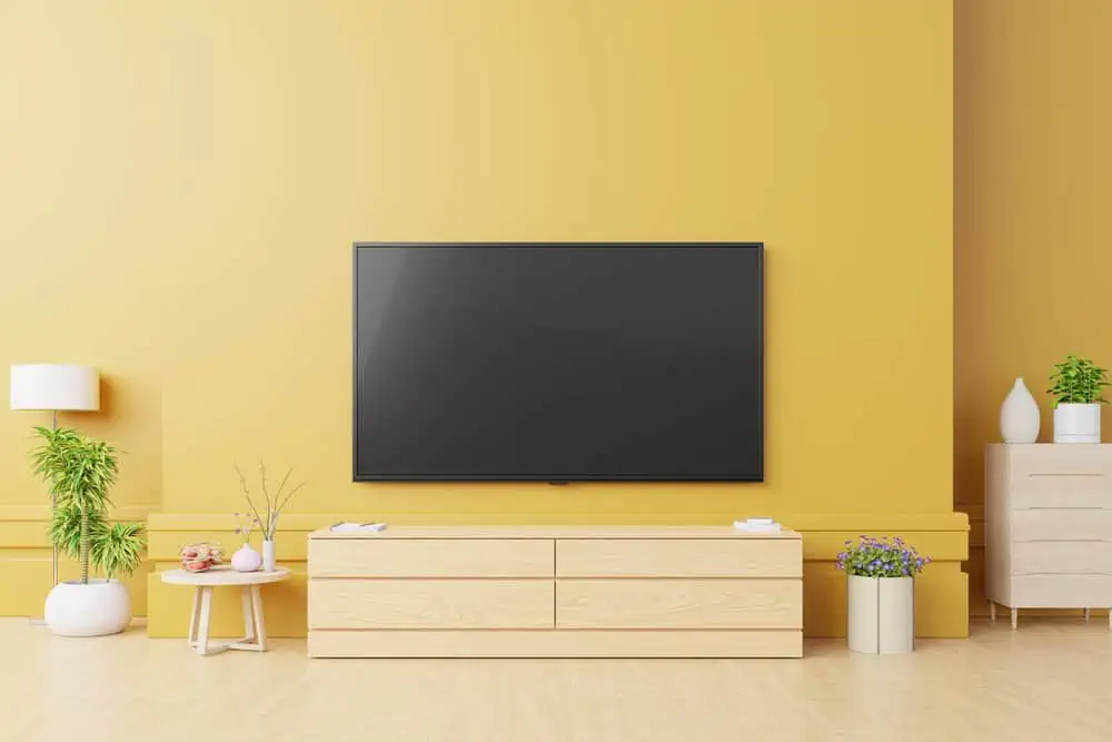
45. Dark Color Just for the TV Wall
For a more dramatic effect, use dark hues for your TV wall. With a dark color behind your flat-screen TV, you can create an immersive viewing experience. Take a look at Sherwin-Williams’ Caviar for a nice paint suggestion.
46. Pewter Scheme
Pewter is a gray color that’s perhaps better defined as a gray-silver color. Warm beige undertones can be seen in some pewter hues, as well as cold blue and green undertones.
Some people might think that a pewter scheme would be too cold for a living room, but it has a certain level of class to it.
47. Clean and Cool Tones
Sometimes, all you want is a clean-looking living room. Notice how easy it is to achieve it, as you can opt for a single color and spam it through wall paint, furniture choices, and even decorative elements. Just look at how classy this neutral setup with golden accents looks.
48. Using Dark Colors to Frame a Textured Accent Wall
We love everything about this setup. It uses so many modern and sleek lines that it’s somewhat the definition of a modern setup.
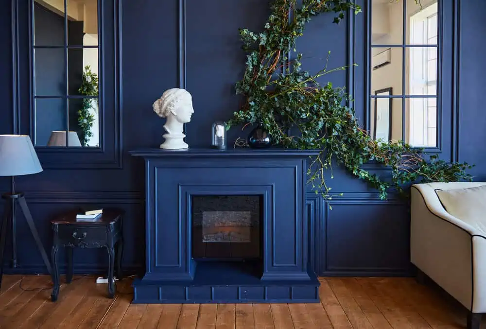
If you have textured accent walls that stand out, you can use darker colors to frame them, highlighting them even further. It just looks like the perfect spot to place a TV.
49. Navy Blue Is Timeless
Navy blue is a sophisticated shade for a living room that adds a sense of coziness and warmth. With vibrant colors and patterns, you can use it as a backdrop, or you can complement it by using soft neutral for a living room that just comes together.
Don’t those golden painting frames look gorgeous against that navy blue wall? Choose Kensington Blue from Benjamin Moore for quality paint.
50. Paint Stripes
A living room doesn’t have to be boring, even if you use neutral colors. Pick a lighter and a darker shade of the same color and paint stripes.
In contrast to vertical stripes, horizontal stripes are more edgy and contemporary. They amplify the sense of space in a room and can even lengthen it.
What Colors Make a Living Room Look Bigger?
If you have a small room to work with, consider opting for colors that create the illusion of more space. That would include light colors such as sage green, light gray, off-white, and muted yellows. Here are some other tips for making a room seem bigger:
- It is possible to make a room appear larger and more open by using mirrors. To create the appearance of depth, aim your mirrors towards a central point.
- Making a space appear larger is mostly dependent on choosing the proper pieces of furniture, such as multifunctional ones.
- When clutter is kept to a minimum or hidden from plain sight, the area will appear more spacious and well-organized.
- Your walls can benefit from a pared-down approach, too. Keep the number of images on your walls to a minimum.
- Natural light brightens and expands every room, making it appear more spacious. Otherwise, you can add creative effects using lighting fixtures.
Tips For Painting a Living Room
Learn how to paint your living room like a pro.
- Preparing a room makes a world of difference. Get rid of furniture, cover fixtures, dust and clean, and use painter’s tape for the edges. Thank us later.
- Test the paint before you apply it to the entire wall. Based on your lighting, the result could look a little different.
- Brush before you paint. Take care of corners and edges to prevent future roller smudges.
- Don’t skimp on supplies. Don’t buy the cheapest roller on the market.
- Invest in a roller extender or ladder so you can paint comfortably in higher places.
FAQs

What Colors Brighten a Living Room?
More light and space are created in a room by using lighter, cooler colors on the walls. For optimum lighting, choose delicate tones of gray and blue. Consider painting a drab, dark room with yellow or terracotta paint if you want to bring in some warmth and make it seem bright.

What Colors Make a Room Feel Relaxing?
There are plenty of colors you can go with if you want a relaxing room ambiance, including lavender, sage green, muted yellow, pastels, and others. Blue tones evoke a sense of calm which is why you often see it in bathrooms and even spas.
Yellow can be very soothing as well, as long as it’s muted or pastel. Green stimulates the brain and brings a sense of freshness and relaxation.

What Color of Paint Reflects the Most Light?
All colors have an LRV (Light Reflective Value). This determines how much visible light is reflected from the color and can help determine other lighting sources in the space.
The color that reflects the most light is actually white. If you don’t like white and want to add color to the space while still reflecting good light, stick with lighter tones.

When Painting a Room Two Colors, Which Wall Should be Darker?
Accent walls in dark colors are common. Choose a wall that has little to no windows or doors for the darker color. With long and narrow spaces, paint the darker color on a smaller wall, preferably the one farthest from the entry.
If there’s a feature or focal point in the space you want eyes drawn to, paint the wall behind it the darker color.
What Color Will You Choose?
We hope these 50 living room paint ideas have at least painted a picture of your ideal living room. Most of these wall colors work in other situations too, like when you’re looking to paint a home office, a drawing-room, a den, or even your gaming room.