Is it time to paint your home’s exterior, but you have absolutely no ideas for exterior paint colors? You’ve come to the right place. We’ll dissect exterior house color trends based on architecture.
Plus, we share what designers have to say, and what apps and brands are available to help you out.
Key Takeaways
- Choose exterior paint colors based on your home’s architecture and style.
- Use a color visualizer to see how different colors will look on your house.
- Test paint samples on your home’s exterior before making a final decision.
- Consider current trends, such as warm whites, all-black exteriors, and contrasting door colors.
How to Choose Exterior Paint Colors for Your House
Deciding on a color to paint your home’s exterior can be a tough choice, especially when there are so many options out there. We’ve put together three tips that will make you feel more confident about your color choice, ensuring the first impression of your home is a great one.
Get the Facts on Exterior Painting
Before you even begin the process of choosing the right house color, it’s a good idea to educate yourself with some useful facts.
When painting the exterior of your home, keep the size of your house in mind.
Light or dark hues may be more appropriate, depending on the size of your home. As a general rule, light colors make objects appear larger. They’re also more responsive to shifting light conditions. While dark tones make objects appear smaller and help them blend in with their surroundings.
Use a Color Visualizer
Once you have a general concept of what you want for your home’s exterior, you can easily turn to a free color visualizer to discover the exact shade. Numerous major paint manufacturers offer this tool with exterior options. Each paint tool’s interface is slightly different.
But they all employ similar techniques for allowing users to experiment with numerous paint settings. You can sort by popular colors or designer recommendations.
Simply upload exterior images of your property to see how various paint colors would look on your walls. It’s an excellent approach to experiment online and gather ideas for your home’s color scheme.
Use Paint Samples
Once you’ve narrowed down your list of possible color choices, it’s time to confirm them using color samples. While visualizers are beneficial, you want to see how that specific color looks on your wall with bare eyes.
Pro Tip
Purchase sample quantities of the paint colors you’re considering and line the outside with brush-outs (a brush-out is simply a brushstroke of paint).
Most Popular Exterior Paint Colors
Finding exterior paint colors to suit your home is easy when you have the right inspiration. You can find this all over the internet on sites such as Instagram, Pinterest, Houzz, and more. Let’s discuss trends and color options that work best depending on the material of your exterior and the style of your home.
All-Black House Exteriors
You read that right. All-black. This trendy look has been spotted in paint as well as siding and rock facades. And it’s not as gloomy as you might imagine. An all-black exterior looks sharp and modern while also pairing well with a more traditional design.
If you’re looking for black exterior paint color, try Tricorn Black (no. 6258) by Sherwin-Williams.
Warm Whites and Creams
“Warm white” refers to the tone and hue. New trends suggest warming it up rather than using the stark, clean white exterior paint colors we’re so used to seeing.
A popular choice for a warm white or cream exterior paint color would be Shaded White (No. 201) by Farrow & Ball.
Muted Tones with Contrasting Door Color
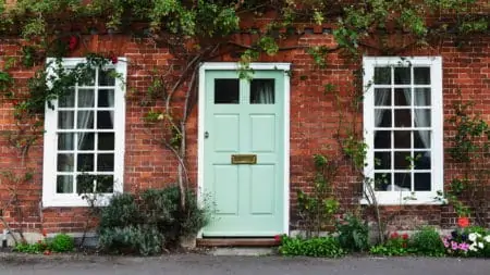
Paint your front door with a pop of color! This trend has actually been around for a while, but we’ve seen a spike in popularity lately. If you’ve got a darker house exterior, try a yellow or cream, or, if your home’s exterior is on the lighter side, try black or navy.
Colors to consider: Gusto Gold (No. 6904) by Sherwin Williams or Dark Night (No. 6237) by Sherwin Williams.
For Brick Homes
For homeowners considering repainting their brick facade, we’ve compiled a list of a few diverse tints that are certain to increase curb appeal. Keep the facade a somewhat neutral color and use complementing colors for the accents.
Whether you’re thinking of a milky white cottage or perhaps a contemporary gray Craftsman, the paint colors below will inspire you to repaint your brick home.
The best color choices for a brick home include:
- Warm beige: Stony Ground (No. 211) by Farrow & Ball
- Creamy white: Off-White 3 by Farrow & Ball
- Rich charcoal: Graphite (1603) by Benjamin Moore
- Cool gray: Gravity (4005-1B) by Valspar
For Modern Houses
When it comes to modern houses, the exterior paint color options are limited. Modern homes often have muted tones of simple colors like black and white. But you can vary from that. Charcoal, light grey, navy, off-white, and various creams all work well for modern home exteriors.
This is because they’re often mixed with elements like stone, glass, or wood. If you deviate from the usual modern home colors, you move away from the style itself.
The best color choices for a modern home would be:
- Rich charcoal: Graphite (1603) by Benjamin Moore
- Bright white: Pure White (SW 7005) by Sherwin-Williams
- Modern black: Black Magic (SW 6991) by Sherwin-Williams
- Deep gray: Iron Ore (SW 7069) by Sherwin-Williams
For Colonial-Style Houses
While white and black is a timeless palette, there are so many more period palettes available. Why not try out fresh color combinations inspired by the past?
Hint
A pop of red against a classic white-and-black backdrop draws attention to the magnificent, portico-covered doorway of your property.
An earth tone such as Pastoral (PPU10-20) by Behr will complement rather than dominate the natural surroundings for larger properties. The addition of a blue-green accent to the front door and shutters can further connect the residence to the surrounding landscape.
The best color choices for a colonial-style home would be:
- Creamy white: Swiss Coffee (OC-45) by Benjamin Moore
- Bright white: Pure White (SW 7005) by Sherwin-Williams
- Bold navy: Gale Force (SW 7605) by Sherwin-Williams
- Earthy green: Pastoral (PPU10-20) by Behr
For Ranch-Style Houses
Ranch-style homes are some of the most adaptable designs available. You may customize the exterior of a one-story ranch with a variety of styles and colors.
Ranch homes come in a range of architectural styles, from a straightforward layout to a huge estate with unique features or something in between.
Warmer neutral browns like Baked Sienna (S220-6) by Behr work well in open environments because they merge well with their surroundings.
Remember
Numerous brown tints and tones work well together to create a rich exterior brimming with warmth and depth.
The best color choices for a Ranch-Style home would be:
- Warm beige: Stony Ground (No. 211) by Farrow & Ball
- Creamy white: Swiss Coffee (OC-45) by Benjamin Moore
- Warm brown: Baked Sienna (S220-6) by Behr
- Gray-blue: Teton Blue (N490-4) by Behr
For Cottage-Style Houses
Cottage-style homes lend themselves to an external color scheme that is less constrained by formal standards and allows for more experimentation with pattern and shade. The Gravity (4005-1B) by Valspar might be a great choice here.
Keep the siding or exterior a nice neutral color while contrasting small details such as trims or shutters.
Cottage-style homes are flush with soft, inviting colors that are appealing to the eye. Never go with bold, striking colors for a cottage style. However, if you want to add your own flair for color, try using muted tones in small places.
The best color choices for a Cottage-Style home would be:
- Creamy white: Swiss Coffee (OC-45) by Benjamin Moore
- Cool gray: Gravity (4005-1B) by Valspar
- Gray-blue: Teton Blue (N490-4) by Behr
- Cool blue: Big surf (M460-3) by Behr
Apps to Help You Find the Perfect Color
Painting a house is a time-consuming task. Apart from the physical labor of painting the walls, you must determine the house paint color schemes that are most suitable for your home.
This frequently entails visiting a store. Then obtaining samples, painting them on a surface, and waiting to see whether the drying hue suits you or not.
The apps in the following list streamline the process by utilizing digital technology to realistically apply paint to any surface. And they even work for your home’s exterior.
ColorSnap Visualizer
ColorSnap Visualizer is a computer-based application. But there is an app version available for all smart devices; it just has a more basic interface for users. Once you have the program, you begin by selecting one of their sample images or uploading your own.
Sherwin-Williams recommends taking one in natural light. This is to get the best impression of how the color will appear on the walls.
Prestige Color Pic
Prestige ColorPic is an app available for iOS and Android that enables you to snap an image of your room, upload it, and then begin painting digitally on your walls. Thousands of paint colors are available in the app; plus, you can compare them to popular brands such as Sherwin-Williams and Benjamin Moore.
McCormick Paints Color Visualizer
McCormick Paints Color Visualizer enables you to select a generic image to represent any room in your home. Then you can manipulate the color on the walls. You can also add your own photos, which we recommend doing to see how the paint will look in your own home.
There are a wide variety of colors to choose from. And the tool can even suggest complementary or coordinating hues for trim points. Finally, you can save and download the image, allowing you to share your thoughts with others.
PPG Paint Color Visualizer
PPG Paint Color Visualizer is a great, user-friendly tool for beginners. You begin by selecting a typical image of a room or home exterior and then applying different color samples to it. You can also add your own image to get an idea of how the paint will perform in your home.
Exterior Paint Color FAQs

How Many Colors Should a House Exterior Have?
When choosing an exterior color scheme, the rule of thumb is to choose three colors as a starting point. However, there are monochromatic homes that demonstrate you don’t have to use distinctly different hues.

What is the New Trend in Exterior House Colors?
Off-white is one of the most popular exterior paint colors in 2021. However, if you truly want to nail this trend, go for a warm, creamy white color.

Is Gray Paint Going Out of Style in 2021?
Take a peek at the Colors of the Year for 2020 and 2021. You’ll see how far we’ve come from our fondness for cool neutrals. Pantone chose the light Ultimate Gray as one of its Colors of the Year for 2021. But the second hue, the vibrant yellow Illuminating, is the furthest thing from gray.

Why are Some Paint Colors Not Recommended for Exterior?
Something as simple as selecting the wrong exterior paint color for your home could result in costly repairs. For instance, the darker the color, the more pronounced the fading, chalking, and discoloration will be compared to a white or light gray paint.