Are you planning to redecorate the house and want to pay extra attention to your living room? Sometimes, all you only need is a fresh coat of paint and some creative inspiration!
A fresh coat of paint or an enticing new color can transform the entire space. So, if you’re looking for some neat DIY painting ideas for the living room, you’ve come to the right place.
Key Takeaways
- Choose the right color combinations for your living room to transform the space.
- Consider accent walls or different paint techniques to add depth and texture.
- Light colors can make a room feel more spacious and energetic.
- When painting yourself, follow tips like cleaning surfaces and painting in the correct order for a professional-looking result.
Can I Paint My Living Room Myself?
Before we take a look at DIY living room paint ideas, let’s briefly talk about the complexity of the project. Painting a living room by yourself isn’t complicated, but it can be time-consuming if the room is big.
The height of the ceiling can add to this project’s complexity, as you might need a ladder or scaffolding. But many people have done it, and you can do it too.
The time it takes to paint your living room depends on the size of the room. Generally speaking, it takes about two to four days to paint an average-sized living room. That includes prepping, priming, and painting.
DIY Painting Ideas for Living Room
The walls are your canvas. So much can be done with the right color combinations and a little imagination. It’s time to get creative!
1. Light It Up
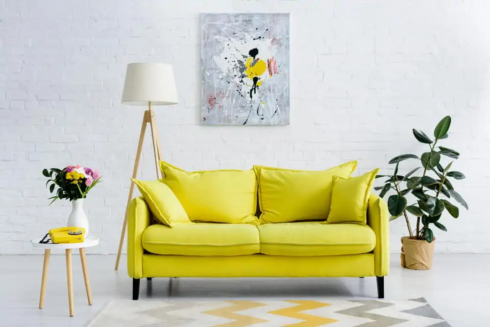
When it comes to living room colors, people usually want natural light. You can paint your exposed brick wall in white or some other light color to keep the energetic vibes going.
Pair that with a bold yellow couch and some wall art, and you have the perfect place for spending the day at home.
2. Accent Wall
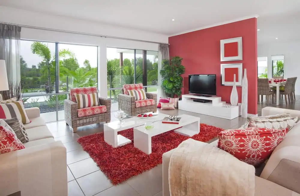
Red can be used for a simple pop of color on an accent wall. This powerful color fits our list of living room paint ideas very well. It’s exhilarating, energizing, and awe-inspiring.
It can serve as a stunning backdrop for everything from antiques to modern furniture. Consider Real Red by Sherwin Williams for a bold color that can bring passion and life into the living room.
3. White Winner Wainscotting
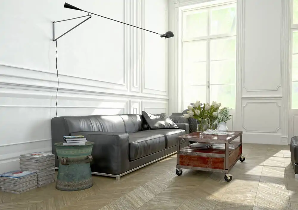
In natural light, painting the wainscot and the walls the same color adds a sense of modernity to the space.
It’s critical to pick a color that doesn’t overpower the walls or to use the same hue across the room to draw attention to the molded region. You can apply the paint by spraying it in semi-gloss or by brushing it in satin.
4. Cueing Up the Classics
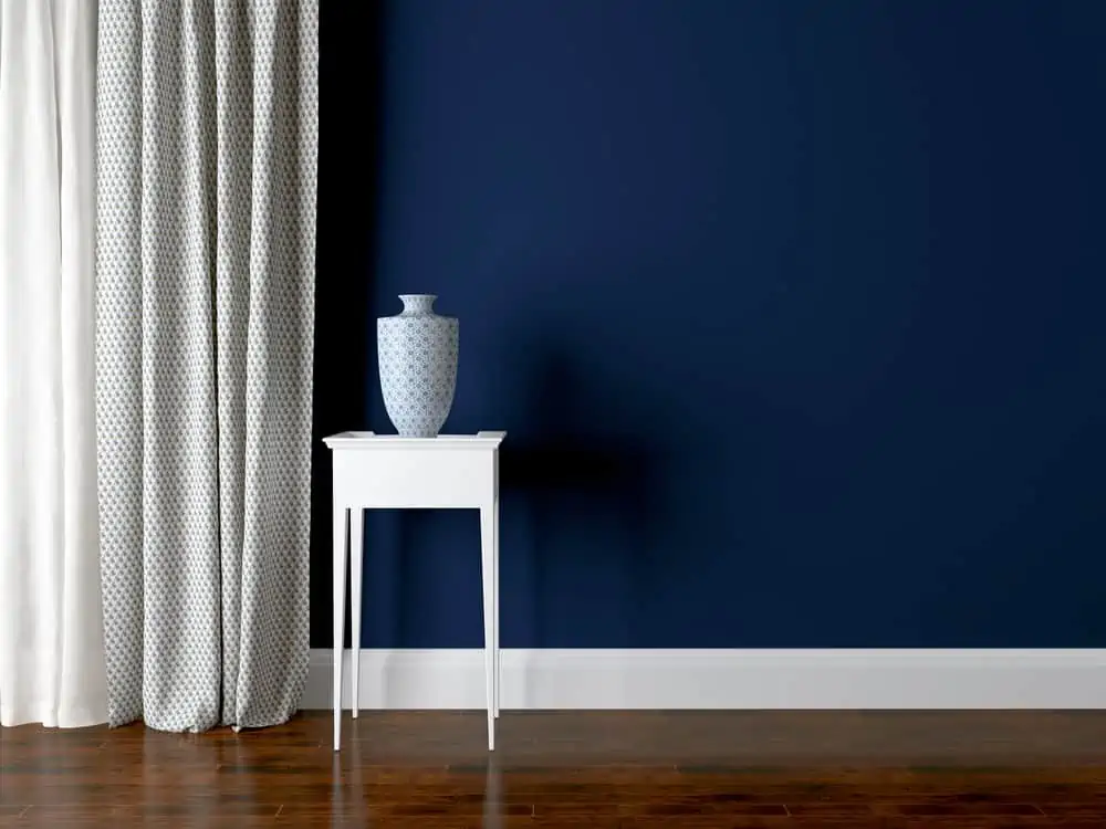
Your wood furnishings or floors will stand out even more prominently in a room where the colors and wood tones are starkly different.
Darker finishes contrast sharply against lighter colors in the room. This includes colors like mild greens or blues and hues from the sunny side of the color wheel like yellows and oranges. In the same way, the contrast between light wood and dark or bold wall colors is striking.
This navy and white combination just makes sense. Blue by Benjamin Moore would make a perfect paint choice for our list of living room paint ideas.
5. A Grip on Gray
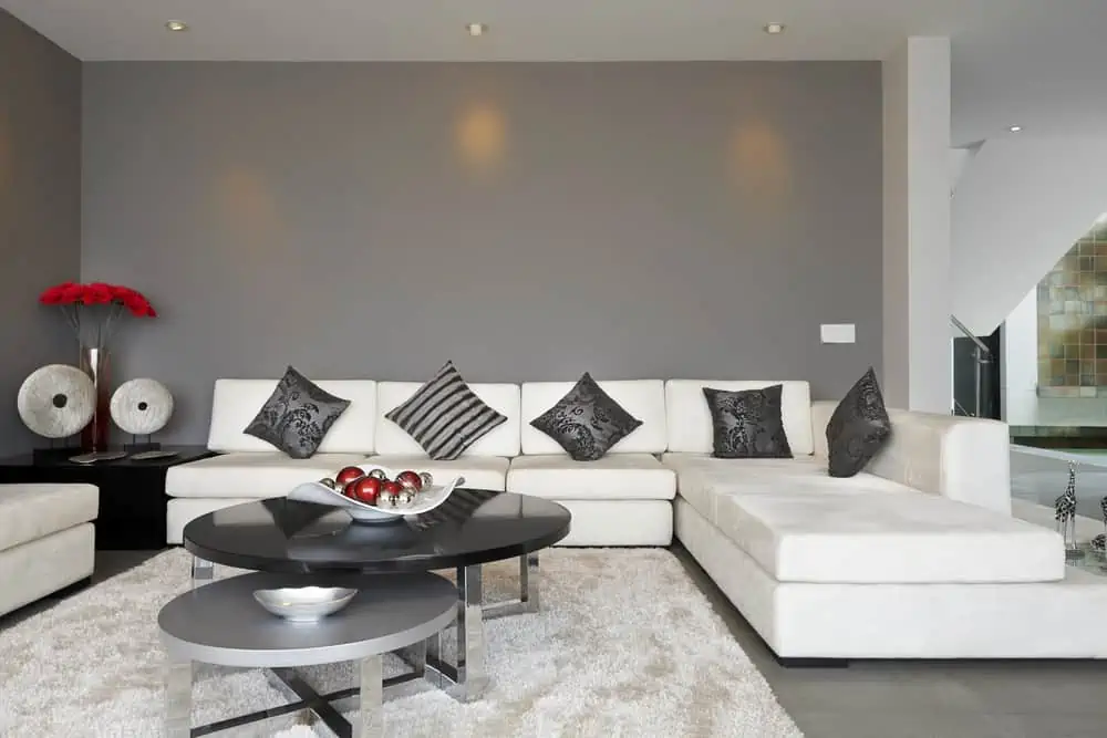
This season, gray is all the rage. Colors like beige, ivory, and taupe have recently been overshadowed by a new color trend: gray.
Modern and edgy but ageless and classic at the same time, it’s the new fundamental hue. It’s the ideal chameleon, as it may be used in virtually any environment or mood.
6. Trickster Texture
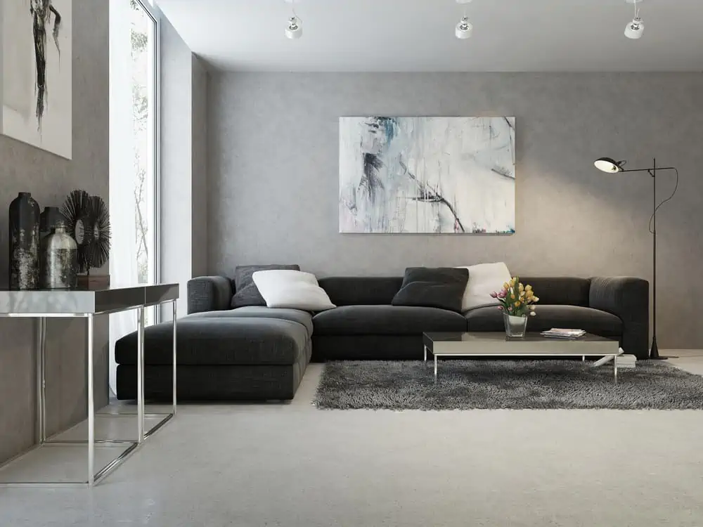
Neutral colors and false textures are a combo that you can’t really go wrong with. If you’ve never painted anything before, faux finish painting can be a little daunting.
However, don’t give up on your home improvement plans just yet. Some solutions are beyond the average person’s capabilities, but there are still several simple methods you may use on your own.
7. Warm Neutrals
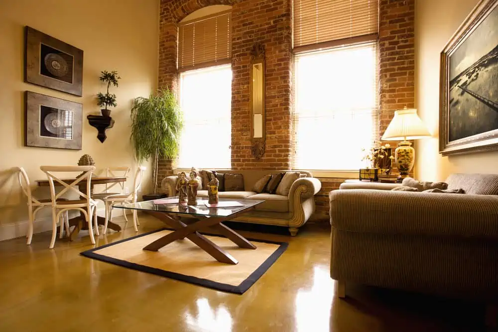
Combine bricks and neutrals for a very inviting living room. The focal point of the area will be one of the exposed brick walls, which makes a strong statement.
Classical Yellow by Sherwin-Williams would work well here because it’s a warm color and easy to combine with other accent colors you might choose.
8. White Trim Work
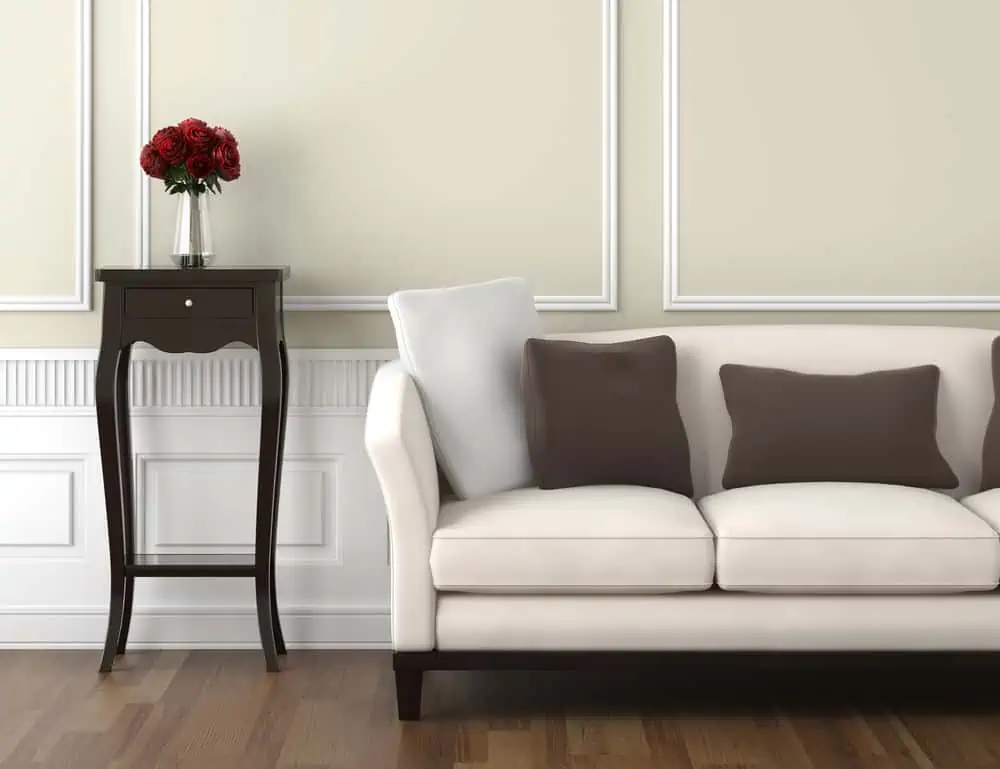
As I mentioned earlier, having light colors makes your living room more breathable and keeps you in a more alert mood than dark colors.
You can always opt for beige or taupe walls and add depth with white trim. This color combo makes it easy to pop in colors through accent pieces if you choose to do so.
9. Pleasuring Pastels
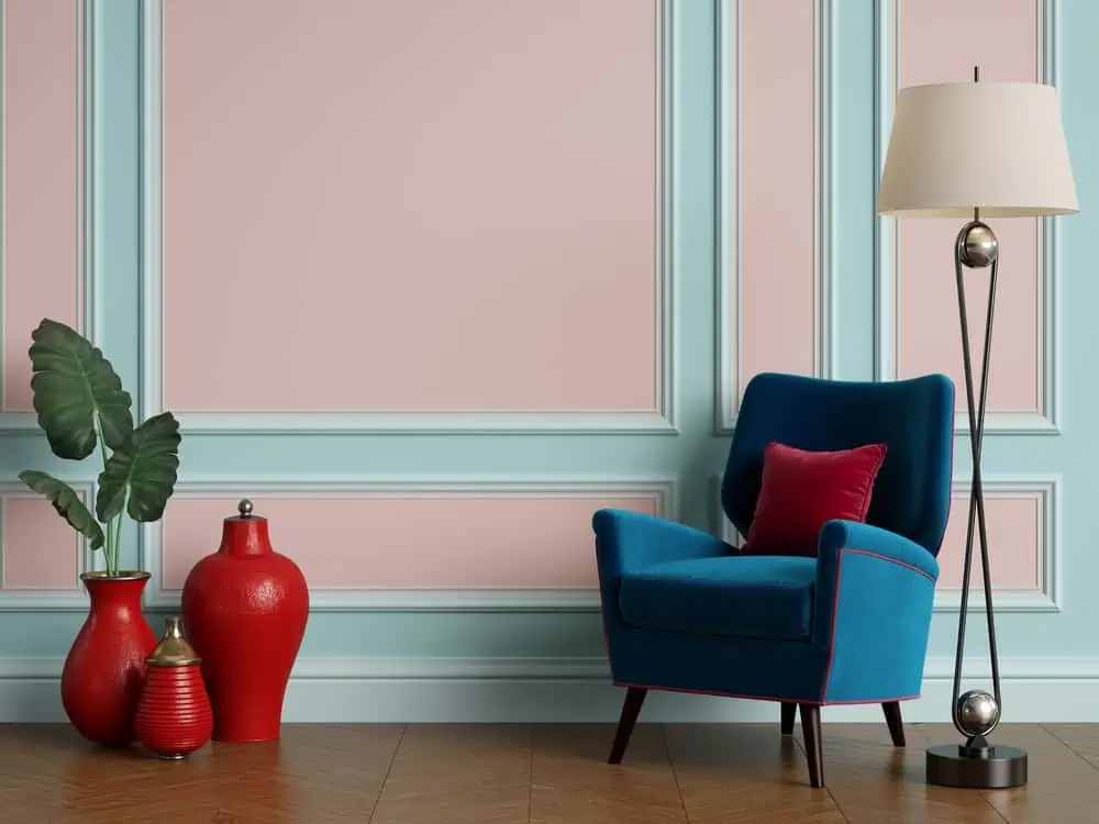
Soft pastels make the room appear very delicate and gentle. If you have trim work across the living room, this will give you a chance to play around with multiple pastel options. Ocean Boulevard and Wild Geranium by Behr would make an excellent pair.
10. Using Trimwork
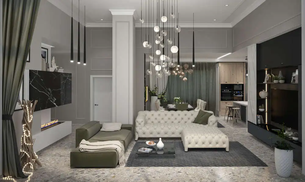
Both modern and traditional living rooms can all benefit from trim work, which draws the eye to more daring designs and elements. To avoid overwhelming the room, choose a wall paint color and trim style that are on par in terms of muted tones.
See how a simple, narrow trim was used to add depth to the walls and beams. And everything is painted in the same color.
11. Bold Pop and Contrast
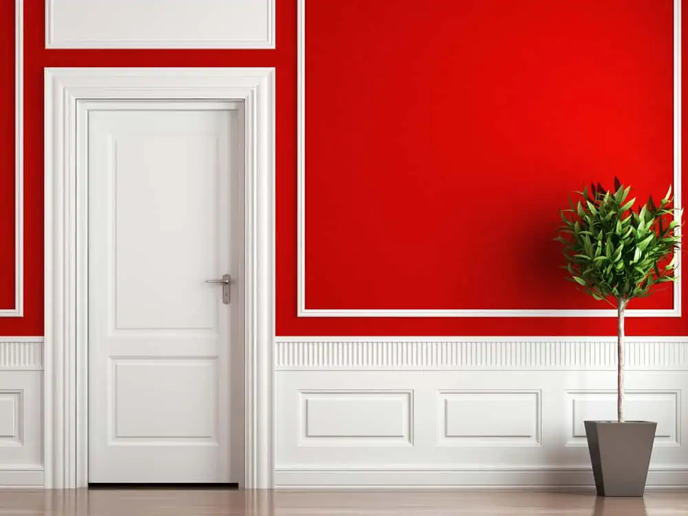
When you stick to white trim, you can really go all the way with your wall paint color choices. Notice how exquisite this deep shade of red looks when paired with white trim work. Benjamin Moore’s Red may just be that fierce color you’re looking for to achieve this living room look.
12. Subdued Colors
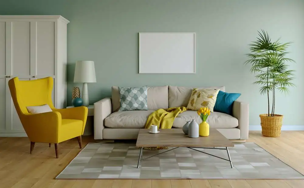
A more subdued version of a vibrant color can still add a burst of energy to a room without being overbearing. Check to see if the color of your walls clashes with any of the room’s focal points. A simple color scheme and avoiding a wide range of shades will help you achieve this.
13. Stick to the Shade
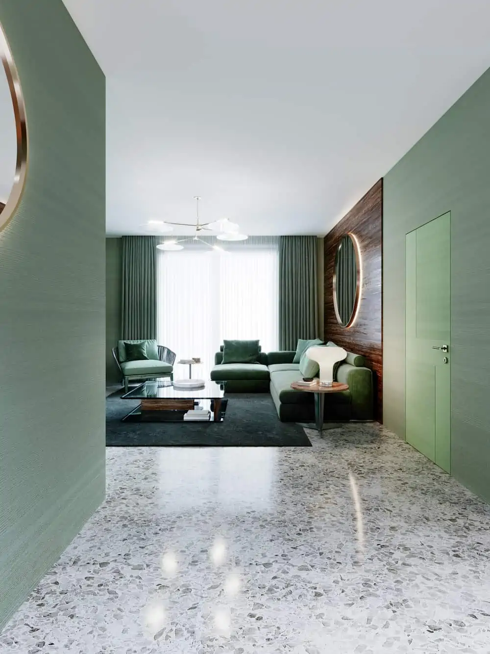
The best reason to use a single color throughout your home is to create a seamless transition of color from one room to the next.
Professional painters often recommend painting or spraying a single color throughout a home for cost reasons. The color choice is entirely yours, but how gorgeous is this Grandview by Sherwin-Williams?
14. Yellow Tones
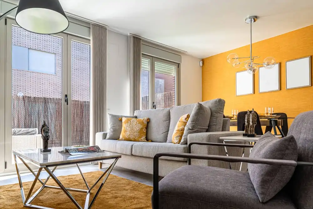
It’s true that yellow can be a bold color. But there are a lot of different shades to choose from to get the accent wall that matches your entire living room setup. Yellow makes it feel like your room is glowing with light.
To tone it down, you can opt for gray furniture to make it pleasing to the eye. Yellow fits basically every room of the house, so it’s great for bedroom, kitchen, bathroom, or living room use.
15. Luxurious Charcoal
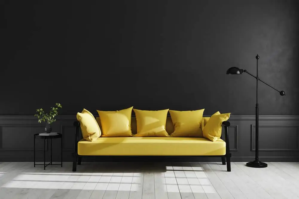
Charcoal gray is a versatile color that can be used in various decors despite its boldness. Despite popular belief that dark hues make rooms appear smaller, charcoal gray has the opposite effect. It makes a space appear larger while also providing depth and dimension.
Add a drop of color with a yellow couch, and your living room setup should feel very modern and luxurious.
16. Monochromatic Scheme
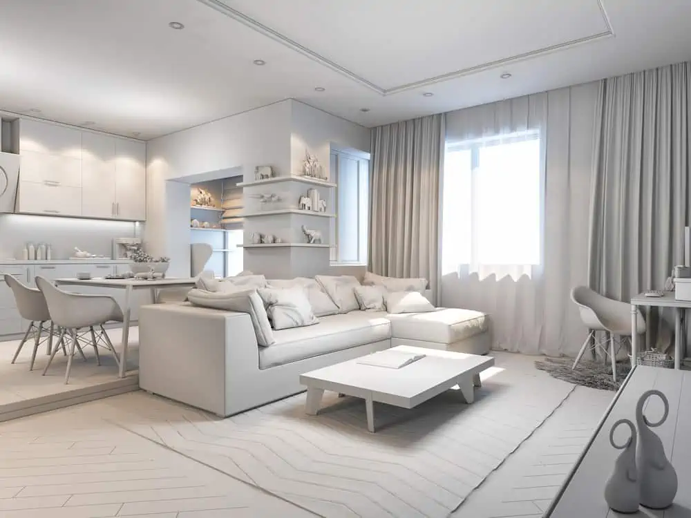
Monochromatic color palettes are effective because they simplify your design.
There are a few ways to ensure that your design is cohesive, but the most frequent method is to include a few similar threads throughout. If you stick to the color scheme, you’ve already achieved the desired level of cohesion.
17. Bold and Beautiful
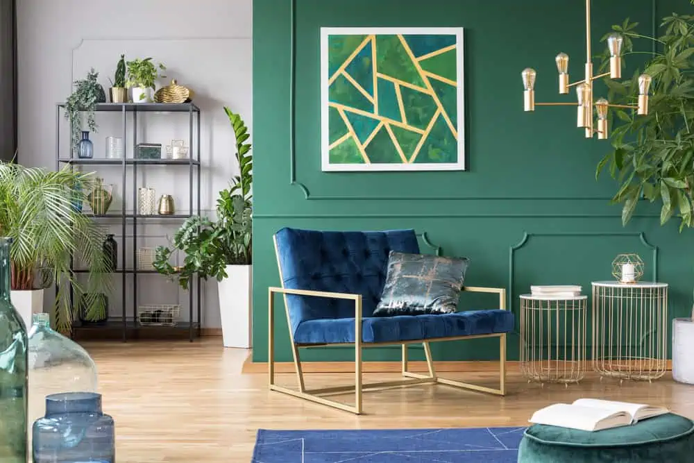
If you’re unsure how you want your living room to look, how about going with bold colors? Use a bold color to paint an accent wall with trim work to highlight the other bold colors and textures.
Here we see how harmonious green and gold work together. Enchanted Wells by Behr might leave you inspired.
18. Stripes and Neutrals
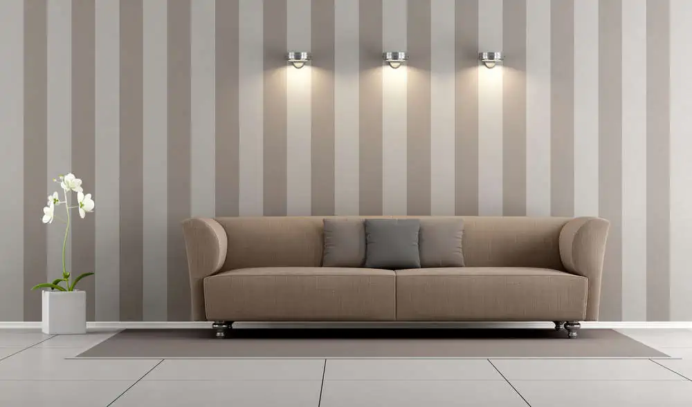
When it comes to designing, it’s hard to think of anything more fundamental than a straight line. Perhaps this explains why stripes are the most commonly utilized pattern for interior wall decoration. If you opt for neutrals, you’ve got yourself an intimate living room with playful walls.
19. Depth and Texture
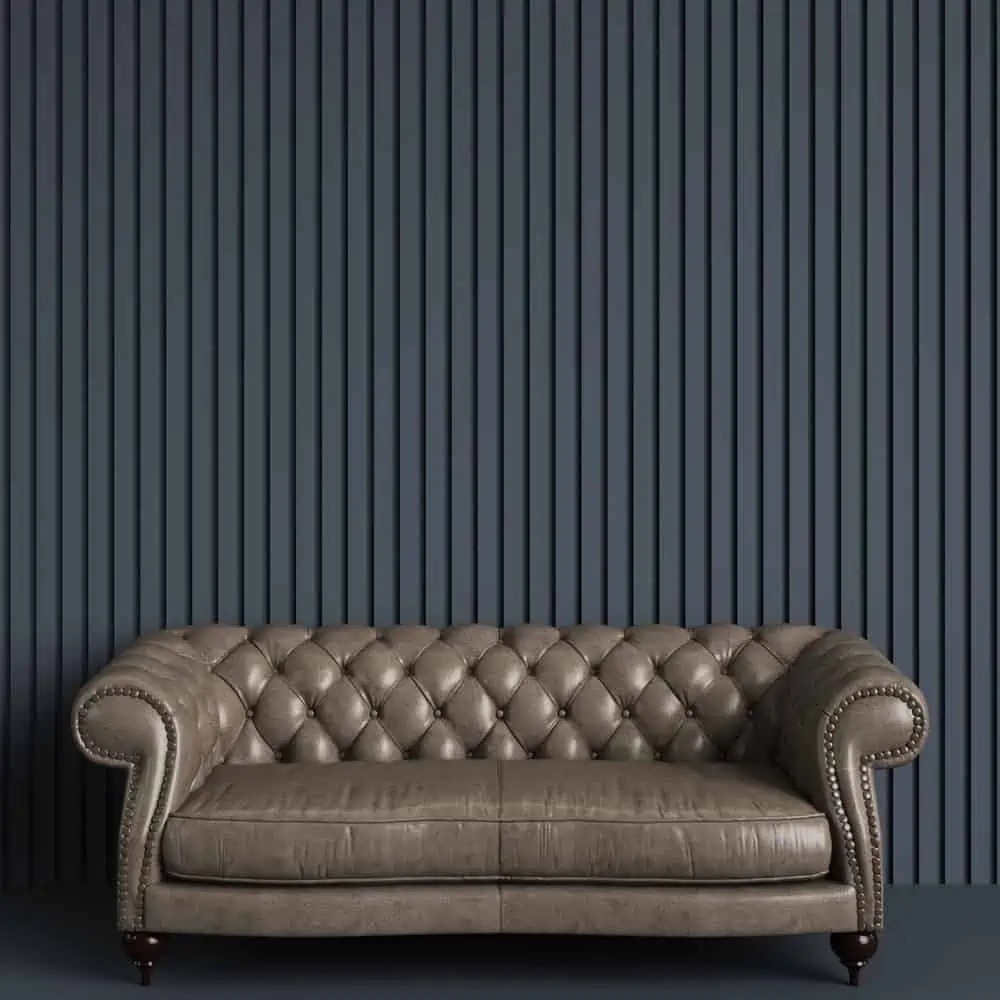
Another idea for painting your living room that almost never fails is covering walls in narrow panels and painting one color to add depth and texture.
The color is entirely up to you. Nurture your dark side or go with lighter or neutral tones. Add a couch with matching hues, and you have yourself a streamlined living room look.
20. Classic Space
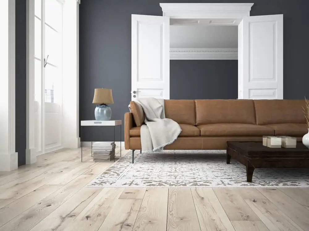
Use a dark color with stark white to create a bold, classic space. This is an excellent approach if you want to decorate your living room, but you’re not sure where to start.
Pairing dark grays with white frames and doors makes for a great basis that could serve for adding accent colors in the future.
21. Painting a Tray Ceiling
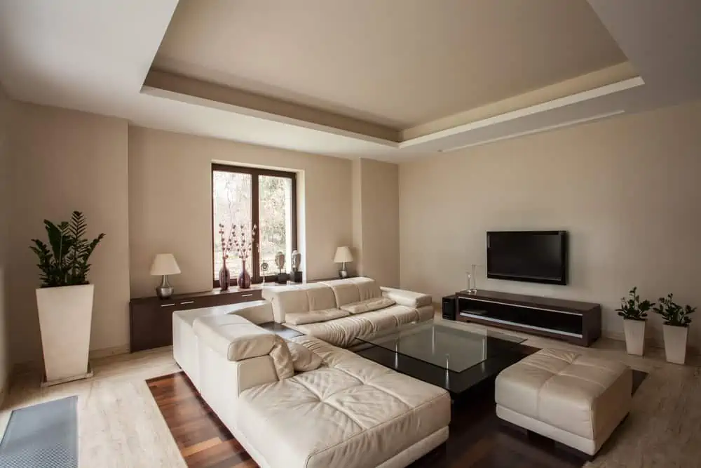
When painting both the ceiling and walls the same color it’s a simple approach to achieve a cohesive look.
Using a single color throughout the area creates a sense of unity. You can choose a lot of colors for a project like this, but Chapel Stone from Johnstone’s is one of my favorites.
22. Timeless Classic
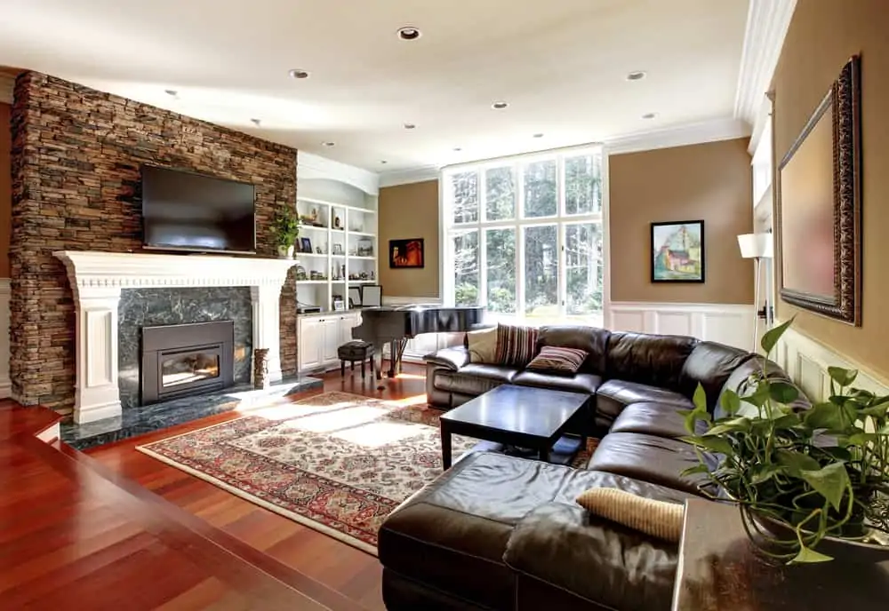
Brown and beige are two timeless color options. This combo will always be in style because it helps create a traditional look that makes you feel at home.
When you add natural colors and textures throughout the living room (like the stone and marble used to make the fireplace), it just feels very cozy.
23. Cool Textures
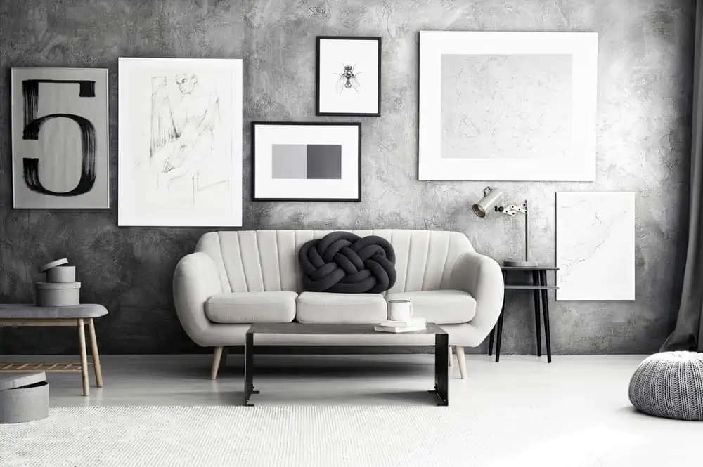
Nothing beats the simplistic elegance of a living room decorated and painted in black, white, and gray. There are several techniques to make wall texture. Dabbing a sponge in joint compound, using a trowel, or even using a primer and sand mixture.
24. Gentle Olive Tones
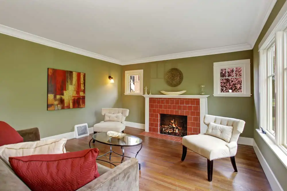
Olive is so easy to integrate into a cozy living room setup. Olive tones are soft and warm compared to bold neon hues.
For a living room with red accents or fireplace setups, olive would make an excellent option. Speaking of which, here is PPG’s color of the year, Olive Sprig.
25. Adjacent Accent
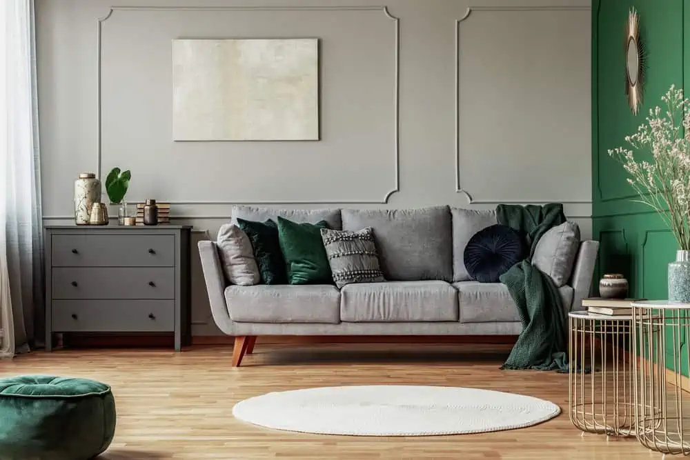
You may be used to seeing the living room wall with the couch in front of it being the accent wall. But it doesn’t always have to be like that.
If you want something different for an accent wall, consider choosing an adjacent one. Emerald Isle by Benjamin Moore might be the perfect option.
How to Decorate a Living Room
Painting is one thing; adding decor is another story. Here are a few pro tips.
Follow Color Trends with Pantone
Pantone Color Institute brings together designers, marketers, producers, and businesses to collaborate and create a dynamic color presence.
Their expertise in color is unmatched because they are the most widely used color-matching system. They have a deep understanding of how color influences both design and consumer behavior.
Create Texture and Depth with Layers
In order to create depth in a room, clever texture requires layers. Adding layers is like developing a palette. Build on a texture that you like and use it as a starting point.
To avoid feeling stifled, the texture must be properly balanced. Use pillows and blankets to create these layers.
Use Interchangeable Wall Art
This is a great idea for keeping your living room freshly decorated each season. Choose soothing neutral colors and then quickly exchange them for bold hues through your wall art.
Arrange Furniture so Traffic Flow Is Never Blocked
Always keep in mind how people will go in and out of the room while arranging your furnishings. Accessing another piece of furniture shouldn’t necessitate climbing or stumbling over something else.
In addition, they should be able to go straight through the room. Make certain that there is enough space for people to stroll freely.
Add Color Through Accessories
Certain decor elements make it easy to inject color into a neutral room. You can do this by opting for colored furniture for large pops of color. If you want to start small, consider colorful throw pillows, rugs, and even candles.
Tips For Painting a Living Room Yourself
Want to step up your living room painting game? Here are a few tricks for beginners to help you out:
- Keep wet edges while you paint to avoid lap marks. Lap marks are overlapping layers that tend to dry a little darker.
- Move your stuff out of the way and cover what you can’t move with tape or a drop cloth.
- Make sure your ladder is always stable, and ask someone to hold it if need be.
- Rollers with extendable poles can strain the hands, but they are safer because you don’t usually need a ladder.
- Paint the trim first, the ceiling second, and the walls third.
- Clean the surface before you paint.
The Verdict
Hopefully, these DIY painting ideas for the living room provided at least some inspiration for your next painting project. Remember that no rules are set in stone when it comes to interior décor. So, pick a wall color that you’d like to see day after day as you step into the room.