Dying to paint your walls red but worried it might be too bold of a color choice? The reality is that crimson wall paint is a great choice, but it can be tricky to pair with other colors.
If you’re not sure how to integrate crimson red paint into your decor, we have a ton of suggestions in store for you.
Key Takeaways
- Crimson red is a deep, reddish-purple hue that evokes feelings of adoration, affection, and sophistication.
- Pair crimson with colors like green, beige, bronze, or maroon for a stylish look.
- Choose a darker matte tone for bedrooms and bright shades for living rooms and dining areas.
- Experiment with crimson as an accent color or on cabinets for a modern touch in kitchens.
What Color is Crimson Red?
The color Crimson Red is a deep, reddish-purple hue. Because it’s not as intense as pure red, crimson is more tonally pleasing to the eye.
Crimson can evoke feelings of adoration and affection as well as portray ideas of aristocracy, royalty, and religion.
People often use crimson as a sign of luxury and sophistication. So, if you want to look elegant and vintage by pairing it with green, maroon, or bronze, you should do that. You can achieve the look of modernity by using neutral colors like beige.
Crimson Wall Paint Ideas
I’m positive at least one of these ideas will spark the inspiration you need to commit to red!
1. Crimson Porch Entrance
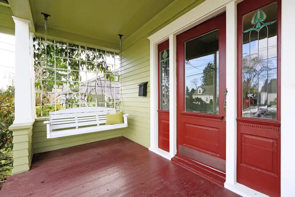
One of the best colors to pair crimson red with is green. Using green and crimson as a complementary color scheme is a great way to add visual interest and intensity to both hues of color.
This porch masterfully combines these two colors, even if the intensity of the crimson shade might feel overpowering for some.
2. Crimson Red Living Room
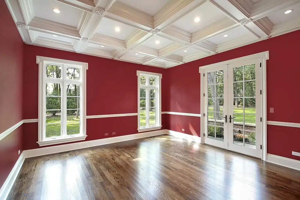
A crimson red space would be fantastic for a living room or a home office where you want the space to feel more alive and energetic.
Crimson red is fantastic when paired with white, which works with trim and door/window frames. This would look fantastic with either dark or light-brown furniture.
3. Crimson Sitting Area
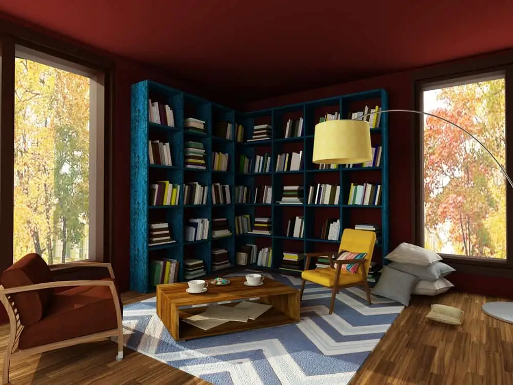
Crimson red and blue make a fine pair, especially if we’re talking about dark and intense blue shades, such as navy. Any interior designer will tell you that red and blue were made for each other.
The entire room setup might feel a little dark to some. But it offers a cozy place for you to enjoy coffee with friends or the company of a good book.
4. Modern Crimson Office
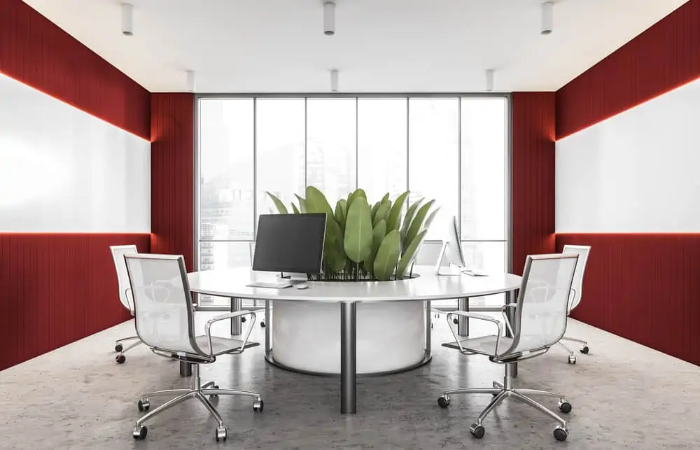
The combination of crimson and white will always be foolproof. Notice how this office has a very elegant touch to it.
I love how the silver chair and table legs give the entire setup a fancy look. The crimson red walls create an energetic ambiance that seems to welcome new and exciting ideas.
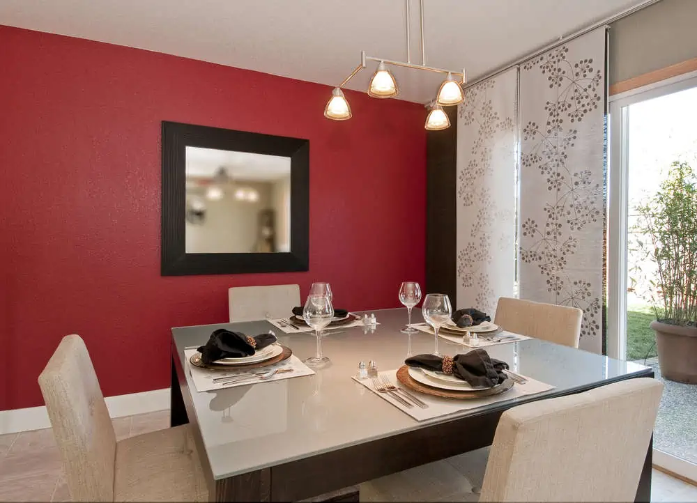
5. Crimson Dining Area
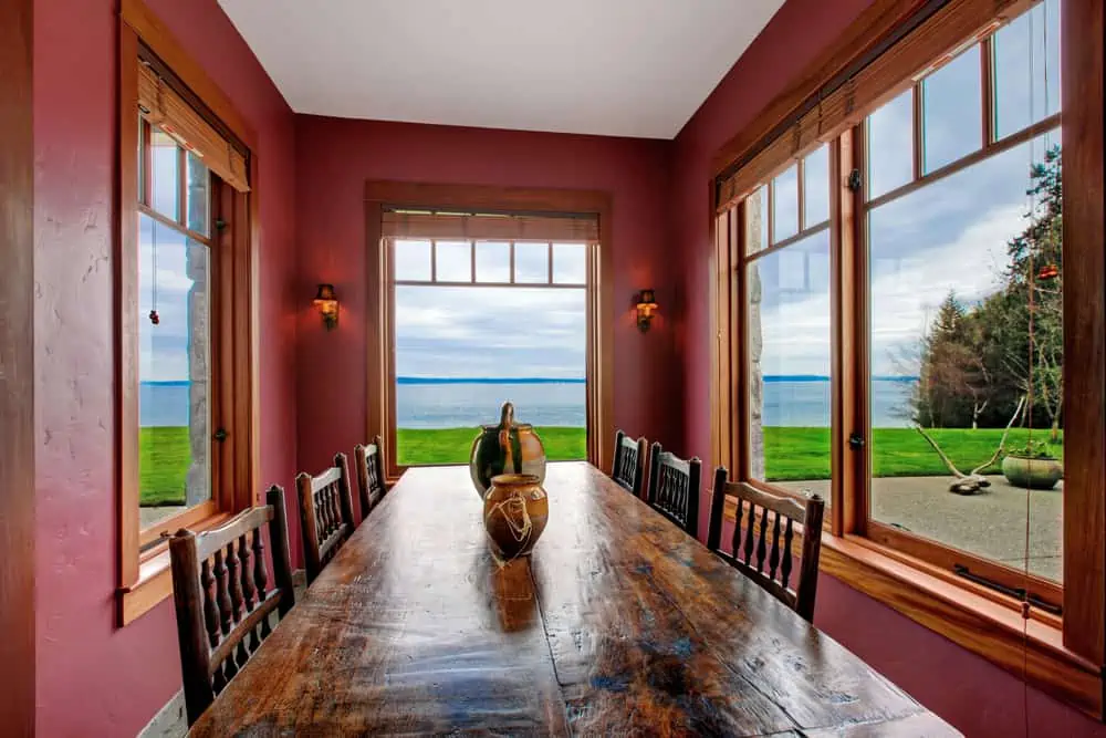
An easy-on-the-eyes dark red color, crimson is ideal for bedrooms or dining rooms with dark woods. Dining rooms benefit greatly from its warm undertones and red-rock undertones. As with fine wine, it can appear somewhat purplish.
Instead of contrasts, this design went for a more unified appearance. It involves a large, dark wooden table, matching chairs, and natural wood-colored window frames and blinds.
6. Modern Gray and Crimson Living Room
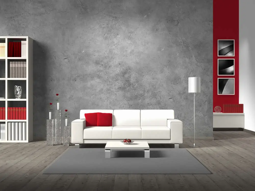
Gray and crimson are two colors that could harmoniously pair with one another regardless of the room in question. If you feel that crimson is too overpowering, you can choose it as an accent color.
Notice how, in this scenario, it stands out from the crowd of colors without feeling too overwhelming. The crimson throw pillows on the sofa are also a great touch.
7. Modern Open Space
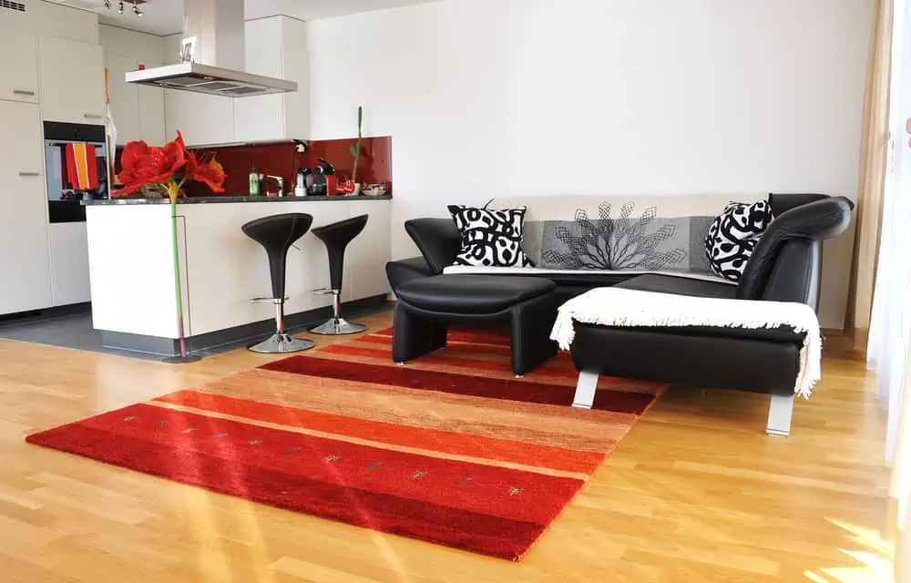
In a space that’s mostly back and white, a simple red backsplash is the pop of color it needs. With the kitchen and living room melding into one another, it’s good to carry the same color scheme throughout.
8. Elegant Dining Area
Crimson in the dining room turns every meal into an almost decadent affair. It could be the perfect spot for hosting holiday or dinner parties.
If you decorate with silver accents, you’ll be able to enjoy a five-star dining experience every night, even if you’re only reheating leftovers.
Choose light fixtures compatible with dimmer switches to set the tone for a dinner date just as you want it. Dimmer lights can actually change the hue of the crimson paint.
9. Modern Crimson Kitchen Cabinets
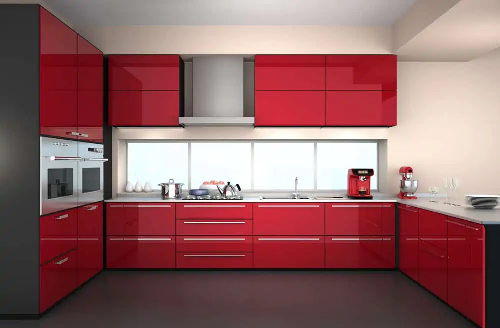
I always say that painting cabinets is a bold choice. But it saves thousands of dollars and looks amazing when done right. A high gloss crimson just gives these modern doors so much character.
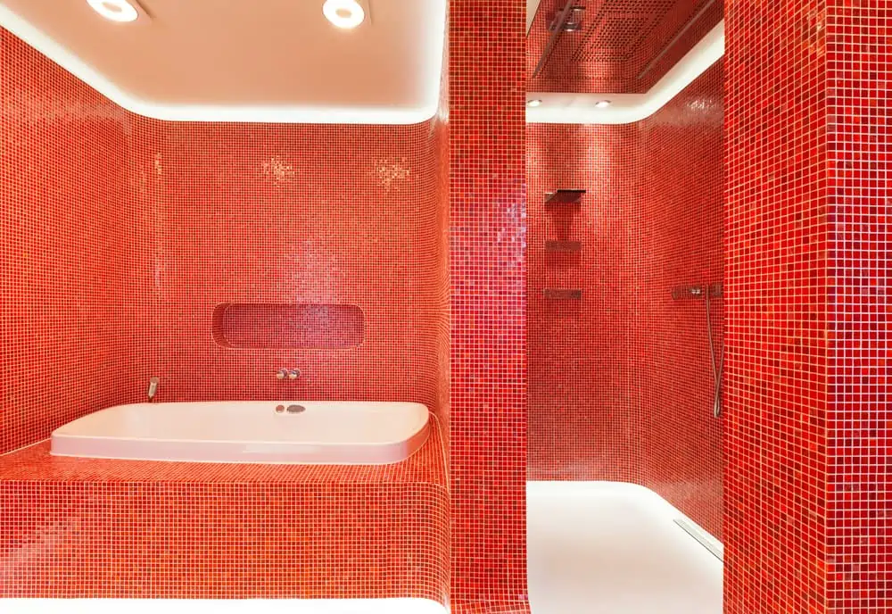
10. Black and Crimson Tile
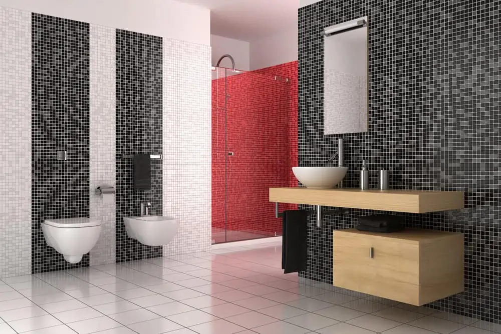
Crimson and black make for a mysterious and sexy color combination. If you’re a fan of tile in the bathroom, you’re going to love this setup. You can always choose to paint the tile pieces if you can’t find crimson tiles delivered in your area.
If you’re unsure about color combinations, you really can’t go wrong with the crimson, black, and white love triangle.
Helpful Tip
Turn to an interior designer for recommendations if you’re really unsure how to use crimson in your home.
11. Crimson Shutters
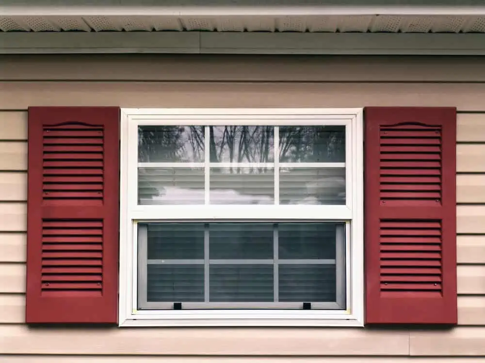
Passionate and energizing, notice how crimson red makes an excellent choice for exterior window shutters? When paired against a neutral siding, you get a lovely pop of color.
12. Crimson Bathroom Tiles
If you want a crimson bathroom and can’t seem to find the right colored tiles anywhere, simply grab white tile and paint over it! You can use Pouring Masters crimson red acrylic paint, which adheres to tile, rock, wood, canvas, and other materials.
13. Candy Stripes
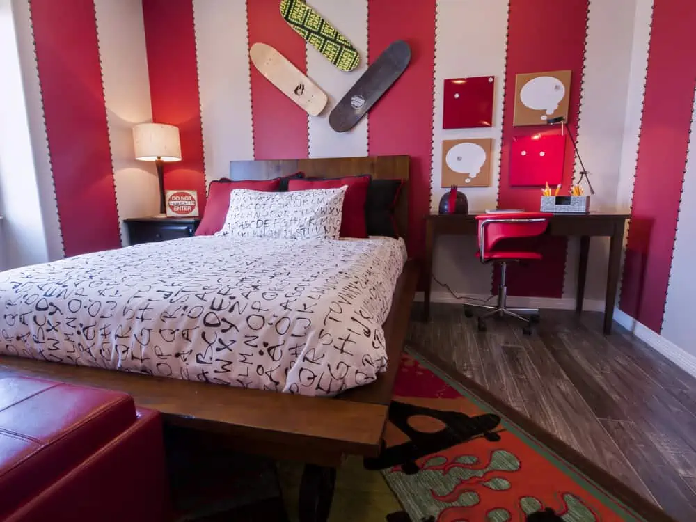
Notice how a little bit of crimson red can bring so much life into a dull-looking bedroom? By going with a thick, striped pattern, this look would be great for a kid’s bedroom or a playroom.
14. Master Bedroom with Crimson Accent Wall
Here is how to incorporate crimson red into an accent wall that turns any master bedroom into a romantic space. Sometimes all you need is an accent or feature wall. It’s best to choose one behind the headboard to keep the room anchored.
While you experiment with different finishes, you can use the same shade of red in your pillows or throw blankets to maintain cohesion.
What Colors Go with Crimson Red Paint?
When I used to be in the field, “What goes with red?” was a common question I often got. Finding a perfect match is harder than you think due to red’s overpowering impact on the eye.
Bronze
When paired with crimson, bronze is the perfect metallic color since it enhances the hue’s warmth. Crimson will not be overpowered by bronze since it is a more subdued hue of gold, which is less yellow than gold.
Using bronze instead of gold or silver with red can elevate it to a more upscale appearance, whereas using gold or silver with red can make it look cheap and tacky.
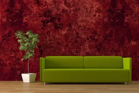
Green
Using red and the deep shade of green known as forest green, you may achieve a retro aesthetic. In traditionally styled rooms, pair these two colors with dark brown woods like mahogany or walnut.
Maroon
Maroon is a darker shade of red. Crimson and maroon complement each other effectively when used together to create a monochrome appearance.
Beige
This popular combo works well because it is a warm neutral, which enhances the coziness of red. Choose this color as a backdrop for holiday decor or a cozy room like a den. Pair it with crimson-colored accessories like curtains and blankets.
Eggplant
Add some color to your classic or country cottage décor with eggplant. It’s a terrific choice. A focal wall in eggplant and crimson colors, with the rest of the walls painted in cream, is an option.
Tips For Picking the Right Crimson Red Paint
There isn’t just one type of crimson. And other factors come into play, such as finish and sheen. They can often alter the way a color looks.
For Bedrooms
If crimson is your color of choice for the bedroom walls, it’s best to choose a darker matte tone. You can’t afford the bedroom colors to be overly energetic.
Having a red-colored bedroom can help you start your day off on a positive note. Decorating a bedroom in red is an auspicious practice in Feng Shui.
Crimson red undertones and an accent wall in cool neutrals can help those who have trouble sleeping or are prone to restlessness before bedtime.
For Living Rooms
Your living room will stand out from the rest of your house if you paint the walls in a bright shade of crimson red. Creating a warm, inviting atmosphere in your living room is essential to making you want to spend time there.
There’s no better way to temper a bold color than with lush indoor plants, plush leather furniture, and raw wood accent pieces. Sherwin-Williams Crimson Red (color code SW 2906) is an excellent choice.
For Dining Areas
In dining rooms, you can play with crimson shades and finishes as much as you want. Nobody can stop you if you want to go with a bright shade and satin finish.
Decor and furniture can also be a source of inspiration. Furniture from the 1950s and ’60s looks timeless, while an ornate antique brings the room to life.
However, a warm wood and brushed steel contemporary rustic look will bring the look up to date. Another way to freshen up a crimson red dining room is with natural fibers and modern wall art.
For Kitchens
As far as kitchens are concerned, the vibe you’re going for is lively and filled with passion for cooking. Crimson red goes well with natural wood, especially those with reddish undertones.
Painting the cabinets red while keeping the walls white is another option for kitchens.
You can choose products like Rust-Oleum Universal cardinal red gloss multi-surface spray paint for the cabinets. Give your outdated kitchen a new life and repurpose old cabinets with this creative idea.
Final Words
Crimson wall paint is a choice that can make or break your interior decor setup. While intimidating, crimson red walls can set the vibe of several rooms in the house. If you want your home to feel sexier, more vibrant, and more powerful, crimson is a color to consider.