Have you ever heard that orange colors give you energy and blue colors help you relax? Have you ever wondered how much of it is true?
Well, wonder no more; color can influence our mood. This means that not all colors are suitable for rooms meant for relaxation.
Painting your bedroom walls the wrong color can seriously affect your mood and impact your sleep. So, if you want to see the best bedroom paint colors, you’ve come to the right place.
Key Takeaways
- Colors can impact mood: Lighter shades of blue and green are calming, while bright or neon colors should be avoided in bedrooms.
- Soft neutrals, gray tones, blues, and pastels are great bedroom paint colors for relaxation.
- Choose colors that complement your furniture and décor for a cohesive look.
- Experiment with accent walls or different shades to create a personalized and inviting atmosphere.
How Do Paint Colors Influence Your Mood?
Color has a proven scientific effect on mood. Certain hues can energize us or might be relaxing; some types even induce feelings of hostility or sadness. Emotional reactions are triggered by a color’s saturation, brightness, or purity.
The two most common bedroom colors are blue and green, and for good reasons. Blue tones are more subdued, and they have a relaxing impact on the brain.
Most colors of blue can generate a serene mood, but the optimum effect is achieved by using lighter shades on your bedroom walls.
Green can evoke feelings of nature, which can help you relax. It’s also a calming and refreshing color for many individuals.
You want to avoid energizing colors (like orange or red) and very bright or neon shades for the bedroom.
50 Best Bedroom Paint Colors
Next up, we’ll look at 50 gorgeous bedroom paint color ideas designed to inspire your next paint purchase.
1. Ocean Vibes
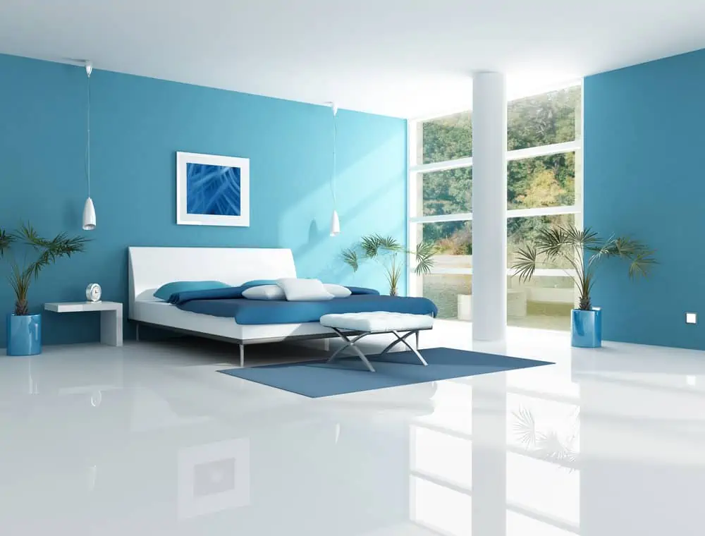
First, I’ll be focusing on different shades of blue, just to show why this is still one of the most popular bedroom colors even in 2022. Whether paired with blue elements or used as a contrast color, nothing speaks “bedroom serenity” like a lighter shade of blue.
2. Blue Kid’s Bedroom
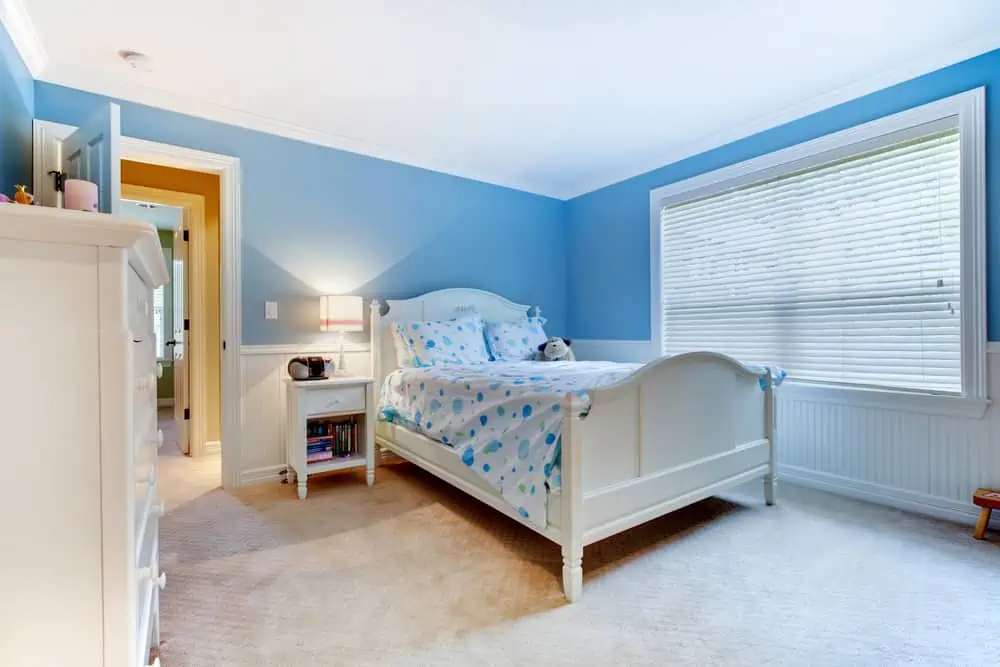
Notice how well blue and white go together when decorating the bedroom. It offers just the right level of tranquility.
But the color choices are light enough to boost the energy needed to get out of bed in the morning. The room looks very clean and always ready to welcome you to sleep.
3. Blue and Earth Tones
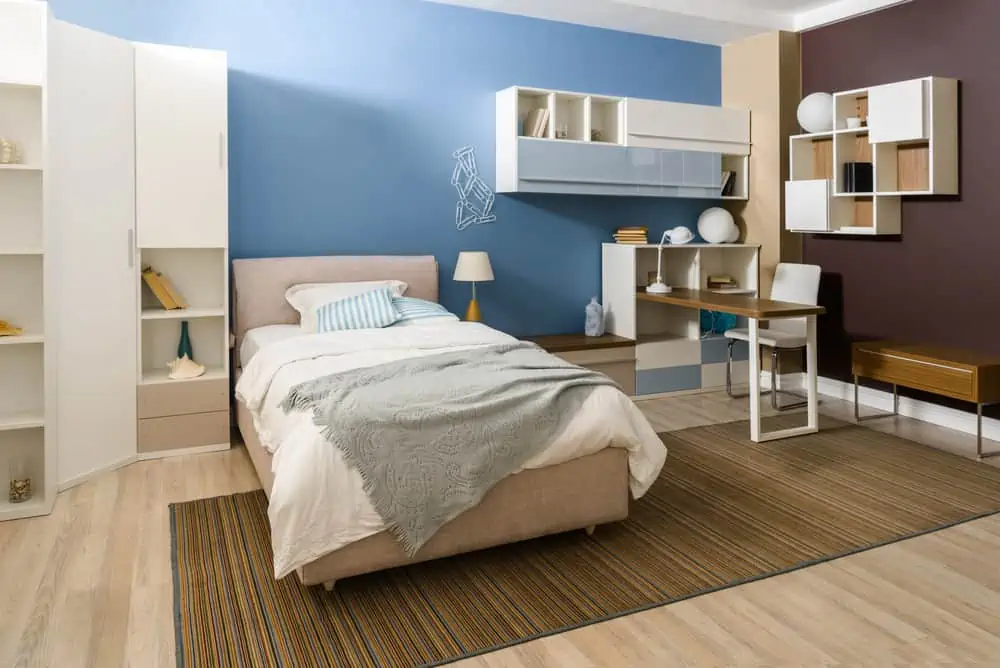
There is no doubt that blue is one of the best bedroom colors. A benefit of opting for blue as a bedroom paint color is that it’s easy to pair with common furniture tones.
Notice the different shades of white, brown, cream, and other earthy tones that go really well with the light blue paint color choice.
4. Blue Accent Wall
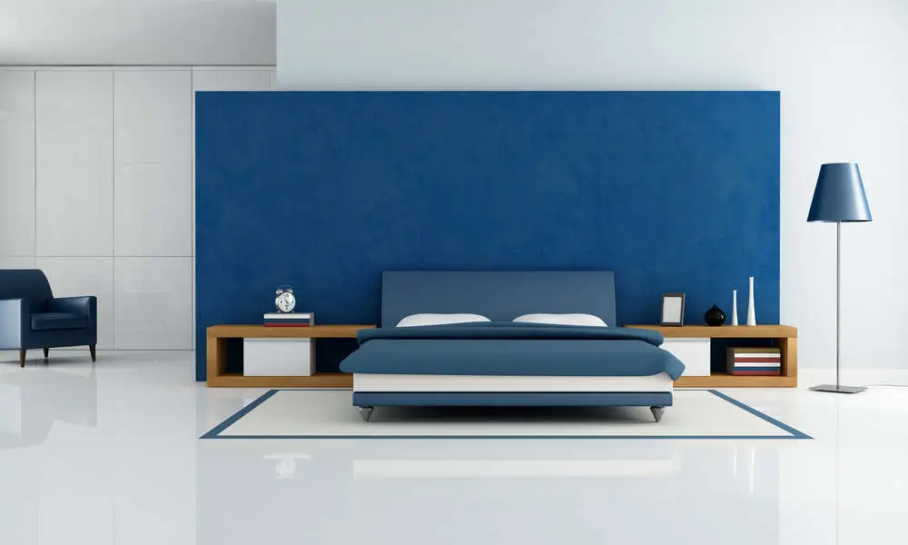
Want to benefit from blue’s relaxing properties, but you don’t want to paint all your walls in blue? How about an accent wall?
This darker shade of navy blue creates a peaceful atmosphere to induce a state of sleep. This goes great in a modern bedroom, especially if you pair your blue with white or gray.
5. Coastal Bedroom
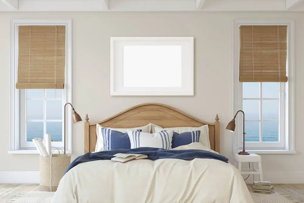
If you want to bring the sea vibes closer to home, how about going with coastal-themed paint colors for bedrooms?
The entire setup is very soothing with these off-white colors that are predominantly seen in the walls and bedding. The colors of choice are very naturals, reminiscent of the sandy beaches, ocean waves, and seashells surrounding your beach towel.
Pro Design Tip
Go all-out with the coastal theme! Add elements of rope, stripes, lanterns, baskets, and wall art that embodies anything from the sea.
6. Matcha Green
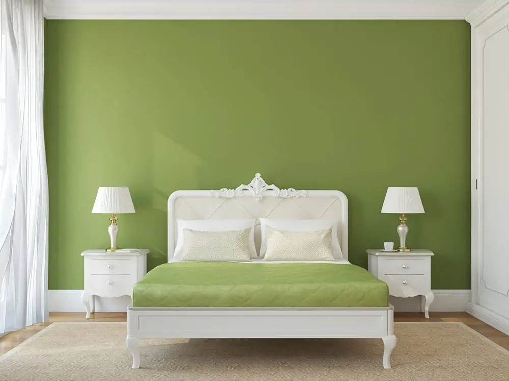
You can’t really go wrong with a matcha green bedroom paint color. Increasing the paint sheen level allows you to get different visual effects as the sun moves across the room. It’s subdued enough to serve as a colorful neutral depending on the room’s decor.
7. Forest Green Accent Wall
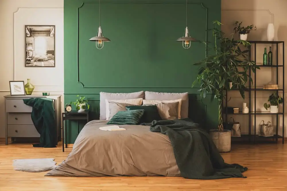
There’s something about forest green that transports you to the middle of nature. Pair it with a fresh-smelling room deodorant, and it’s a match made in heaven.
It’s a great color for a painted floor because it adds depth and richness without being overpowering. This dark green-blue hue is a great match for off-whites and a smoky pink for a striking contrast.
8. Soft Green
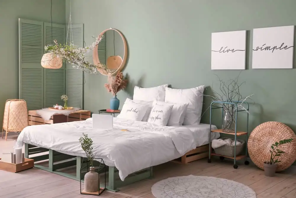
This lovely shade of blue-green is calm and restful, making it ideal in terms of paint colors for bedrooms. After a tense day, it’s nice to come home to a room painted in this calming shade of green.
Because it naturally brightens up a room, it can also give the illusion of a larger space in a small one. You feel as if you’re in the middle of a sparkling ocean.
9. Dark Purple
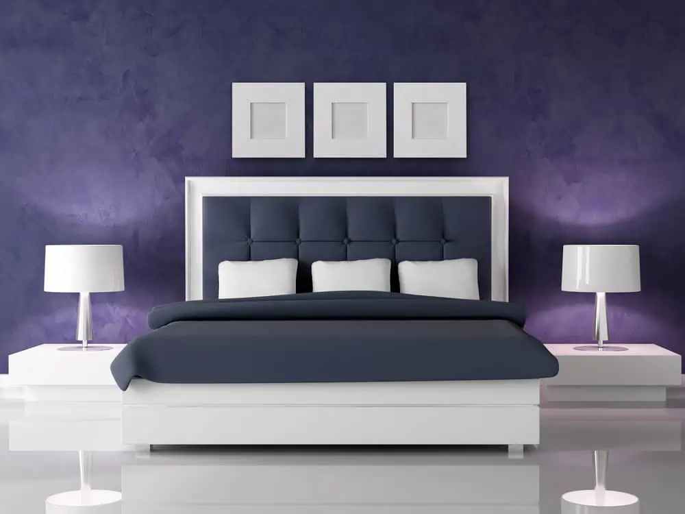
This feels like a very intriguing color; it’s not quite lavender but also not dark enough to reach that plum purple shade. It does, however, have a certain vibrancy to it and would look great when paired with white bedroom decor elements. The white headboard and white picture frames you see in the image are perfect examples.
10. Bright Purple
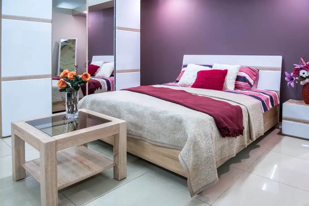
When it comes to picking purple for a bedroom color, many people are tempted to choose a muted shade. This vibrant purple is ideal for anyone who wants to add a burst of color to their bedroom.
Because a bold color creates an immediate focal point in the bedroom, you won’t need as many accent pieces to complete the look.
11. Royal Purple
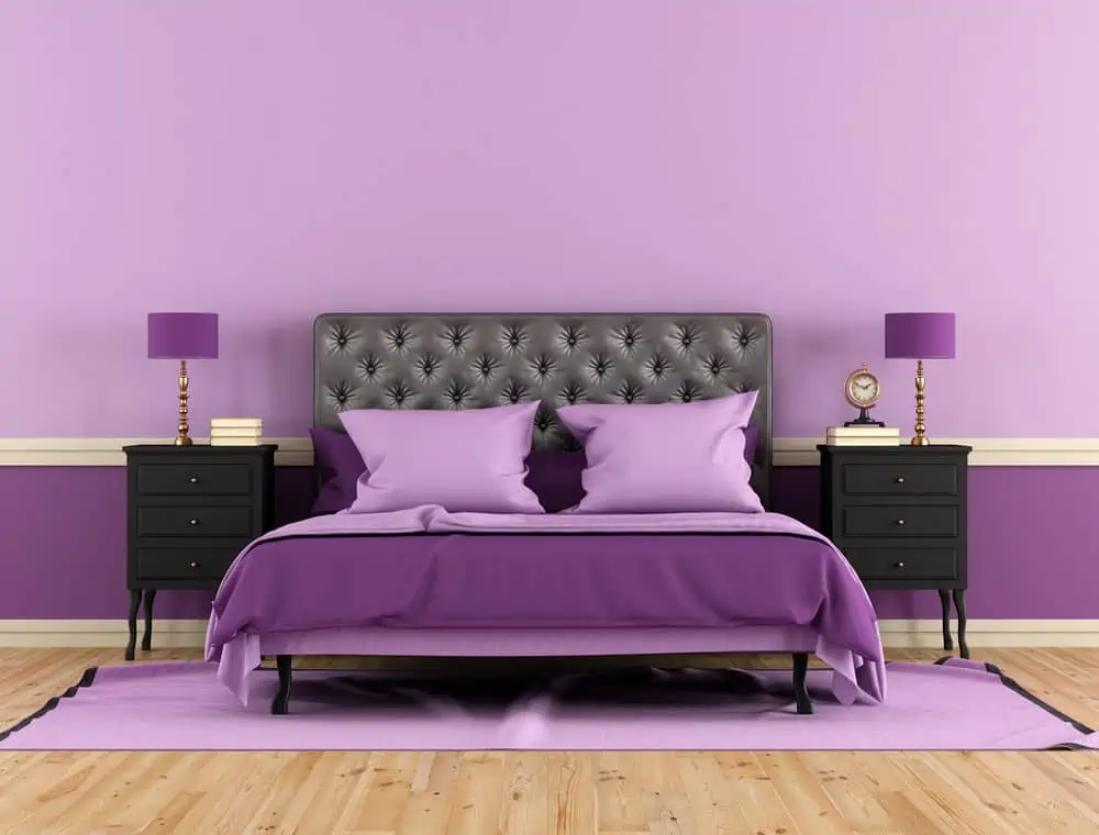
Often overlooked, purple is a color that lends a sense of grandeur to a room. When it comes to color, purple paint can be moody or bright and cheery, depending on its use.
It can both energize and calm you at different times of the day. Pair it with other shades of purple or with black nightstands, and you can’t go wrong.
12. Minty Green
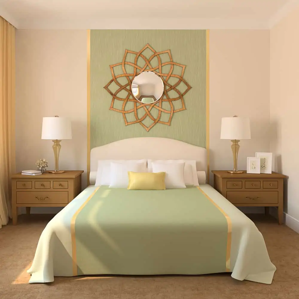
This color evokes images of the beach, sunshine, and the deep blue sea, just to name a few. While delicate and feminine, it is also edgy and striking, grabbing the viewer’s attention and drawing them in. This color works well with both brown and black, so you can use it in any room.
13. Cute Pastels
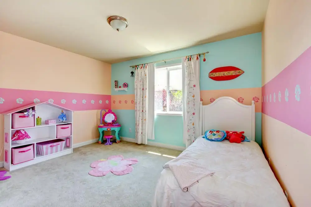
For a child’s bedroom, pastels are bulletproof. You can opt for a single wall color across the entire room or play with different pastels on different walls, as you can see here.
Opting for pastel wall colors lets you combine the different colors that range from light blue to muted pink.
14. Lush Lilac
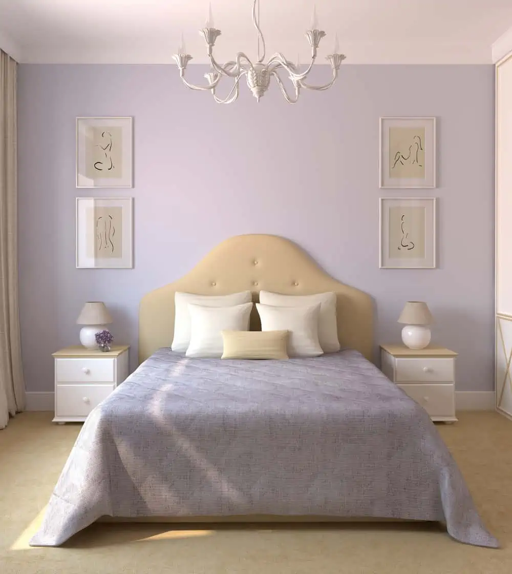
Lilac is a fun, unexpected color that instantly infuses a space with a carefree vibe. It is a rich color that doesn’t feel like it’s being overly sweet. While this color is perfect for a child’s room, it can also work in an adult’s space.
15. Dusty Pink
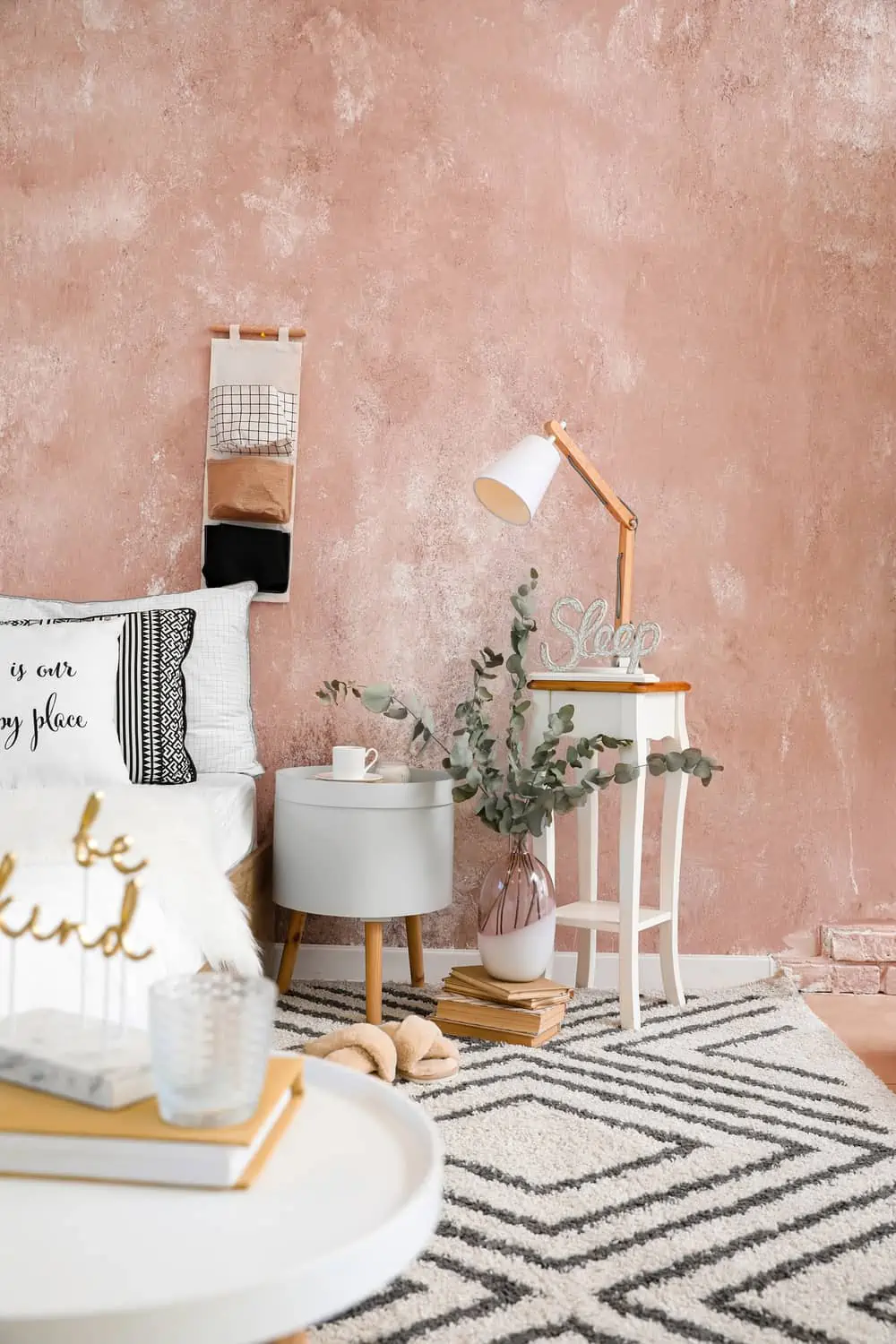
This pink is the ideal color for both primary and children’s bedrooms because it is neither too light nor too dark. Despite the room’s abundance of natural light, this color will not feel harsh or bright.
In addition to looking great with white trim, this color also works well with dark brown or gray wood tones. Plus, it’s easy to get that same paint job effect by applying the paint with a sponge.
16. Sunset Serenity
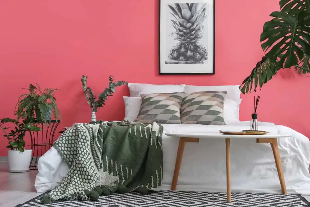
Because they make people in the room appear more flushed and healthier, darker, deeper pinks are the most flattering. Pair this deep purplish-pink with neutrals and cool whites to keep the room from looking cluttered. The color feels luxurious and would work well in a chic bedroom setup.
17. Blush Pink
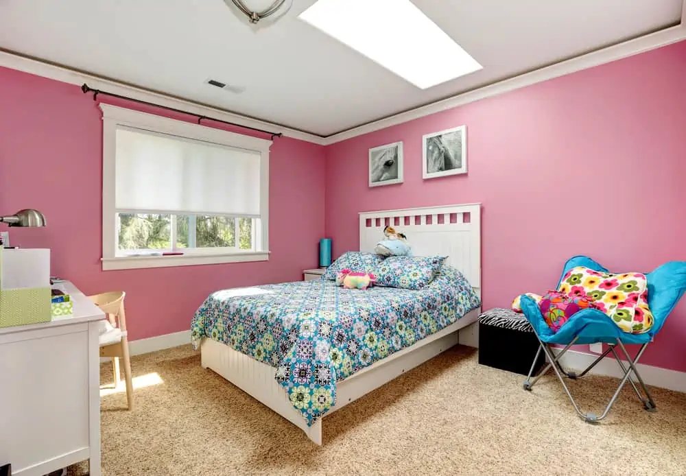
Something about this particular shade of pink takes you back to childhood days when you’d spend hours dreaming about this and that. It has a vibrant appearance, but it’s not so bold that it would bother anyone. It’s the perfect balance between light pink and bold, powerful pink.
18. Layers of Joy
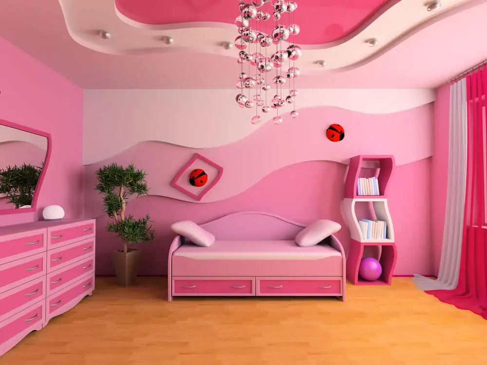
If you’re feeling really playful, might I suggest combining multiple shades of pink? I have to admit; the entire vibe makes me feel like this would be more suited for a child’s room.
But I can see how it could make its way into an adult’s bedroom. The semi-gradient wall effect is pretty nice, but it could be overwhelming for a bedroom.
19. Bed of Roses
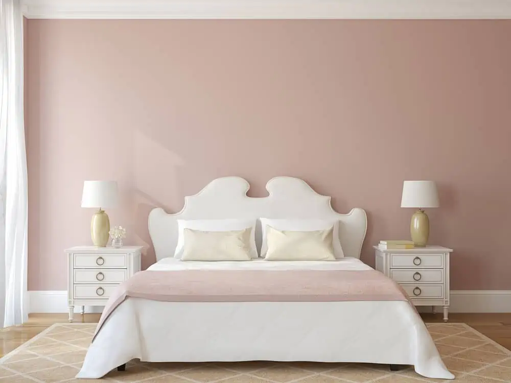
There is no list of pink paints that is complete without the perfect millennial pink. When it comes to pinks, this rose shade is one of the more unique options. It’s romantic and naive and would look stunning as an accent wall in a white kitchen or a bedroom.
20. Coral Pink
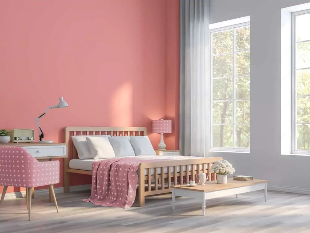
I’ve been obsessed with Living Coral since Pantone announced it as the Color of the Year for 2019. This vibrant coral paint is a trendy showstopper in any bedroom. Let this color do all the work, and don’t bother with a lot of extra decor.
21. Airy Gray
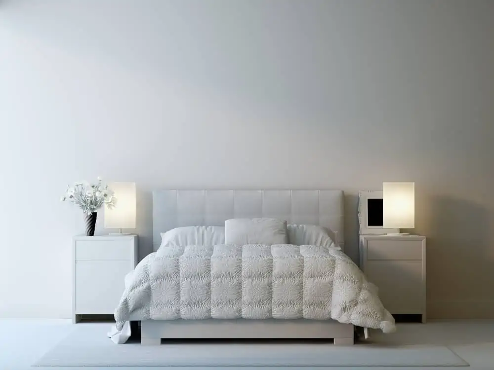
Adding depth and dimension while maintaining a bright, open feel is achieved by using this light, airy gray color. If you need a color that will help you relax, look no further than this misty, tranquil shade. A guest room that serves as an office can benefit greatly from this design.
22. Navy Blue
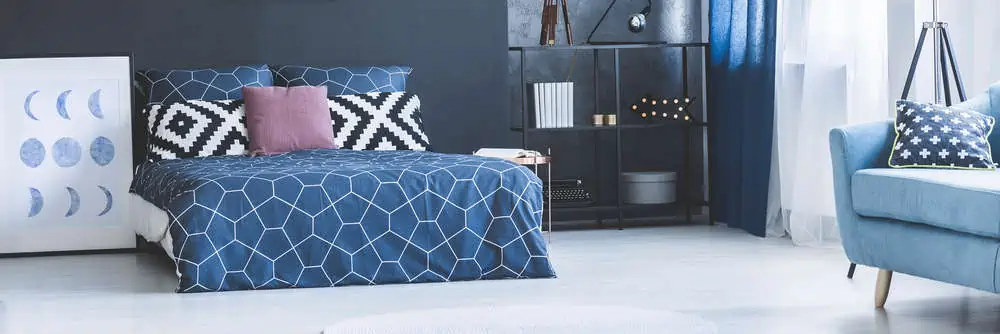
Navy blue isn’t a subtle color, but it creates an instantly tranquil bedroom thanks to its richness. If your guest room features wainscoting, this deep blue shade is ideal.
You can achieve a nautical-inspired look in your home. Just paint the upper half of the walls in this bold color and the lower half in bright white paint.
23. Master Taupe
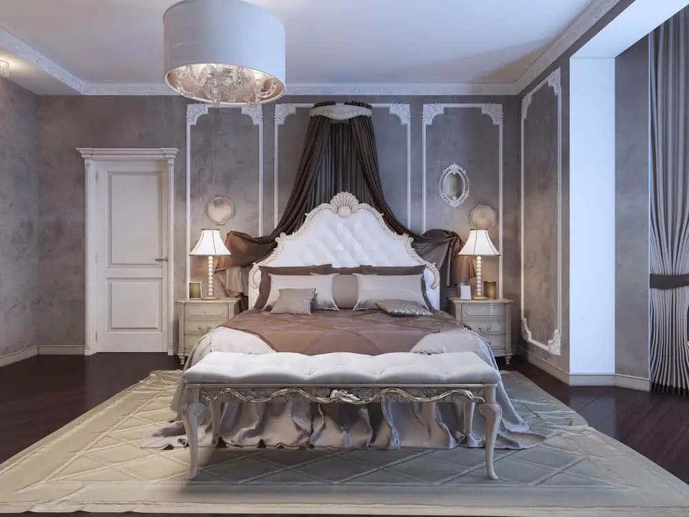
It’s good to paint your bedroom in taupe because it’s both neutral and calming. This is a medium taupe with pronounced gray undertones. This color would be perfect in a contemporary guest room with plenty of natural light and bright white trim.
24. Lazy Linen
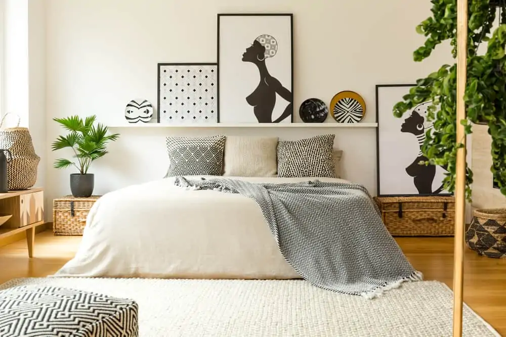
Linen is a classic when it comes to bedroom paint colors. It’s not quite white but also not beige. Traditional bedrooms will benefit from the strong yellow undertones in this taupe paint color.
It looks its best when paired with stark whites. Throw in a few neutral-toned throw pillows to add a little texture to this warm and welcoming color.
25. Warm White
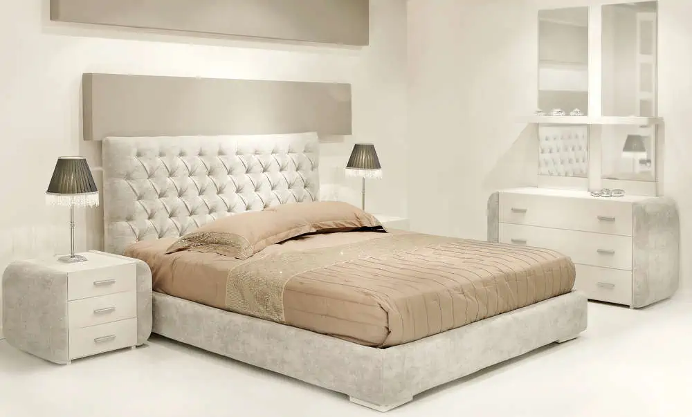
Wall paint color is critical to creating a peaceful environment where homeowners can unwind at the end of a long day. Warm white is a bedroom wall color that’s trending in 2022.
It’s not a stark white, but more of a warm sea salt color. It has a soft yellow undertone, making it the ideal backdrop for a cheery and peaceful bedroom.
26. Mellow Yellow
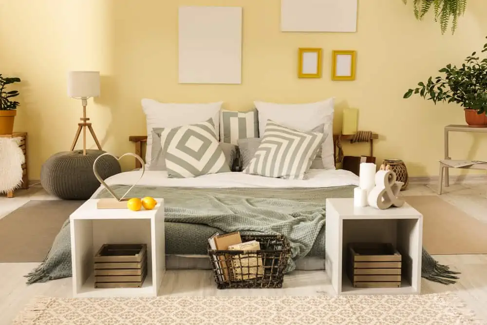
Thanks to the color’s laid-back vibe, your room will feel bright and airy rather than gloomy when you wake up in the morning. If you’re looking for a paint color that’s easy to work with, look no further than this shade of yellow.
27. Neutral Greige
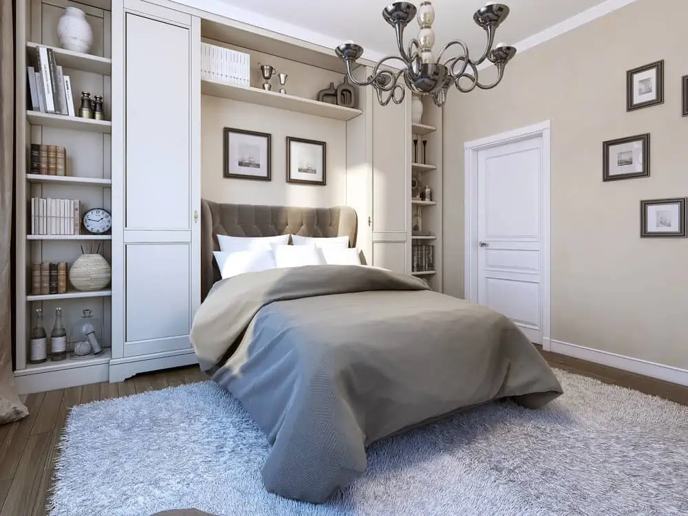
This bedroom wall paint color qualifies as a neutral, a greige, rather than a gray. This cool gray is a great choice in contemporary or modern bedroom designs.
A hint of its blue undertone shines through when painted on the wall, making it a good match for other cool hues and colors.
28. Serene Green
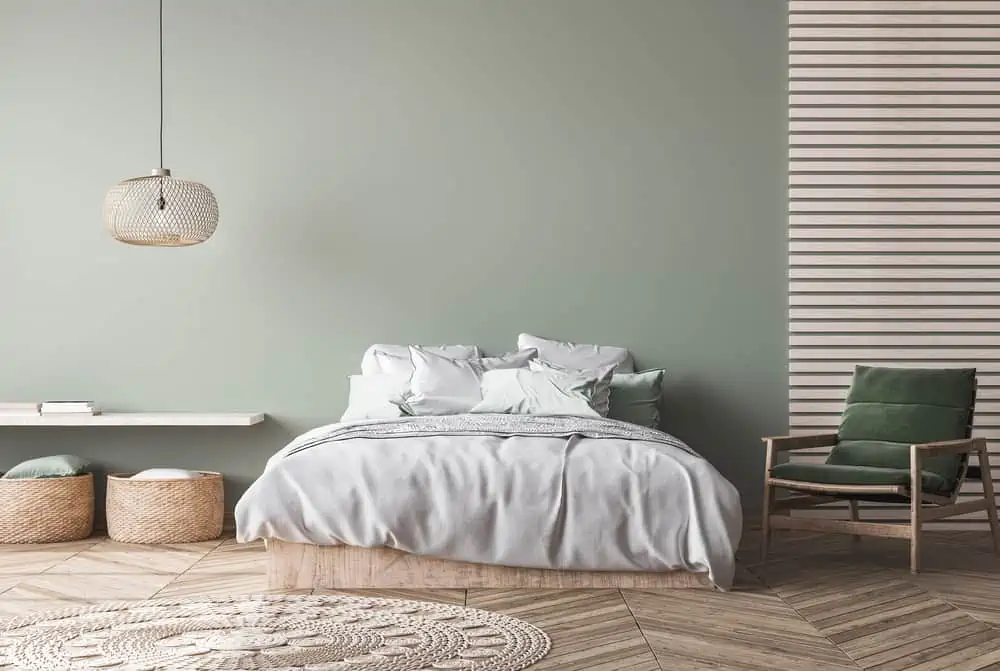
Even though green is a calming color, picking the right shade for a bedroom can be difficult. Ensure the color you choose isn’t too overpowering so that it doesn’t detract from the overall look.
This shade of green is enough to make the room feel fresh but with just a hint of blue to keep it light and breezy. You could create a lush, nature-inspired guest retreat using this green as a base.
29. Wheat Walls
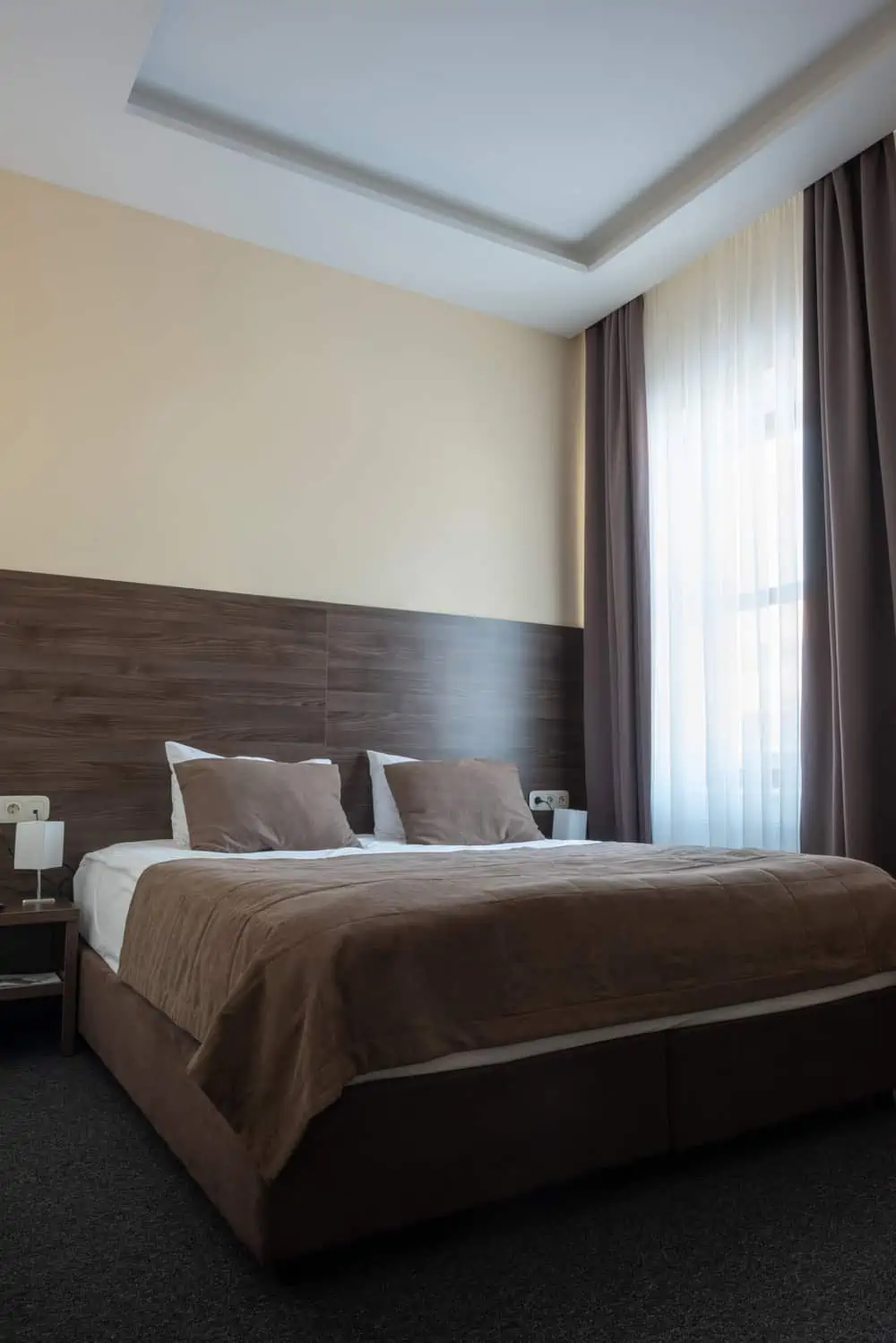
Greige is the go-to color when you’re stumped over whether to go with gray or beige. This is a crisp greige shade that appears tan or beige when lit dimly and gray when illuminated brightly. You can use it in a bedroom because it’s a great backdrop for almost any style.
30. Slate Blue
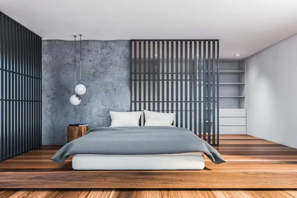
With its calming hue, slate blue is perfect for traditional interior design. It has a rich gray undertone that makes it a good choice for a modern bedroom design.
You can use it in combination with either a barely visible light gray or a deep navy color. A beach-themed bedroom would be a great place to use it.
31. Peppercorn Black
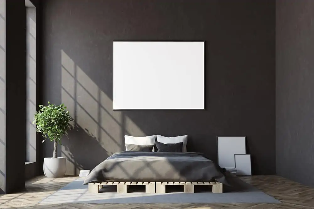
You don’t have to keep to neutral colors in the bedroom, so feel free to play around with bolder hues. Peppercorn is an excellent choice for an accent wall or the entire room.
Even though it’s dark charcoal, it’s surprisingly warm and inviting. The eye won’t see any shadows or corners in a smaller bedroom. So, a dark color like peppercorn can make it appear larger and more open.
32. Perfect Peach
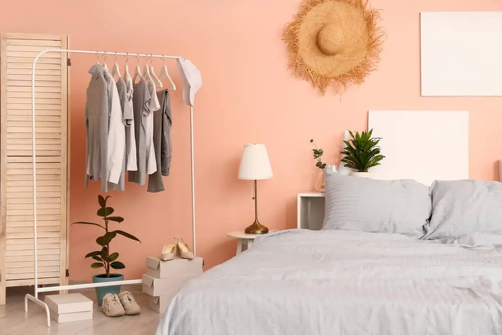
Peach is quite a bold color for bedroom walls. But I like to think it has soothing properties because it doesn’t strain the eyes that much. It works well with black and white decor elements and you can also opt for steel blue accents across the room.
33. Dark Sage
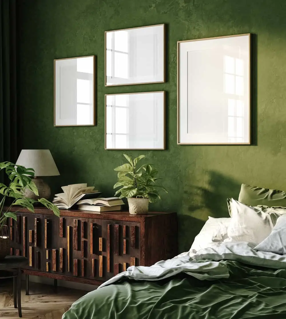
If you’re a fan of green but prefer a deeper shade, I understand. Using deep sage for the very first time is easy when paired with the right tones. Pale pinks, pale greens, and some black accents are great ways to incorporate this color into your home without going overboard.
34. Cheeky Charcoal
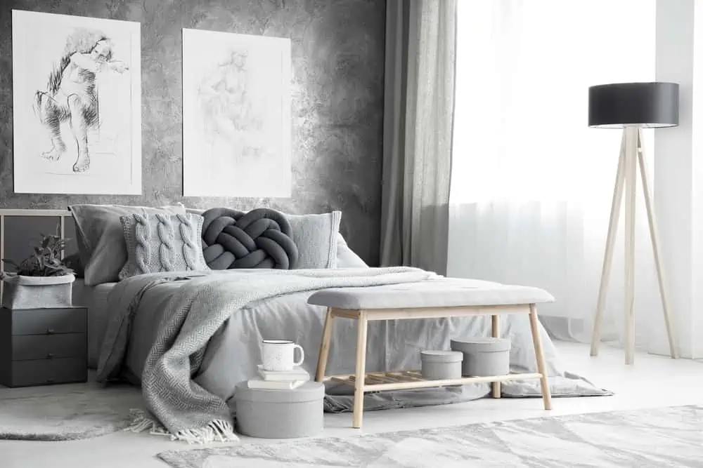
Charcoal color is ideal for a master bedroom as the darkest of the dark. This is the choice if you crave a burst of color but don’t want a ton of it.
Play around with your bedroom’s color scheme by changing the lighting, bedding, and other decor elements. Then play some sad music, because that’s the mood that this paint color conveys.
35. Dreamy Beige
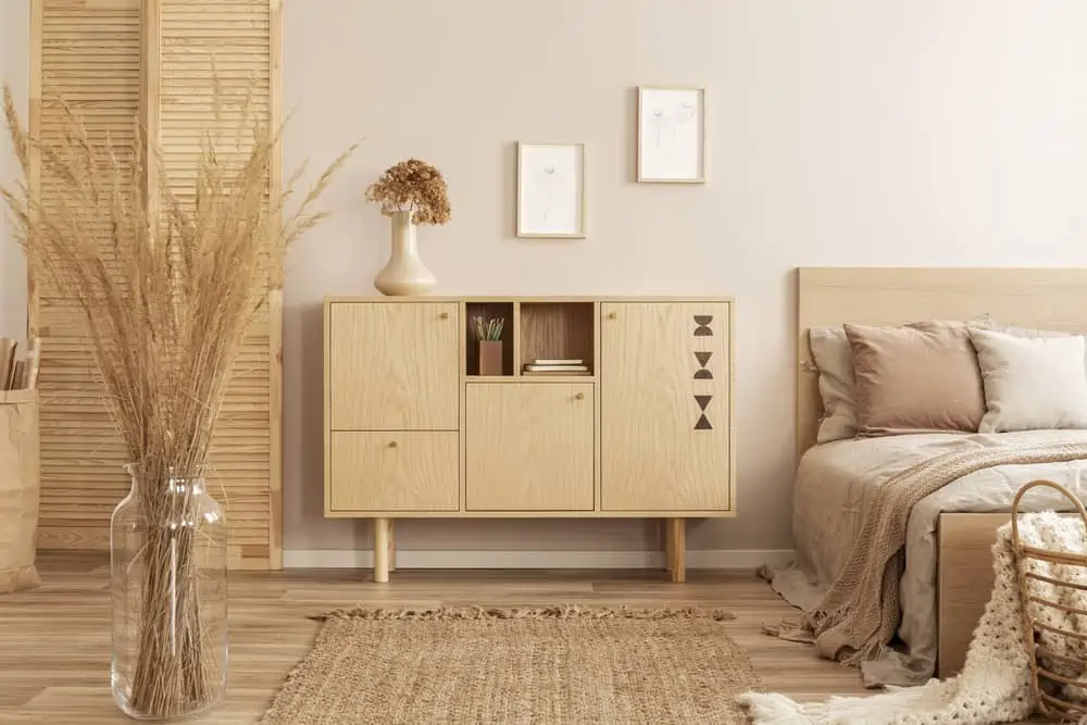
It’s warm, subtle, adaptable, and clean looking all at the same time. Even though it’s preceded by the word pale, beige is anything but dull. Your bedroom will have an airy, light feel thanks to its bright interior.
36. Spontaneous Silver
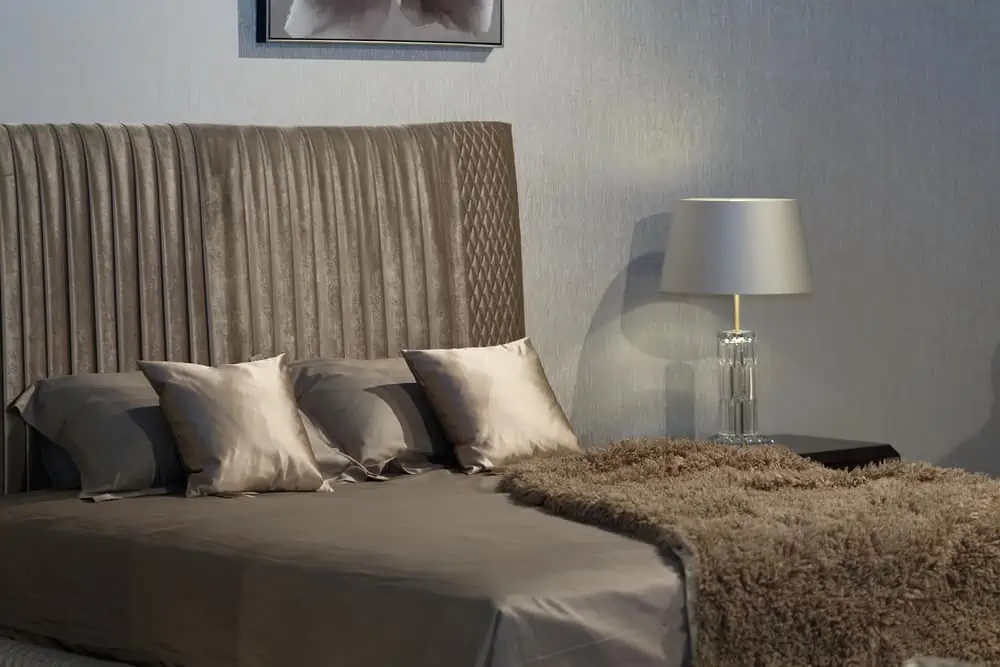
Go with a bold and shiny gray with a rich jewel-like hue. Monochromatic colors work well with wood flooring and dark furniture pieces.
It creates a pristine and refined living environment. Combine it with shades of gray, blue, or brown. Then it’s like having a stress-free bedroom color scheme that you can choose time and time again.
37. Voracious Violet
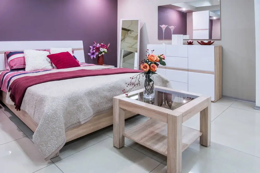
To avoid overpowering a room, this is a great option. You can paint the entire space violet or just a few accent walls in the same shade.
This gives a more calming and soothing effect to bring it all together. It’s understated and goes well with multiple layers.
38. Warm Brown
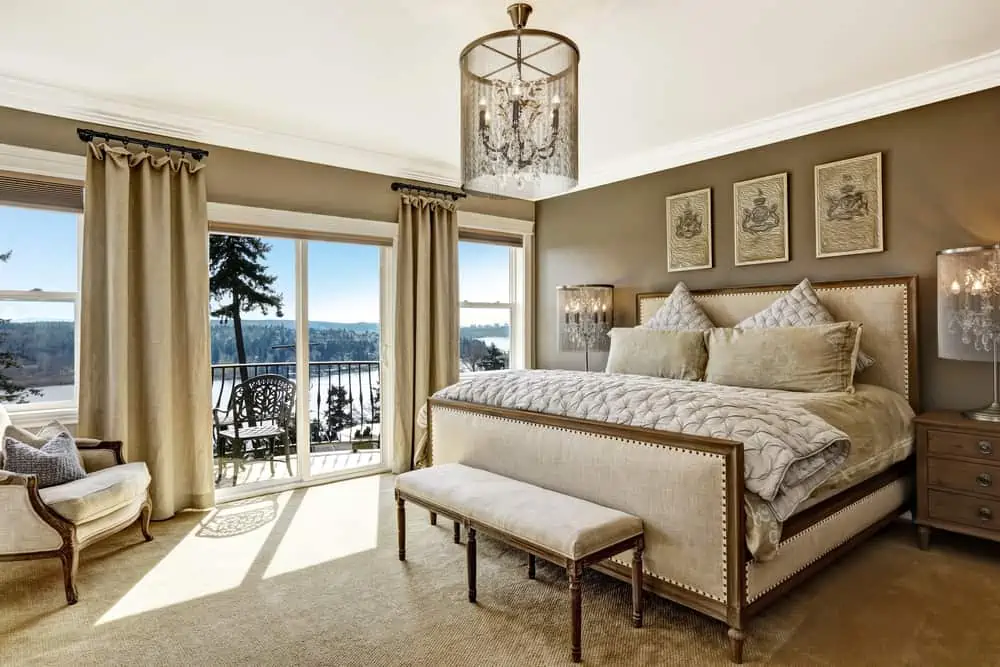
One of the many benefits of choosing brown in a bedroom is that it works with pretty much any furniture you’re thinking of adding to the room.
The calming effect of the warmer tone is also ideal for helping you sleep at night. When paired with golden decor elements, you’re guaranteed to end up with a luxury bedroom.
39. Emerald Green
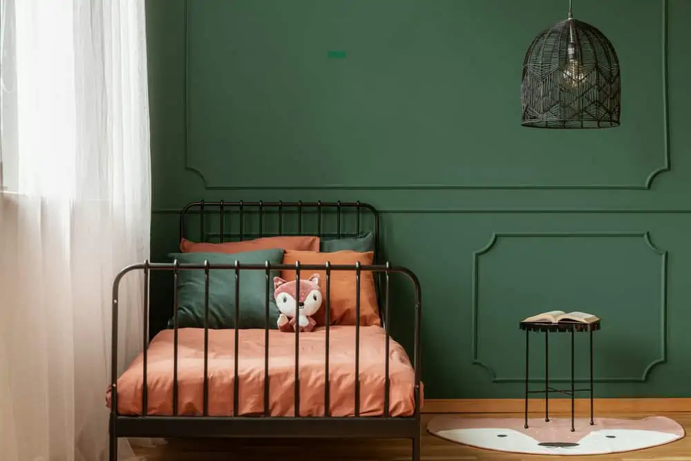
Tired of muted and faded bedroom green? Make a statement by choosing emerald! Pops of color will adorn your bedroom.
It’s sumptuous, inviting, and comforting, all at the same time. If you’re using it as a backdrop for your original artwork, it looks great with white or browns.
40. Mustard Yellow
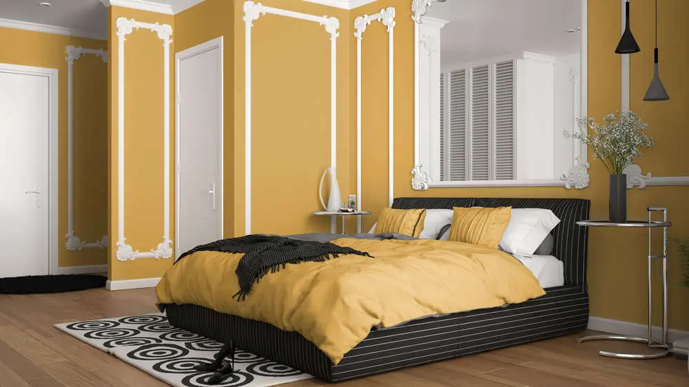
If you like yellow but can’t seem to find the right shade, consider mustard. It offers that perfect balance between rich and soft that just makes sense in the bedroom. Pair it with blue and green decorations and use black to anchor it if it ever feels like too much.
41. Cozy Cream

The color cream is a little darker than white, but it’s still very tidy. Your bedroom will have that warm touch that people always crave to see throughout their home. It also goes well when mixed and matched with most furniture tones.
42. Creamy Yellow
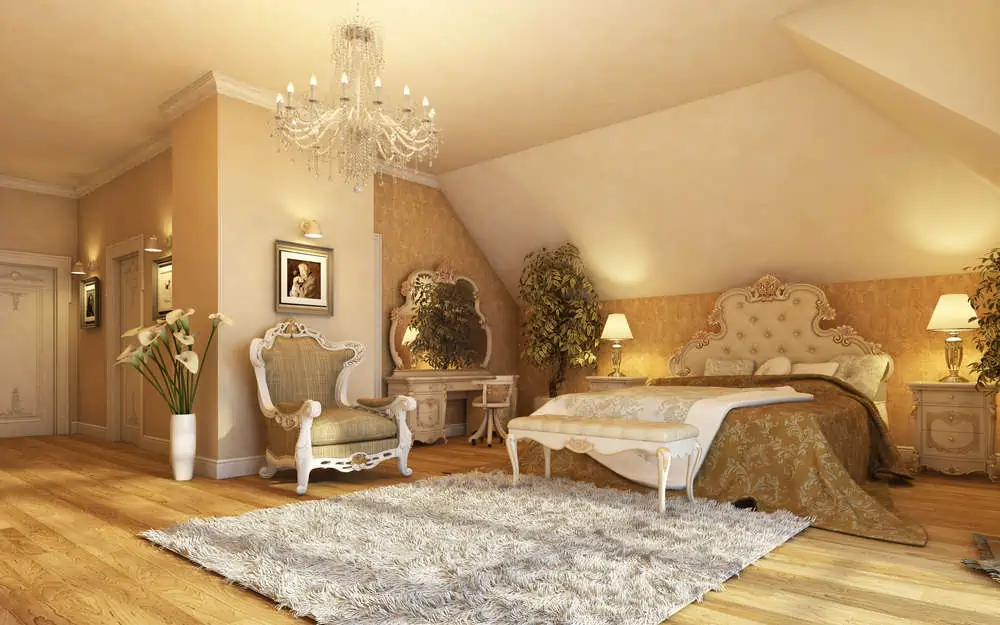
Creamy yellow is one of those bedroom paint colors because you can’t really go wrong with it. You’ll be in a good mood and have a warm feeling when you enter your bedroom because of the cream-colored walls.
The walls will stand out, and you can use shades, lamps, and furniture to add color to counterbalance the darkness of the tones/hues.
43. Bright Green
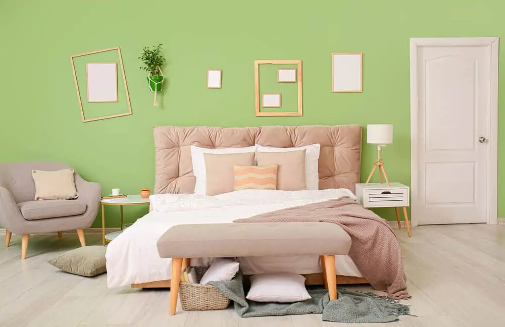
Bright green is a cheerful bedroom paint color that will help you wake up happy every day of the week. This color can be toned down by using ash grays or crepe pinks.
Chevron and other geometric patterns look stunning when defined by black lines in the room. Copper accents could also be used to complete the look.
44. Accent Red
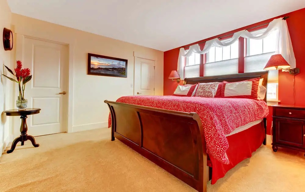
I feel like painting your bedroom red is a bit too much. But one red accent wall might be just what you need if you want your bedroom to have its own personality.
If you’re going for a bold red color for your bedroom wall, keep the rest of the room’s color palette simple. Choosing neutral colors such as whites and grays is a good idea. Your red wall will look great with white bedding or framed white art.
45. Vibing Purple
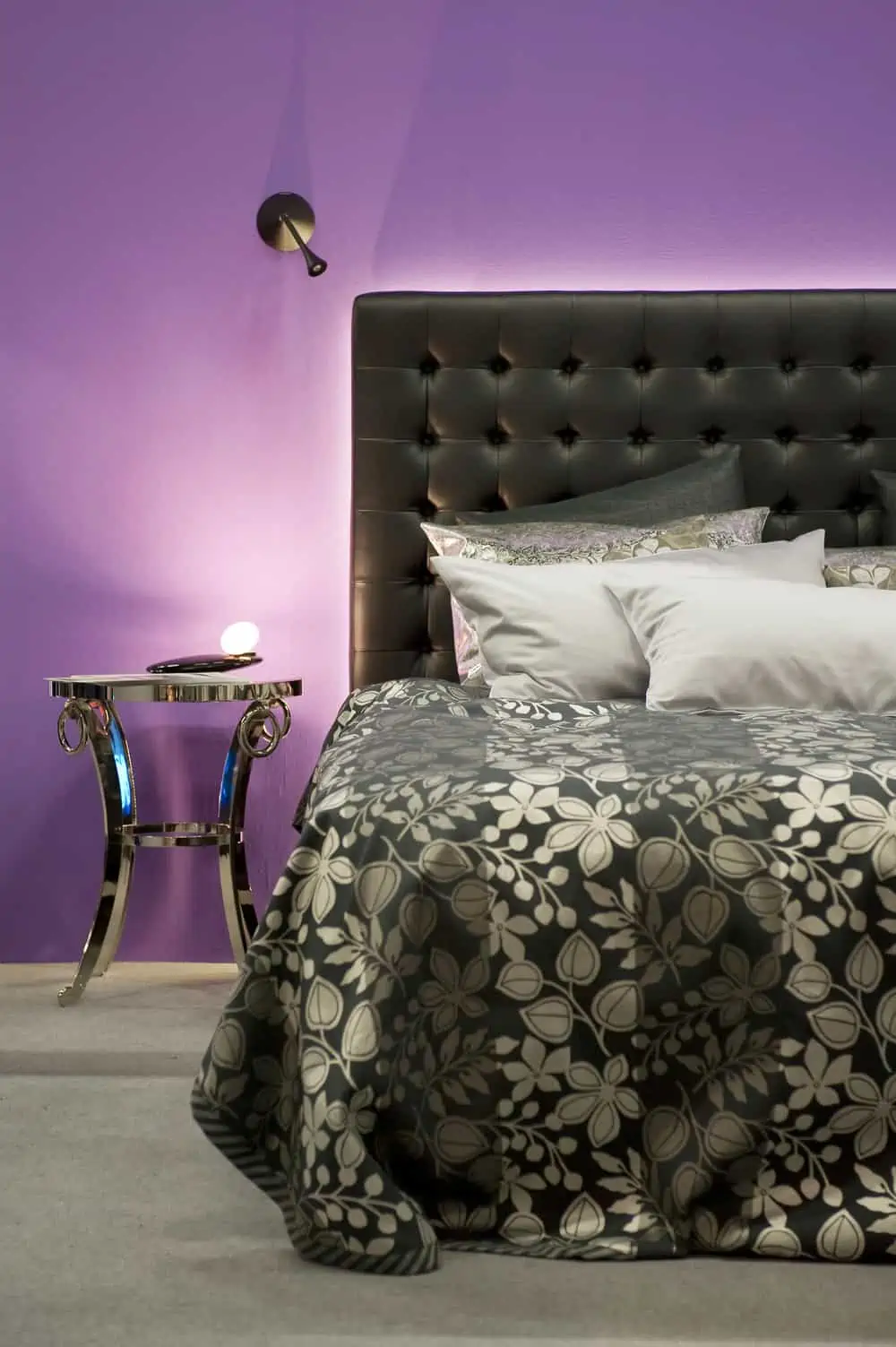
Purple is both stylish and fun-loving at the same time. This color can transform your bedroom and allow you to experiment with different forms and designs.
You can pair purple with grays and yellows and get really playful when it comes to patterns. If you’re a fan of the Bohemian style, this is the right bedroom paint color for you.
46. Whopping White
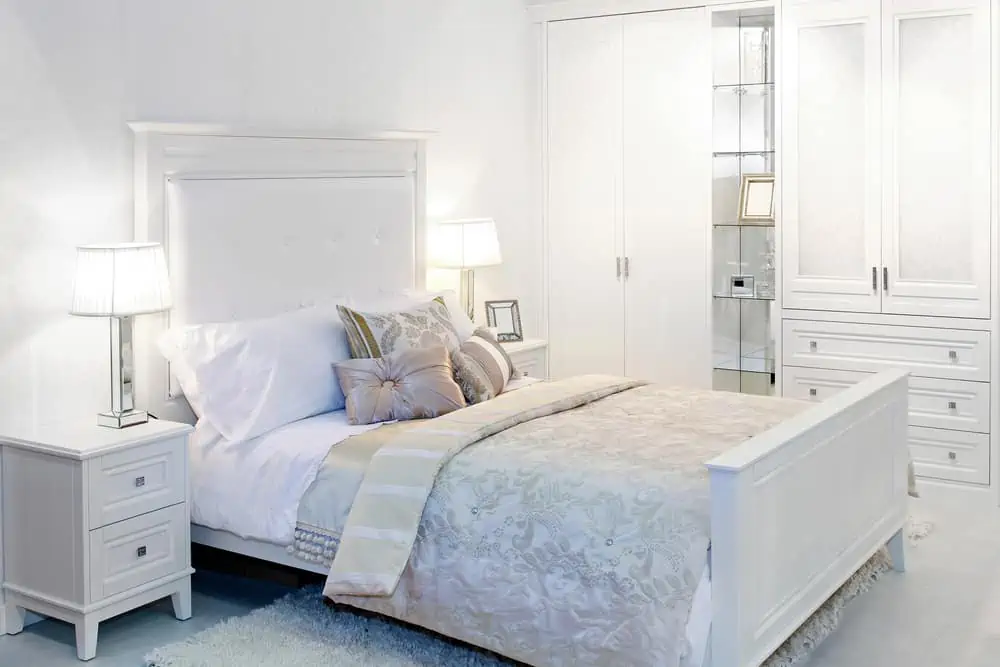
We don’t give white enough credit. It might not be one of the boldest or most original bedroom paint color ideas. But some people just want to take the safe way out, and I’m okay with that.
Besides, the fact that you can pair white with literally any other color is always a plus. It expands your playground in terms of potential color combinations.
47. Modern Black
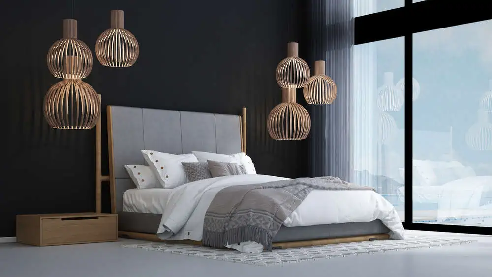
When you want your bedroom to be a dark cave that’s cozy and inviting to take day-naps in, black is a perfect choice. It’s a fantastic option for a modern bedroom and looks very exciting when paired with metallic accents.
48. Dark Beige

While beige and off-white have less presence, dark beige is an excellent choice when you still want to decorate with neutrals.
It gives a room a richer, more luxurious look without making it appear overly dark. Greens and whites, both considered earth tones, go well with this bedroom wall color.
49. Deep Brown
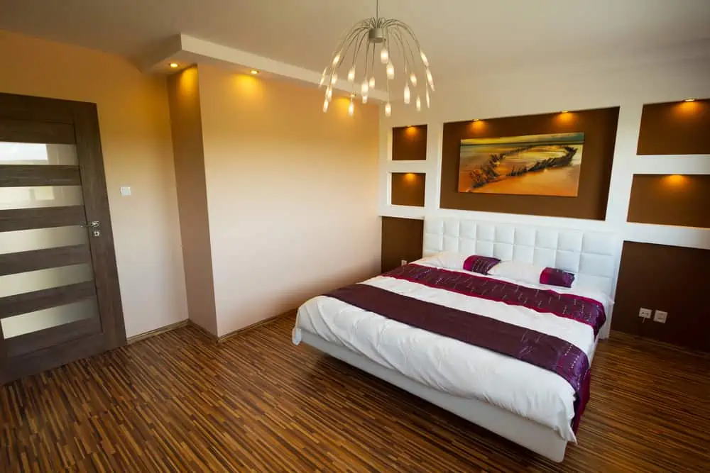
Just look at the dark brown used here on the accent wall. A bedroom’s best friend is a paint color that is both deep and dark.
Contrary to popular belief, a small room can appear larger and cozier thanks to rich colors. Look no further than this rich espresso paint for an accent wall or the entire room. It will work beautifully in both settings.
50. Gentle Off-White
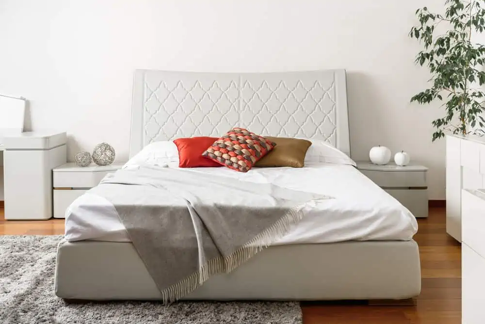
Off-white is a great alternative to all-white if you’re worried about your home looking too formal. You can add depth to your bedroom with pretty much any shade of off-white.
It goes well with earthy tones as well as vibrant reds and oranges. Since it’s a bedroom, consider soft colors, like light blues or muted pinks.
Tips For Picking Bedroom Wall Colors
Overwhelmed by all the amazing options we’ve listed? Here are some extra tips to help you choose.
Think Bedroom Orientation
The direction of your room influences your choice of bedroom paint colors. This is because light quality and warmth vary depending on your room’s cardinal point.
Choose Complementary Colors
When you want to use a variety of various scale patterns, starting with a single hue is the ideal approach. Then, look for a range of designs and prints that use this key hue in them that you enjoy.
Don’t Neglect Your Artwork
The key to a successful interior design project is choosing colors from your bedroom artwork. Most artists are masters of light and colors, and they choose their own color schemes for their works. Their expertise can be applied to your project by selecting colors from a beloved work of art.
Go Lighter or Darker
Finding the perfect interior paint color can be as simple as making a few little tweaks to your existing scheme. Before making a hasty decision on your paint color, consider experimenting with a lighter or darker tint of the same color.
Bedding Can Help
Think about your favorite bedding items and draw inspiration from there when choosing your bedroom wall colors. Pull out thread colors and tiny accent tones, and use them in your paint.
What Was Your Favorite Bedroom Paint Color?
Choosing the ideal bedroom paint colors will strongly depend on your personal preference. Colors indeed have a psychological impact on our mood. But there’s no absolute rule against choosing burgundy for your bedroom walls.
These bedroom paint color ideas are here to inspire you but not fully dictate your options. In other words: get creative!